zaterdag 22 oktober 2016

The Photobook Review Tulipa Graphic Design Willem van Zoetendaal Leendert Blok Jasper Wiedeman Photography


The PhotoBook Review’s Publisher Profile
Willem van Zoetendaal did not become a photobook publisher out of a sense of vocation. Many of the activities that form an integral part of publishing are anathema to him. Cost balancing? Zoetendaal shrugs. If he feels the urge to bring out a book under his imprint, Van Zoetendaal Publishers, then that’s exactly what he does, even if the financing is not yet in place. Van Zoetendaal selected five books from his collection that, together, as told to Arjen Ribbens, tell the story of his publishing house. This excerpt comes from the latest issue of The Photobook Review.

Tulipa, L. Blok and Jasper Wiedeman, Basalt, Amsterdam, 1994


Tulipa

L. Blok and Jasper Wiedeman

Basalt • Amsterdam, 1994

This was the first book that I published myself. I set up a foundation, Basalt, for this purpose, together with the art historian Frido Troost (1960–2013), so that we could apply for grants. Why the name Basalt? Because I was born at The Hague’s breakwater. This is the first in a series of books in which I juxtaposed historical and contemporary photography. In this case, it was autochromes from the 1920s by Leendert Blok, a photographer who worked for flower bulb cultivators in the Netherlands’ Bollenstreek region, and photographs by Jasper Wiedeman, who had just graduated from the Gerrit Rietveld Academie, where I was teaching at the time. By contrasting the two, you get differing perspectives. Contemporary photography can open a new window on history. I had the good fortune that there were a lot of students at the academy back then who felt connected to traditional photography. Many of them went on to achieve international renown, including Céline van Balen, Rineke Dijkstra, Hellen van Meene, Paul Kooiker, and Koos Breukel.

To Sang Fotostudio, Lee To Sang, Basalt, Amsterdam, 1995


To Sang Fotostudio

Lee To Sang

Basalt • Amsterdam, 1995

One day in the early 1990s, I passed a photography studio called To Sang Fotostudio in Albert Cuypstraat, Amsterdam. In the window, I saw a photograph of a fellow journalist with his daughter on his lap. The photographs in the window provided such a beautiful record of this colorful, largely immigrant neighborhood, that I gave my first- and second-year students money to go and get their portraits taken here. In 1995, I published a large-format folder of twenty-three portraits by the studio’s photographer, Lee To Sang. The design is entirely subordinate to the image. But the book works. Frido Troost and I put a lot of work into the picture editing. This publication made quite a stir: an exhibition about To Sang Fotostudio traveled to various photography festivals, Tate Modern acquired a number of the photographs, and Johan van der Keuken made a documentary about To Sang. His photography studio became a cult success. Martin Parr is one of many significant figures who went there to have their portraits taken. After he retired, Lee To Sang gifted me his archive—some seventy thousand negatives. So it is still a resource for publications to this day.

Quatorze Juillet, Johan van der Keuken, Van Zoetendaal Publishers, Amsterdam, 2010


Quatorze Juillet

Johan van der Keuken

Van Zoetendaal Publishers • Amsterdam, 2010

In Johan van der Keuken’s archives, I found thirty-three photographs of people partying in the streets of Paris. They were all made on July 14, 1958, the country’s national holiday. I arranged the photographs in such a way that they also form a dance. I love slim editions, so I use the negative format less and less—4-by-5 inches, for example, leads to a bulky format for a book. Over the years, I’ve moved away from using stiff paper. This book is printed on paper from Gmund, a German manufacturer whose products I love. It’s fine, uncoated paper: if you don’t want the pictures to show through it, you can only print on one side. So the pages have Japanese folds and are bonded with cold adhesive. There aren’t many pages, but the folded leaves give it a good volume. The cold adhesive binding allows the book to be unfolded easily.

Arthropoda, Harold Strak, Van Zoetendaal Publishers, Amsterdam, 2011


Arthropoda

Harold Strak

Van Zoetendaal Publishers • Amsterdam, 2011

Harold Strak is a photographer who has an almost scientific approach to his work. This book contains eighty photographs of the remains of insects that were ejected from spider webs after they were eaten. I chose a rectangular format so that I could show four photographs side by side on each double page spread. The lithography and printing technique were inspired by Fraenkel Gallery in San Francisco. Their publication Seeing Things (1995), about the history of photography, is one of the most beautifully produced books I know: superior printing in eighty-eight colors, with each print run dried for twenty-four hours. I went to the same lithographer, Robert J. Hennessey, who also lithographs all the catalogues for the Metropolitan Museum of Art, New York. Massimo Tonolli, a top Italian printer from Verona, printed it beautifully in tritone.

Mädchen, Diana Scherer, Van Zoetendaal Publishers, Amsterdam, 2014


Mädchen

Diana Scherer

Van Zoetendaal Publishers • Amsterdam, 2014

I’m always present when a book is printed. It was especially important in this case. I like black to be really black, and printers don’t often print it to my liking. I had the cover of this book run through the press one more time in order to achieve the deep black. I made it this big (9 ½ by 15 inches) so that it would become a physical experience. I used two types of paper for the inside; the Japanese paper feels a little bit like the dresses in the photographs. No, there is no text in this book. An introduction would undermine the mystery. In my books, you never find texts about the photographs themselves. You can’t explain photographs. The magic of photography is precisely that you study images yourself and give them your own meaning.

Willem van Zoetendaal is the designer and editor of seventy photography books to date, many of which he published under his own imprint, Van Zoetendaal Publishers. Van Zoetendaal has also curated numerous photography exhibitions in Italy, France, Spain, the Netherlands, South Korea, and Japan, and ran a contemporary photography gallery under his own name from 2000 to 2014.

Arjen Ribbens is an art editor for NRC Handelsblad, the leading Dutch evening newspaper. He is also a part-time publisher specializing in art editions and books on stupidity (De encyclopedie van de Domheid, or The Encyclopedia of Stupidity, 1999).

Translated from Dutch by Heidi Steffes.


zaterdag 15 oktober 2016

Views & Reviews Photographer and cinematographer who captured 30s London Wolfgang Suschitzky Photography


SUSCHITZKY / HALL, NORMAN (ED.). - Suschitzky. Great photographs. Vol. I.

 1292998657,
London: Photography. 12mo. Oblong. 24 p. Incl. technical data. Illustrated with photographs.

Published on 12 October 2016
Written by Tom Seymour

All images © Wolfgang Suschitzky, courtesy The Photographer's Gallery

The iconic Austrian photographer and cinematographer Wolfgang Suschitzky, a former contributor to The British Journal of Photography, has died at the age of 104. BJP remembers his lifelong contribution to photography.

Born in Vienna in 1912, Suschitzky was the son of Wilhelm and Adele, a secular, Jewish couple who ran a small bookshop in Vienna that included titles which warranted them, at that place and time, the title of ‘radicals’.

And so, in the 1930s, after his father had committed suicide as the consequences of Nazism became clear, so Wolfgang, a young man in his twenties, sought refuge in the UK.


Suschitzky is best known for his his work, as cinematographer, on Mike Hodges’ 1971 film Get Carter, with Michael Caine as the macho and psychotic London gangster.

It’s remembered as a thriller, a precursor to the many violent gangster films that are now such a staple of British cinema.

But Get Carter, shot with Suschitzky’s ascetic, moral eye, has most value as a piece of social realism, a cinéma verité-esque document of the realities of Newcastle in the 1970s. The Tyneside here isn’t one of chain restaurants and high street clothing shops, hen parties and stag-dos.


Instead, the film orientates – and indeed embeds – its action, and its players, into the people of the city – the faces of the old men who have spent a life working the mines or harbour-side, now sat in the pubs or hiding in the betting shops, the youngsters on the street corners or the dancehalls.

Suschitzky’s career in photography, of course, stretched far behind that. He first owned a photography studio in Amsterdam, his first destination after Vienna.


But, after his marriage to his first wife started to collapse, he left Holland for the UK.

Wolfgang created atmospheric photographs of London shortly after his arrival in the 1930s. Charing Cross Road, the centre of London’s bookselling trade, became an early fascination – a hark back, maybe, to his parent’s bookshop, such an integral place in his childhood. Later, he began to collaborate with artist Paul Rotha, with whom he developed his career in motion pictures.

Brett Rogers, director of The Photographers’ Gallery, who displayed an exhibition of Suschitzky’s work in the London gallery in January this year, said of the late photographer: “Tempering the social conscience of a documentarian with the eye of a German expressionist, Suschitzky created classic works that are both an invaluable documentary of the long vanished time but also brilliantly captured.”


Reviewing the exhibition, Gaby Wood of The Telegraph said: “His images of London, taken with the keen eye and gentle humility of a recent immigrant, are so evocative you feel they must be stills from films made before the war, mysteriously replayed in your mind’s eye.”

He retired in 1987, but his work continued to be exhibited.

In 2007, he was awarded Austria’s gold merit medal lifetime achievement award. The place from which he fled finally realised what a talent they lost.

See more of his work at The Photographer’s Gallery. 


Wolfgang Suschitzky obituary


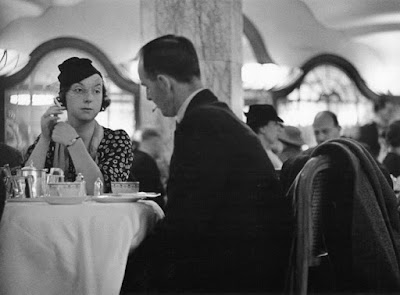
Customers at a Lyons Corner House in London in 1941, photographed by Wolfgang Suschitzky. Photograph: SYNEMA - Society for Film & Media

Amanda Hopkinson
Friday 7 October 2016 18.21 BST Last modified on Monday 10 October 2016 23.46 BST

Although born in Vienna, the photographer and cinematographer Wolfgang Suschitzky, who has died aged 104, forged his career in the UK where, as a Jew and a socialist, he took refuge in the 1930s. His best-known photographs remain those taken at dawn on Charing Cross Road in London at that time. The steam rising from the asphalt as cloth-capped workers lay the road surface ahead of the steamroller, and the whitish glow of milk bottles on a float, are eerie period essays in black and white, a paean to the dignity of labour.

Suschitzky was the cinematographer for Get Carter (1971), shot on location in north-east England, starring Michael Caine. His early cinematic work – in collaboration with the director Paul Rotha – was in a documentary style similar to that of his stills, with titles such as Children of the City (1944), a dramatised study of deprived children in Dundee, the Bafta-winning The World Is Rich (1948), a hard-hitting documentary that looked at food distribution following the second world war, and No Resting Place (1951), among the first British feature films shot entirely on location. He also worked on Jack Clayton’s Oscar-winning short The Bespoke Overcoat (1955).

Suschitzky’s photography has enjoyed something of a renaissance this century, with his inclusion in a number of group shows, not least Another London: International Photographers Capture City Life 1930-80 at Tate Britain in 2012. On his centenary in the same year, he received a Bafta special award for his cinematography.

Suschitzky’s father, Wilhelm, and mother, Adele (nee Bauer), were secular Jews who owned a radical bookshop in Vienna. Wilhelm, a noted free-thinker, killed himself during the rise of nazism. Wolfgang’s elder sister, Edith (later Tudor-Hart), was also a photographer, and a great influence on her brother.

An image by Wolfgang Suschitzky of workers applying asphalt to the surface of Charing Cross Road, London, in the 1930s

Suschitzky left Vienna, and the Austrofascist regime that seized power in 1934, for Amsterdam, where he met and married Helena “Puck” Voûte, with whom he opened a photography studio. By 1935 the marriage was ailing and he left for London. There, he met Rotha and they began to work together. Suschitzky was committed to photographing his adopted homeland and to helping others escape from his former one, including two cousins who, having been held at Dachau, were eventually released, only to be interned on the Isle of Man.

Despite graduating in photography from the Höhere Graphische Bundes-Lehr- und Versuchsanstalt (School of Design and Graphic Arts) in Vienna, Suschitzky’s first passion was zoology, and he found lifelong pleasure in photographing animals. His animal portraits have a particularly Bauhaus imprint, his zebras a study in geometry.

In 1940 he held his first exhibition – of animal pictures – in London and published his first book, the “how to” guide Photographing Children, which was followed by Photographing Animals a year later. “It always pays to make only slow movements when you take pictures of animals,” he explained. “I never carry food when I walk through the zoo. The animals soon smell whether you have anything in your pocket. As far as possible I avoid zoo backgrounds. They either look depressing or incongruous.” He was characteristically modest: “Any competent photographer can take good animal pictures; there is no particular technical knowledge required … I have the greatest respect for the nature photographer and for those who take pictures of animals for scientific records.”

His childhood ambition had been to become a zoologist and in 1956 he was delighted to supply the photographs for the book The Kingdom of the Beasts by Julian Huxley, whose scientific views closely corresponded to his own.

Always believing that man was but one remove from animals, and that the child is father to the man, Suschitzky specialised in child portraits that broke with the studio stereotype. He preferred to photograph in natural light, if possible out of doors, and the Photography Year Books printed annually in the 1950s and 60s frequently included his images of children engrossed in building sandcastles and skiing down mountain slopes, while the World Exhibition of Photography used others in the shows What Is Man? (1964) and Woman (1968).

Suschitzky’s work as a freelance cameraman became increasingly heterogeneous, with films as diverse as Ulysses (1967), Ring of Bright Water (1969) and Entertaining Mr Sloane (1970); and those on the artists Poussin (1968) and Claude Lorrain (1970). He was always realistic that it was the film work that paid the bills to support a growing family – he had three children, born to his second wife, Ilona (nee Donat). This marriage ended in divorce. His third marriage, to Beatrice Cunningham, ended with her death in 1989.

Michael Caine, left, and Ian Hendry in Get Carter, 1971, for which Wolfgang Suschitzky was the cinematographer. Photograph: Allstar/METRO


Suschitzky became increasingly interested in themes prompted by Edward Steichen’s international The Family of Man exhibition in 1955, which set out to explore how “people are different the world over, and everywhere the same”. His work for Geographical magazine extended into series on the daily lives of people in Burma, Thailand, Yemen, Ethiopia and India.

By the 1980s, Suschitzky was also working in television commercials and was the cinematographer for the children’s series Worzel Gummidge (1980-81). In the same decade he began to receive somewhat belated recognition for his photography, in the Art in Exile exhibition in the UK (a touring show that originated in Berlin) and exhibitions in London at the Photographers’ Gallery, Camden Arts Centre and Zelda Cheatle Gallery. The work on display at the last of these presented images of both his abandoned and his acquired homelands, as seen in Suschitzky’s book Charing Cross Road in the 1930s (1989).

More recent publications include the retrospective Wolf Suschitzky Photos (2006, introduced by the Magnum photographer Erich Lessing), and Wolf Suschitzky Films (with a tribute by the Get Carter director, Mike Hodges), in 2010. Seven Decades of Photography (for which I wrote an introduction) appeared in 2014. In the same year he was granted an honorary doctorate at the University of Brighton.

Wolfgang Suschitzky’s eerie period essays in black and white are a paean to the dignity of labour. Photograph: Eamonn McCabe for the Guardian

Earlier this year he shared a major exhibition with Dorothy Bohm and Neil Libbert, fellow photographers of his heritage and generation, at the Ben Uri Gallery in north London. Called Unseen, it and the accompanying book drew further on “overlooked” images of London, Paris and New York by the three photographers, who all attended the launch.

Suschitzky believed that great photography is “a combination of the right choice of detail, the elimination of all that is inessential and the right moment that makes the picture”. He demystified his technique still further, by adding: “I was always quite content to be a good craftsman.” His cinematographer son, Peter, spoke of Suschitzky’s “patient and discreetly watchful eye, never seeking to impose his own views but always ready to give technical advice, and reluctant to help in decisions involving personal taste”.

Celebrations for his centenary included a party at the Camden Arts Centre and a reception at the Photographers’ Gallery where his work was on show in the print room. When I invited him to lunch in an Austrian cafe in London, a neat queue formed to obtain his signature. With his amused eye, mild manner, gentle warmth and large heart, he was always the gallant gentleman. He signed, then shook the men’s, and kissed the ladies’, hands.

Suschitzky is survived by his partner, Heather Anthony, his children, Peter, Julia and Misha, his five granddaughters, four grandsons and seven great-grandchildren.

• Wolfgang Suschitzky, photographer and cinematographer, born 29 August 1912; died 7 October 2016

This article was amended on 10 October 2016 to include mention of Wolfgang Suschitzky’s third wife, Beatrice Cunningham, and to correct the spelling of his first wife’s name. In addition, the relatives that he helped free from Dachau were his cousins, not his brothers, as previously stated.


woensdag 12 oktober 2016

Forth Coming: Long Live the Glorious May 7 Directive Books on Books No. 20 Errata Editions Photography


Long Live the Glorious May 7 Directive
Books on Books No. 20
Published by Errata Editions
Text by Carol Yinghua Lu, Liu Ding, Shuxia Chen.

Featured image is reproduced from 'Long Live the Glorious May 7 Directive.'Long Live the Glorious May 7 Directive, published in 1971, is one of the key propaganda photobooks of Chairman Mao Zedong’s infamous Cultural Revolution. Illustrated with both color and black-and-white photographs taken by uncredited photographers, the book extolls the virtues of Mao’s communist ideology and purports to document the joyful, industrious effects of these ideas in action.

In Long Live the Glorious May 7 Directive, smiling workers and peasants read together from Mao’s “Little Red Book” of quotations, stalwart soldiers march in unending ranks and Chinese fighter pilots conquer the open skies. Of course, history remembers the realities of Mao’s Cultural Revolution quite differently.
Long Live the Glorious May 7 Directive is now extremely rare; Errata Editions’ Books on Books 20 presents this fascinating volume in its entirety with essays by Liu Ding, Carol Yinghua Lu and Shuxia Chen.

Featured image is reproduced from 'Long Live the Glorious May 7 Directive.'


WassinkLundgren - Ellen Thorbecke - Ed van der Elsken - Bertien van Manen - Reineke Otten in The Chinese Photobook Martin Parr Photography


Long Live the Glorious May 7 Directive. Uncredited photographer(s). People's Liberation Army Picture Publishing, Beijing, 1971. 232 pp. 10.25 x 11.5 in./26 x 29 cm. Clothbound with gilt title and spine. Original acetate jacket. Cardboard slipcase. Black-and-white and color reproductions.

Included in Parr & Badger, The Photobook: A History, Vol. I and Martin Parr and WassinkLunggren (eds.), The Chinese Photobook: From the 1900s to the Present. Often found incomplete and tattered, making this copy quite exceptional! In most copies, the photograph of Lin Bao, Mao's second in command, whose supposed 1971 coup attempt resulted in his death, are defaced. Shown at right, in this copy, it remains pristine.

"1966 was a momentous year in Chinese politics, for it marked the beginning of Mao Zedong's Cultural Revolution and the forming of the notorious Red Guards. Long Live the Bright Instruction celebrates five years of the Cultural Revolution, which Mao and his intimates initiated in an attempt to regain power after he had been demoted following the failure of his main policy initiative in the previous decade--the 'Great Leap Forward'. This is a true propaganda book in the sense that the bright colour photographs--most of them as carefully staged as an advertising shoot--totally mask the reality of the Cultural Revolution while extolling its virtues, exactly at the point when it was becoming discredited."--Parr & Badger

For a comprehensive look at Chinese propaganda imagery see Lars Hasvoll Bakke's brilliant survey on the subject at the excellent Crestock.com site


Mario García Joya: A la plaza con Fidel
Books on Books No. 21
Published by Errata Editions
Text by Leandro Villaro, Mario García Joya.

Featured image is reproduced from 'Mario García Joya: A la plaza con Fidel.'A la plaza con Fidel (To the plaza with Fidel) is doubly rare among Cuban photobooks: relatively few photobooks were produced in Cuba after the Revolution, and A la plaza con Fidel is also notable for its unique subject matter.

Photographed between 1959 and 1966 and published in 1970 by leading Cuban photographer and cinematographer “Mayito” (Mario García Joya, born 1938), the book focuses on Fidel Castro’s supporters and the festive atmosphere of the Revolution. Castro would mark important moments of the Revolution, when either revelry or reassurance was called for, with public addresses delivered in Havana’s Plaza de la Revolución; “to the plaza with Fidel” became a refrain of the Revolution.

The 21st volume in Errata Editions’ Books on Books series, this edition of A la plaza con Fidel presents this little-known book in its entirety, with essays by photography curator Leandro Villaro.

Featured image is reproduced from 'Mario García Joya: A la plaza con Fidel.'


A la plaza con Fidel;: Un ensayo fotografico de Mayito. Text and photographs by Mayito (Mario Garci´a Joya). Design by Raul Martinez. Instituto del Libro, Havana, Cuba, 1970. 40 pp. Tall quarto (13.5 x 9.25 in./34 x 25 cm). Hardbound. Photo-illustrated boards. No jacket as issued. 30 black-and-white reproductions (many double page spreads), with gatefold (detached). Text in Spanish, English and French.

Horacio Fernandez (ed.), The Latin American Photobook and in Parr & Badger, The Photobook: A History, Vol. II.
Mario García Joya ('Mayito') is without a doubt one the most influential photographers and cinematographers Cuba has produced. "This publication ... is at once a propaganda book and a masterly exposition of how to construct a photo-essay and photobook from (on the face of it)somewhat unpromising material."--Parr & Badger


Books on Photobooks
By: Steven Heller | June 13, 2016

It took a trip to Rome to find what is under my nose. In a lovely little bookshop, ONEROOM Books, Art & Photo—the title refers to it being one room and a small closet—is a wealth of excellent international photobooks and books on and about photobooks. The store is run by the amiable Stefano Ruffa, and has things not readily available in New York City, including an entire series by Manhattan-based Errata Editions. The under-my-nose-and-have-not-seen-it-in-New York–purchase included a reprint of Alexey Brodovitch’s most famous photographic book, Ballet.

By Joerg Colberg
Mar 4, 2011

The history of the photobook is filled with many absolutely amazing examples, many of which remain only known to experts - or those fortunate enough to have the means to acquire them. The main reason for this is mundane: It’s not because some elitists pick books and decide they are great. It’s because most of those books were printed once and then sold over the course of a few years. To make matters worse, there’s the Velvet-Underground effect: Many of those books didn’t even sell well, while inspiring what ultimately became a real movement. In fact, some books are so hard to get because they sold just a few copies, and the rest were then literally destroyed. The case of Alexey Brodovitch’s Ballet is particularly heart-wrenching: According to the main essay in this reprint, the original print run was five hundred copies, which were not sold through any major bookstores. In 1956, a fire at the artist’s farmhouse destroyed the majority of the negatives, along with most of his library, plus a collection of signed lithographs by Picasso and Matisse. There was another fire, in the next home, too. (more)


Alexey Brodovitch of course is widely known for his long work as an art director for Harper’s Bazaar from 1938 to 1958. But he also published a photobook entitled Ballet in 1945. The book, now available as part of Errata Editions, is nothing but astounding. With a background in ballet productions, Brodovitch had taken “souvenir” photographs between 1935 and 1937 of ballet companies visiting New York. The use of a 35mm Contax camera, available light, plus the relatively slow film at the time could have been considered a serious obstacle. But Brodovitch wanted to capture ballet the way he saw and felt it. And that included taking some of the often blurry and/or underexposed negatives and cropping small parts even further or messing with them in the darkroom. Only a few of those negatives - then on loan by someone else - survived the fires at his homes.

In the book, Brodovitch made the images transcend their sources. Presented full bleed, often heavily manipulated (in addition to cropping there are various other things he did), the photographs were transformed into the most amazing experience, an expression of ballet itself. The images jump and move and dance in ways that must have been revolutionary in 1945 and that still are (or maybe I should say are again) revolutionary today. Photobooks these days often are made by photographers, with maybe a little bit of input by a designer. Ballet, in contrast, clearly was made by a visual artist who knew everything about design, and who wasn’t so concerned about the sacredness of a photograph. If it needed to be cropped, then it was cropped. If the grain needed to be brought out even more, that it was brought out. If the spread required a photo to be flipped, it was flipped. Brodovitch was after the effect, and the result is stunningly successful (and I don’t even care about ballet!).

The success of the book is based on the fact that everything was done for a purpose, with a clear intent in mind. Each of the design or photography related decisions was made so that the final result would work best. That is, of course, how you want to produce a photobook, and Ballet might just be a perfect example of photobook making that is, well, simply timeless.


cover_brodovitch_largepage_full5_brodovitchpage_full1_brodovitchpage_full2_brodovitchpage_full3_brodovitchpage_full4_brodovitch


BALLET [104 Photographs by Alexey Brodovitch]

Alexey Brodovitch

Alexey Brodovitch: BALLET [104 Photographs by Alexey Brodovitch]. New York: J. J. Augustin, 1945. First edition [limited to 500 copies, though allegedly far fewer were produced, most were distributed as gifts]. Oblong quarto. Plain boards with cloth spine. Fitted and attached printed dust jacket [as issued]. Publishers slipcase. 144 pp. 104 gravure reproductions. 12 elaborate typographic segment dividers. Text by Edwin Denby. Penciled gift inscription on front free endpaper. One-eighth-inch nick to the lower edge of page 125/6 with no loss. Form-fitted jacket worn and splitting along front bottom edge. Spine heel and crown lightly split and chipped. Front corners rubbed, and rear panel lightly marked from handling. The uncoated jacket was designed to add strength to the fragile book construction by completely covering the boards and was pasted onto itself at the outer flaps. The previously unknown Publishers slipcase is cardboard covered with a wood-patterned paper veneer with tipped-on printed panels to front and spine mirroring Brodovitch's elegant Title typography. The faux-wood slipcase recalls the sidestage fringes where Brodovitch photographed the dancers. One edge splitting with a vintage tape repair and expected wear overall. A very good copy housed in a fair to good example of a previously unrecorded slipcase.

BALLET is the rare title sanctified by unanimous inclusion in the holy trinity of PhotoBook Agenda Setters: THE BOOK OF 101 BOOKS [Roth et al], THE OPEN BOOK [Hasselblad Center], and THE PHOTOBOOK: A HISTORY Volume 1 [Parr & Badger].

"The picture represents the feelings and point of view of the intelligence behind the camera. This disease of our age is boredom and a good photographer must combat it. The way to do this is by invention -- by surprise. When I say a good picture has surprise value I mean that it stimulates my thinking and intrigues me. The best way to achieve surprise quality is by avoiding cliches. Imitation is the greatest danger of the young photographer.
--Alexey Brodovitch, 1964

11.25 x 8.75 book with 144 pages, 104 full-page gravure plates and 11 elaborate typographic segment dividers: Les Noces, Les Cent Baisers, Symphonie Fantastique, Le Tricorne, Boutique Fantasque, Cotillion, Choreartum, Septieme Symphonie, Le Lac des Cygnes, Les Sylphides and Concurrence. Brodovitch photographed several of the leading Russian ballet companies whilst they were in New York on their world tours between 1935 and 1937. The contents are divided into eleven segments, one for each ballet performance. On the contents page, Brodovitch introduces each chapter in a typographic style that emulates the feel of the dance it is describing.

"When you first glance at them, Alexey Brodovitch's photographs look strangely unconventional. Brodovitch, who knows as well as any of us the standardized Fifth Ave kind of flawless prints, offers us, as his own, some that are blurred, distorted, too black and spectral, or too light and faded looking, and he has even intensified these qualities in souvenirs, and he first took them to have a souvenir of ballet to keep. From the wings, from standing room, watching the performance, absorbed by a sentiment it awakened, he snapped, one may imagine, almost at random. But as you look at his results you come to see that he was steadily after a very interesting and novel subject. He was trying to catch the elusive stage atmosphere that only ballet has, as the dancers in action created it."
--Edwin Denby

"Brodovitch's signature use of white space, his innovation of Bazaar's iconic Didot logo, and the cinematic quality that his obsessive cropping brought to layouts (not even the work of Man Ray and Henri Cartier-Bresson was safe from his busy scissors) compelled Truman Capote to write, "What Dom Perignon was to champagne . . . so [Brodovitch] has been to . . . photographic design and editorial layout."
-- Jenna Gabrial Gallagher, Harper's Bazaar, 2007

"The legendary Brodovitch dominated New York fashion and photography during the 1940s and 50s from his powerful position as art director and graphic designer for Harper's Bazaar and through his influential workshop courses at the Design Laboratory, where he taught aspects of photography and graphic design. Among his now-famous followers were Richard Avedon, Lisette Model and Garry Winogrand. In his teaching, his magazine layouts and his photography he reveled in breaking all of the rules that had controlled the more static American photographic scene of the pre-War era. Ballet has been described as 'The first photobook to prefigure or set out a photographic approach to this [US post-War stream-of-consciousness] artistic and cultural upheaval'. In it, Brodovitch reproduced a series of photographs he had made of visiting Ballets Russes companies' performances in New York during the period 1935 - 37. . .

" . . . Using a 35mm camera without flash he had worked with, rather than against, the inevitable blurred and grainy results to create photographs that are full of drama and life. This dynamic is maintained throughout the pages of the book, where the full bleed images run on from one to another in a filmic continuum. 'Ballet has become a photobook legend for two reasons. Firstly, only a few hundred copies were printed, so the book is more talked about than actually seen. Secondly, the volume was extremely radical, both in terms of the images themselves and their incorporation into the design and layout."
-- Parr & Badger, THE PHOTOBOOK Volume I, pp. 235 & 240.

Ballet by Alexey Brodovitch from The Klieg Light on Vimeo.

Books on Photobooks
By: Steven Heller | June 13, 2016

These are well-designed series of reprints but not facsimiles, which makes them interesting documents but not reproductions of the original. They even state, “The Errata Editions Books on Books series is an ongoing publishing project dedicated to making rare and out-of-print photography books accessible to students and photobook enthusiasts. These are not reprints nor facsimiles but comprehensive studies of rare books.”

Still, books like Ballet are so rare that it is important to have them in any well-produced format. And another book that is worth having is Laszlo Moholy-Nagy’s 60 Fotos—while not a rarity it is nonetheless a treat to have in this form.

By Joerg Colberg
Mar 11, 2011

Here we are, in 2011, and most of the photography in 60 Fotos by László Moholy-Nagy will strike us as incredibly old-fashioned and/or dated. Over the course of the 80 years since the book’s original publication, photography has evolved a lot (our thinking about it a bit less so, of course). But there is something, actually a lot to be gained from going back to the book and from looking at photography with the eyes of and guided by this well-known Bauhaus artist. (more)
Of course, this is where personal bias enters, something which I cannot - and will not try to - escape (Art criticism without personal bias is not criticism, it’s merely a description. Art without opinions is not art, it’s entertainment). Two things have always fascinated me about the way Bauhaus artists approached photography. First, there was an unwavering willingness to explore the medium’s possibilities. Second, photographers worked hand-in-hand with other artists, such as designers. We might have a lot of new photographic opportunities right now, but are photographers as willing to embrace what the medium has to offer as their Bauhaus progenitors? I don’t think they are.

We might smile about many of the very basic photographs, exploring depth of field or whatever else - but the photomontages look dated and fresh at the same time. Experimentation in this day and age often just means to see how large an image can be printed or how to smartly sharpen an image. And ironically, while very old photographic techniques are being celebrated, artists pushing the boundaries have to deal with questions like “Is this photography?” It’s not hard to imagine how Moholy-Nagy would have reacted to that question. Just look at the images in 60 Fotos to see whether or not he was willing to be restricted by criteria what photography might be.

The book is a manifesto, showing what photography can do when you’re willing to take it anywhere it might go. It is fearless. Maybe we need a little bit more fearlessness in contemporary photography.


cover_moholy_largepage_full3_moholypage_full2_moholypage_full1_moholy

But these are not simply excerpts or thumbnails. “Each in this series presents the entire content, page for page, of an original master bookwork which, up until now, has been too rare or prohibitively expensive for most to experience. Through a mix of classic and contemporary titles, this series spans the breadth of photographic practice as it has appeared on the printed page, enabling further study into the creation and meanings of these great works of art,” states the website.

The true breadth of each book is shown with “illustrations of every page in the original photobook being featured; contemporary essays by established writers on photography, composed specially for this series; production notes about the production of the original edition; biography and bibliography information about each artist.”