Sonne, Mond und Sterne
Peter Fischli & David Weiss
Artist's book: a collection of advertisement photos, slogans and messages that constitute our contemporary media landscape.
This artists’ book by the celebrated Swiss artist-duo gathers 800 images taken from worldwide magazine advertisements. Designed by NORM in close collaboration with the artists, the book, stemming from Fischli/Weiss’ contribution to the Ringier AG Annual Report 2007 (following Richard Prince's Jokes & Cartoons), is a very generous if slightly nauseating collection of photos, slogans, and messages that constitute our contemporary media landscape. Organized in loose categories, they plunge the reader in a flow of images whose commercial dimension recedes to let their (often unplanned) narrative qualities freely develop into an unlikely account of life’s journey.
Peter Fischli (born 1952 in Zurich) and David Weiss (born 1946 in Zurich, died on 27 April 2012) have been collaborating since 1979 on a body of work that humorously celebrates the sheer banality of everyday existence. Indebted to Dada, Surrealism, Pop Art, and Conceptual Art, utilising a variety of media including photography, film, video, artists' books, installation and sculpture, their work playfully ignores the traditional distinction between high and low art, while at the same time commenting on the human condition. Fischli & Weiss have represented Switzerland at the Venice Biennale several times during their career.
The sun, the moon, and the stars
This new artists' book by the celebrated Swiss artist-duo gathers 800 images inspired by magazine advertisements. Designed by NORM in close collaboration with the artists, the book, stemming from Fischli/Weiss' contribution to the Ringier AG Annual Report 2007, is a very generous if slightly nauseating collection of photos, slogans, and messages that constitute our contemporary media landscape. Organized in loose categories, they plunge the reader in a flow of images whose commercial dimension recedes to let their (often unplanned) narrative qualities freely develop into an unlikely account of life's journey.
Sonne, Mond und Sterne by Peter Fischli and David Weiss by 5B4

Seeing as North America's rampant unregulated free market-style of capitalism is collapsing in on itself, Fischili and Weiss' Sonne, Mond und Sterne (Sun, Moon and Stars) may serve as exhibit A when we finally step back and sift through the wreckage.
Sonne, Mond und Sterne is an 800 page artist book comprised of hundreds of magazine advertisements arranged loosely into a narrative of 20th and 21st century temptations. Unrelenting in its scale, their barrage approach is perfect for a subject as obnoxious as the continual bombardment we face to advertising. Originally conceived as a corporate annual report from Ringier AG for 2007, this volume was edited by Beatrix Ruf of the Kunsthalle Zurich.
I take this as proof of a society gone mad but I imagine Fischili and Weiss are too smart for such a simplistic reading. Their's seems to be an art of embracing the nature of the societies we have made, and I could guess that this collection is their scrapbook of pleasurable "ready-mades" that for them induce more of a wide grin than a grimace of horror. Deadly sins such as gluttony and greed can be both disgusting and desirable after all.
Sonne, Mond und Sterne is paperback and the size feels like a super heavy phone book. There are no accompanying texts or explanations of what it is or why it exists. It was published by JRP/Ringier of Zurich.
The promise of fulfilling needs (and creating new ones) is what advertising does best -- offering the idea of a more manageable life where convenience is a given and happiness is available right off the shelf. In short, promising the Sun, Moon and Stars at a good price.
Fischli & Weiss Shape the Ringier Annual Report 2007
Fischli/Weiss' moniker for this year's 840-page Ringier Annual Report, a rather hefty tome by any measure, is Sun, Moon and Stars. The title evokes nursery rhymes as well as the universe as a focus for our longing and desire to escape. In short, following their works dealing with the worldly, Sun, Moon and Stars is about what holds our world together. The encyclopedic element in all Fischli/Weiss pieces is just as evident in this Annual Report which is best described as an encyclopedia, obtained from hundreds of magazines, of the temptations and yearnings that mark contemporary life. The artists clearly consider print ads the most powerful embodiment of the economic principle and show their fascination with the never-ending flood of products in our lives that shape our very identities. They paired up 800 different ads and put them in an order that allows many interpretations - but tells no story.
About the Artists
Swiss artists Peter Fischli, 55, and David Weiss, 61, creators of a wide-ranging oeuvre using photography, sculpture, installation and film as media, are important members of the international art world. Working as a team since 1979, their works frequently appear in the world's most prestigious institutions and collections, from New York's Guggenheim Museum and MoMA to the Walker Art Center in Minneapolis, Basel's Kunstmuseum, Museum Ludwig in Cologne and others. Their Flowers & Questions retrospective has been on tour since 2007, beginning at the Tate Modern, the Musée d'Art Moderne de la Ville de Paris and Zurich's Kunsthaus, is currently showing at Fondazione Nicola Trussardi in Milan, to go on to Deichtorhallen in Hamburg.
The two artists' works deal with aspects of our daily lives, what we feel and do during and off work, life in the suburbs, travel, beauty, horror and fear, events big and small, the favorite destinations of the common man. And how little our everyday lives and desires change, no matter how much we fight them. By examining the common sense that governs our plans and living conditions - similar no matter where we live - the artists reveal human frailties in understated fashion and with a slight wink, while poking fun at the pretensions rife in today's art world.
Fischli/Weiss toy with food (Sausage Series, 1979), build fragile sculptures from kitchen utensils (Equilibres - Quiet Afternoon, 1984-87), shoot self-portraits against sites around the world (Visible World, 1987-2000), ask profound questions while traveling the globe wearing rat and bear costumes, (The Least Resistance, 1980-81; The Right Way, 1982-83), commission polyurethane carvings of various objects (Polyurethane Sculptures, from 1983), and in Suddenly an Overview, depict in raw clay events, inventions and ideas that shaped the world. The questions that torture them are the same as everyone else's (Questions, 1981-2003) and they find beauty in the same things we all do (Flowers and Mushrooms, 1997-98). Often, their works feature what we consider playful and useless, at the same time giving us effective clichés about artists to bandy about, clichés that make mini-dramas out of freedom, obsessions, relativity, responsibilities and self-determination.
Ringier Group Communications
Ringier is the largest internationally operating Swiss media company, producing over 120 newspapers and magazines. It alsoruns printing plants, several radio and TV stations and well over 80 web and mobile platforms with a worldwide staff of approximately 8,000 employees. With its 180-year history, Ringier stands for a pioneering spirit and individuality as well as independence, freedom of expression and diversity of information. The company’s hallmarks are excellence in products, journalistic quality and exceptional entertainment. Founded in Switzerland in 1833, Ringier has been family run for five generations.
 Het nieuwe werk van het Zwitserse kunstenaarsduo Peter Fischli & David Weiss is een omvangrijk boek. Het bestaat uit achthonderd kleurige advertenties op evenveel grote bladzijden. Fischli & Weiss knipten of scheurden de reclamepagina’s voorzichtig uit West-Europese tijdschriften en brachten ze samen in de nieuwe gebonden schikking van Sonne, Mond und Sterne. Tekst of toelichting wordt er niet gegeven. Na een typografische, donkere cover volgt een witte pagina, en dan de eerste advertentie, voor “Mallorca’s first private residence resort”: een glimlachende vrouw in een witte jurk zweeft boven het blauwe wateroppervlak, een glas wijn in haar rechterhand. Een lichte zon – of is het de maan? – gaat nog net niet onder in een donkerblauwe hemel. De begeleidende tekst kan als motto dienstdoen bij Sonne, Mond und Sterne – en bij de problemen van de westerse wereld: “I’ve been privileged to have tasted the finest food and wines in the world. Now, my biggest luxury is ignoring all this if I choose.”
Wat geenszins kan worden genegeerd, is het auteurswerk dat Fischli & Weiss verricht hebben bij het samenstellen van dit boek. Van willekeur in de volgorde van de advertenties is er nergens sprake. Uit dezacht suizende white noise die het doorbladeren van magazines veroorzaakt, vormen zich hier al snel melodieën; die melodieën zijn de thema’s van Sonne, Mond und Sterne en het zijn de doelwitten van het leven in de 21ste eeuw. Nagenoeg overal staat de vrouw en haar lichaam centraal, maar wat zo’n vrouw kan teweegbrengen is opmerkelijk divers, hoewel het sinds Madame Bovary misschien niet eens is veranderd. Al op de vijfde advertentie prijkt een jonge bruid, en de huwelijkstaferelen blijven volgen. De start van Sonne, Mond und Sterne is dus de productie van een koppel. De rest van het boek maakt aannemelijk dat de verbinding tussen man en vrouw nog steeds de motor vormt van alles wat er in onze westerse wereld gebeurt – of althans: van alles wat geld zou kunnen opbrengen en waarvoor dus reclame moet worden gemaakt. Zwangerschap, babyproducten, speelgoed, tienerspelletjes, sport, snelheid, lichaamsverzorging, juwelen, kledij, accessoires en meubelstukken, reizen, vliegtuigen, auto’s, computerspelletjes, pistolen, jachtgerei, voedsel, delicatessen en drank. Fischli & Weiss hebben geen nieuwe productcategorieën bedacht en ze hebben die categorieën ook niet in een revolutionaire volgorde geplaatst. Ontsnappen aan de verhalen die onze verlangens vertellen – of die ons worden ingefluisterd door de verlangens van de commercie – lijkt niet mogelijk. Want wie kan met volle overtuiging zeggen dat hij of zij niet graag een koppel zou vormen of geen baby wil of niet houdt van een mooi lichaam of geen lange tweeloop wil hanteren of niet graag lekker eet? Wie bezit werkelijk de luxe om die objectieven te negeren? En is het erg om in de eerste plaats gelukkig te zijn omdat men in de eerste plaats een succesvolle consument is?
De thematische categorieën van Sonne, Mond und Sterne werken dus nagenoeg documentair. Een kritische narrativiteit lijkt onmogelijk, tenminste als advertenties en wat ze aanprijzen de bouwstoffen vormen. De stijl die Fischli & Weiss hanteren, zeg maar op het niveau van de pagina, als romanciers op het niveau van de zin, werkt echter wel degelijk ironiserend of bekritiserend. Dat blijkt bijvoorbeeld als twee advertenties, links en rechts in het boek, een enigszins pervers huwelijk met elkaar aangaan door vormelijk of inhoudelijk naar elkaar te verwijzen. Een advertentie voor het nieuwe album van Britney Spears… voorafgegaan door een knalgele papegaai. Een biefstuk met dauphin gratinois… gevolgd door een bikinibabe bij het zwembad. Een flatscreentelevisie… met ernaast een vlakke, flinterdunne open haard. Een man in maatpak kijkt vooruit naar de volgende pagina… waarop een vrouw in zwart negligé op een loopband net niet in slaap valt. De donkere huid van een vrouwelijke mannequin… weerspiegeld in het ebbenhout van een keukenensemble. Enzovoort. Als het dan zo is dat we in het waterdichte kapitalisme allemaal hetzelfde leven moeten leven, dan is het toch mogelijk om op gerichte wijze niet helemaal geleefd te worden – dankzij details, kleine subversies en bewuste ironie.
Toch is er in Sonne, Mond und Sterne meer aan de hand dan de zoveelste vorm van bescheiden verzet – of van de apologie van het kapitalisme door het kritiserend of ironiserend tonen van de deugden en ondeugden ervan. Er is vooreerst die mysterieuze titel – de zon, de maan en de sterren. Dat verwijst natuurlijk naar het belang van kunstmanen of satellieten in het inrichten van een mensenleven, waarbij navigeren een centrale activiteit is. Er is echter meer: Sonne, Mond und Sterne is een gekende frase die opduikt in vele Duitstalige kinderliedjes die worden gezongen op de feestdag van Sint-Maarten. Op Martinstag wordt de heilige herdacht die zijn mantel aan de armen gaf. Kinderen lopen in processie met lantaarntjes en snoepgoed rond, terwijl ze zingen van “Laterne, Laterne/Sonne, Mond und Sterne/ brenne auf mein Licht/brenne auf mein Licht/aber nur meine liebe Laterne nicht”. Hun ouders geven “einige Krümel vom reichgedeckten Tisch” aan de armen en de arbeiders. Zo was het althans vroeger. Sinds een dertigtal jaar is Martinstag het officiële begin van het eindejaarsshoppen. Vele kruimels vallen daarbij niet meer van tafel. De parade van kunstmatige lichtjes die de duisternis van de wereld verhinderen, blijft eeuwig aan de gang.
Tot slot is er de verschijningsvorm van dit wonderlijke kunstenaarsboek. Sonne, Mond und Sterne is in twee vormen beschikbaar – en dat is essentieel voor een werk waarin alles als een boek naar twee kanten openvalt. Als kunstenaarspublicatie is het uitgegeven bij de kleine uitgeverij JRP Ringier, die het omvangrijke werk distribueert aan 50 euro. Het volle pakket, 800 bladzijden, zit echter ook in het gratis te verkrijgen jaarverslag 2007 van het Zwitserse mediaconcern Ringier (dat JRP Ringier overvleugelt). Dit familiebedrijf probeert al jaren een monopolie te verwerven op alle tijdschriften en kranten in de Duitstalige wereld. Voorheen werden de financiële verslagen van Ringier uitgegeven met bijgevoegde kunst van bijvoorbeeld Richard Prince, Matt Mullican of Liam Gillick. Fischli & Weiss schuiven zichzelf met Sonne, Mond und Sterne als een paard van Troje, beladen met splinterbommen, naar binnen in de bedrijfslogica van Ringier – of van de commerciële pers in het algemeen. Zoals ze dat eerder deden met hun gesimuleerde readymades in het museum, zoals ze vorig jaar met Flowers & Questions een revolutionair concept van de oeuvrecatalogus presenteerden, zo zetten ze met dit werk de logica van het artistieke kijkboek op scherp. Zo apocalyptisch én feestelijk tegelijk als in Sonne, Mond und Sterne is het gelukkige leven in het westen nog niet eerder voorgesteld.
• Peter Fischli & David Weiss, Sonne, Mond und Sterne, Zürich, JRP|Ringier Kunstverlag, 2008, (www.jrp-ringier.com). ISBN 9783905829419.


Buying into the Norm cosmos
The Swiss practice’s typefaces are quirky, oddly popular, and deceptively simple – also a critical response to neutrality
For Zurich-based graphic designers Norm, their career has been like a ride through the evolution of designer-friendly computer technology. But, while their founders claim to have been the first in their school to work with digital technology back in the early 1990s, they have resolutely stuck to designing for print, adopting type design as their medium for pushing the boundaries.
Your first point of contact is likely to be their website (www.norm.to). In an unprepossessing window, one word appears, lowercase, underlined, ‘norm’, rendered in Simple, the second of their four typefaces. Click on ‘norm’ and all hell breaks lose, with mini pop-up windows littering your screen.
‘I’m sorry about that website,’ says Manuel Krebs, one of the studio’s founding members, in a resigned tone that suggests he has moved on from that moment of playful anarchy. ‘We did that in 1999 when Flash was hot, and we programmed it; that was when you could make a website yourself. We had lots of time, no commissions.’ Krebs’s contrition signals more than simply an evolution in taste. ‘We love print, we’re not Web designers, we’re graphic designers for print, and typographers.’ . . .
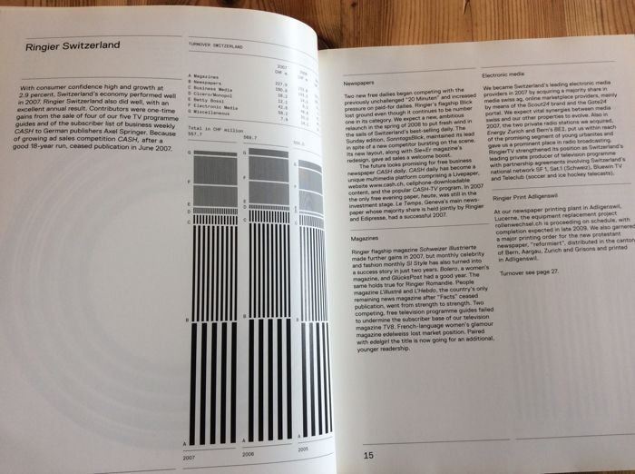
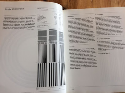
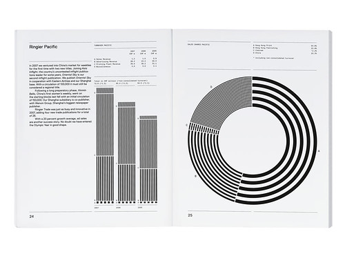
Norm comprises its founders, Manuel Krebs and Dimitri Bruni, both born in 1970, plus Ludovic Varon, who has worked with them for several years. Their work includes book designs for galleries, artists and some of Europe’s most discerning publishers, including Steidl, JRP Ringier, Die Gestalten Verlag and Tate Modern. They also regularly collaborate with the multimedia installation artists Peter Fischli and David Weiss (famed for their filmed experiment The Way Things Go), see p. on exhibitions and books. One such collaboration was the 2007 annual report for the Swiss media conglomerate Ringier AG, which every year invites artists to design its most important public document. In this no-nonsense monochromatic presentation, horizontal rules delineate the pages, with information graphics demarcated as graduated bands of black and white stripes, sitting perfectly within the grid, gently oscillating like an Op Art experiment. Norm reconfigured some of this material for Fischli and Weiss’s book, Sonne, Mond und Sterne (JRP Ringier, 2008), a hefty – 800 pages – flow of imagery, slogans and information. The designers are happy to rework elements, seeing it as an opportunity to perfect formats and rectify mistakes.
A cryptic Introduction
Krebs and Bruni met at the Schule für Gestaltung in Biel / Bienne, Switzerland, in 1991. ‘When we got to college, there was one computer. When we left in 1996, there were twenty . . . but we still designed by drawing one letter at a time, by hand,’ recalls Krebs (who speaks for the studio throughout this piece). ‘I remember a third-year student talking about Photoshop – “It’s too complicated, you’ll never be able to use it!” But we were really happy with technology. School was for research, we weren’t into commercial work.’
Aware that in ‘the real world’, designers such as Neville Brody and the Emigre circle were making ‘very basic’ typefaces, they started designing them too. ‘We’d make a new typeface for a flyer. You could do that then, you could make a pixel typeface in a day or two, constructing letters on a square; it was an okay solution, a thing of its time.’
They founded the studio on 1 January, 1999, after a brief and less than satisfactory period working separately in corporate identity and advertising (Bruni in Zurich and Krebs in Geneva), when they were always last in line, after the art director, creative director, head of the studio, and the client had had their say. In their words, their roles were reduced to ‘deciding whether to use Helvetica or Univers’.
Norm set up shop on Pfingstweidstrasse in Zurich, where their neighbours include Cornel Windlin and Stephan Müller, the founders of Lineto, which now distributes their typefaces and self-published books (lineto.com). Having ‘no commissions’, Krebs and Bruni produced their first self-initiated book in 2000. Part manifesto, part type specimen, Introduction – ‘this is us’ – showcased Normetica, their first commercially available typeface.
Introduction was ‘cryptic’, admits Krebs. ‘That wasn’t a strategy. We just did it, after talking about it for years [they had experimented with a magazine prototype when they were at college]. We can only self-publish if we develop the contents ourselves and are not in debt to any need to explain. The first book was cryptic because
we weren’t sure about it, and it’s easier to do something complicated than to be clear.’
Normetica (2000) displayed steadfast feet on the ‘i’ and a generous bucket to the ‘y’. Despite Norm’s claims to being ‘totally self-centred and self-focused’ when it comes to the designers’ own publishing projects, their typefaces are, by contrast, playfully pragmatic hinting at their useful nature by displaying a beguiling openness, thanks to the addition of ‘feet’, ‘hooks’ and ‘bowls’.
Fancy free
Norm’s second book, The Things (2002) – ‘this is our world’ – was a mash of graphs and diagrams, highlighted in process colours, with layers of information so thick and treacle-like they defy explanation, as Krebs admits. ‘We did the visuals first, then the writing and realised that didn’t work. By adding words, the visuals lost their impact.’ Like Introduction, they edited, published and produced it themselves, but this time approached Die Gestalten Verlag to handle the distribution (‘the investment of time is too big’).
The book may have been visually confused, but the accompanying typeface, Simple (2002), was not. It is monospaced, with similar family values to Normetica, and you could catch fish with the hook of the ‘r’, but its slimmed-down silhouette makes it more user-friendly than its predecessor. (Readers will note that Simple is the face used for the Eye Forum announcements.)
Peter Fischli & David Weiss. 'Sonne, Mond und Sterne'
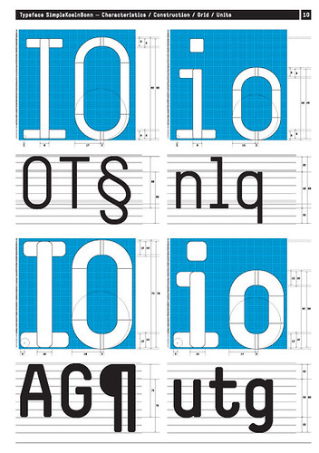
When Ruedi Baur of Integral produced his successful pitch to design the signage for Cologne-Bonn airport, Simple was the type he specified. The idea, Krebs says, was to have ‘a very particular’ typeface that would identify the airport’s official communications within a crowded visual landscape. The problem was that a monospaced typeface could not work for such a complex commission, so Norm had to redesign it as a proportional typeface. The result, SimpleKoelnBonn (2003), is an almost completely new face; all the letters have been reshaped, with the exception of the ‘o’. Though the generous ledges have been reined in, this ‘corporate’ version is still quirky enough to stand out.
Slower off the grid
Replica (2008) is a very different animal. While Simple took three months to design, this typeface has taken almost as many years. Krebs puts this down to technology, and the way the means used to develop a typeface has an inordinate effect on the result. As the software has evolved, the look and functionality of typefaces has also changed, not least because of the requirements of Open Type faces, running to tens of thousands of characters. ‘Replica is a thing of its time, so it’s more sophisticated.’
Like Simple, Replica was conceived in tandem with a book project on the theme of ‘two-dimensional space’. This time, Norm adopted a more conventional approach, writing the words first, so that its argument would be clear. But although the book is yet to be designed, the typeface has already been launched.
While ‘test driving’ Replica on live projects, Norm recognised that the early ‘more standard’ version had ‘no key reason for being unique’, so they set about finding one. ‘We wanted to make a “virgin” typeface – not a variation on a theme but a new Grotesk,’ says Krebs.
Technology was the key. While FontLab Studio – the preferred tool for today’s typeface designers – is an incredibly sophisticated program, Krebs and Bruni argue that its underlying grid structure is too prescriptive. Going against the received wisdom that the finer the grid, the more choice and flexibility the designer enjoys, ‘we decided to create an opposition to technology, by restricting the number of grid lines we draw with, using only every tenth line’. This offered the possibility of creating a typeface that was both universally functional and had enough eccentric characteristics to be recognised alongside similar Grotesks and in the wider chaos of our crowded typographic landscape.
Norm’s solution was two-fold: the same diagonal bevels were used for both inside and outside joints – ‘Print technology is so good these days you don’t have to worry about ink traps’ – and the designers made vertical cuts on all the diagonal lines so you can set it ‘really tight’.
And the name? Again, two distinct reasons: ‘From afar, the typeface looks familiar – a replica – but close up you can see it’s something new,’ says Krebs. ‘Also, the French word ‘réplique’ means a harsh answer, and this is a réplique to Helvetica, Univers and Unica.’
Cornel Windlin, who works closely with Norm to bring the studio’s typefaces to a wider audience, sees the advantage of creating ‘quirky’ typefaces, however deceptively simple. ‘Each of Norm’s typefaces is popular, which is unusual, as
quirky does not usually sell. But people seem to buy into the ideology of “Norm-ness”. The fonts may be limited in some respects, but we have reached an audience that appreciates those limitations as enriching.’
Replica may be more problematic, though, as its ‘quirks’ become obvious only when used at larger sizes. At text size, all Grotesks and sans serifs are prone to overcrowding and bad spacing, and need to be handled with care. But while no typeface designer can totally mitigate misuse, the two special features of Replica, the diagonal bevel and the vertically cut diagonal stroke, address the most glaring issues to afflict such typefaces: the variations in letter width that are obvious at smaller sizes, and the ungainly bites out of joints at larger sizes.
Nearly normal?
Making something unique but universal in a cultural climate that strives for novelty and declares that everything is possible, is a daunting prospect. By embracing technological invention without being dictated to, Norm’s designers have found their own method for dealing with those endless possibilities. ‘We narrow the fields of what is possible,’ says Krebs, unabashedly.
For Norm, it is all about standards, parameters and templates, setting them and pushing against them, to discover creativity and innovation within a set of limits, by way of repetition and constant refining.
Windlin has observed that method at work: ‘They are clearly working on creating their own Norm cosmos, which has its own sets of rules and preferences. Their fonts are an important part of their aesthetic, and they always have a clear reason to do things the way they do. They’re meticulous about their typefaces . . . to the point of obsessive compulsion.’

Wat geenszins kan worden genegeerd, is het auteurswerk dat Fischli & Weiss verricht hebben bij het samenstellen van dit boek. Van willekeur in de volgorde van de advertenties is er nergens sprake. Uit dezacht suizende white noise die het doorbladeren van magazines veroorzaakt, vormen zich hier al snel melodieën; die melodieën zijn de thema’s van Sonne, Mond und Sterne en het zijn de doelwitten van het leven in de 21ste eeuw. Nagenoeg overal staat de vrouw en haar lichaam centraal, maar wat zo’n vrouw kan teweegbrengen is opmerkelijk divers, hoewel het sinds Madame Bovary misschien niet eens is veranderd. Al op de vijfde advertentie prijkt een jonge bruid, en de huwelijkstaferelen blijven volgen. De start van Sonne, Mond und Sterne is dus de productie van een koppel. De rest van het boek maakt aannemelijk dat de verbinding tussen man en vrouw nog steeds de motor vormt van alles wat er in onze westerse wereld gebeurt – of althans: van alles wat geld zou kunnen opbrengen en waarvoor dus reclame moet worden gemaakt. Zwangerschap, babyproducten, speelgoed, tienerspelletjes, sport, snelheid, lichaamsverzorging, juwelen, kledij, accessoires en meubelstukken, reizen, vliegtuigen, auto’s, computerspelletjes, pistolen, jachtgerei, voedsel, delicatessen en drank. Fischli & Weiss hebben geen nieuwe productcategorieën bedacht en ze hebben die categorieën ook niet in een revolutionaire volgorde geplaatst. Ontsnappen aan de verhalen die onze verlangens vertellen – of die ons worden ingefluisterd door de verlangens van de commercie – lijkt niet mogelijk. Want wie kan met volle overtuiging zeggen dat hij of zij niet graag een koppel zou vormen of geen baby wil of niet houdt van een mooi lichaam of geen lange tweeloop wil hanteren of niet graag lekker eet? Wie bezit werkelijk de luxe om die objectieven te negeren? En is het erg om in de eerste plaats gelukkig te zijn omdat men in de eerste plaats een succesvolle consument is?
De thematische categorieën van Sonne, Mond und Sterne werken dus nagenoeg documentair. Een kritische narrativiteit lijkt onmogelijk, tenminste als advertenties en wat ze aanprijzen de bouwstoffen vormen. De stijl die Fischli & Weiss hanteren, zeg maar op het niveau van de pagina, als romanciers op het niveau van de zin, werkt echter wel degelijk ironiserend of bekritiserend. Dat blijkt bijvoorbeeld als twee advertenties, links en rechts in het boek, een enigszins pervers huwelijk met elkaar aangaan door vormelijk of inhoudelijk naar elkaar te verwijzen. Een advertentie voor het nieuwe album van Britney Spears… voorafgegaan door een knalgele papegaai. Een biefstuk met dauphin gratinois… gevolgd door een bikinibabe bij het zwembad. Een flatscreentelevisie… met ernaast een vlakke, flinterdunne open haard. Een man in maatpak kijkt vooruit naar de volgende pagina… waarop een vrouw in zwart negligé op een loopband net niet in slaap valt. De donkere huid van een vrouwelijke mannequin… weerspiegeld in het ebbenhout van een keukenensemble. Enzovoort. Als het dan zo is dat we in het waterdichte kapitalisme allemaal hetzelfde leven moeten leven, dan is het toch mogelijk om op gerichte wijze niet helemaal geleefd te worden – dankzij details, kleine subversies en bewuste ironie.
Toch is er in Sonne, Mond und Sterne meer aan de hand dan de zoveelste vorm van bescheiden verzet – of van de apologie van het kapitalisme door het kritiserend of ironiserend tonen van de deugden en ondeugden ervan. Er is vooreerst die mysterieuze titel – de zon, de maan en de sterren. Dat verwijst natuurlijk naar het belang van kunstmanen of satellieten in het inrichten van een mensenleven, waarbij navigeren een centrale activiteit is. Er is echter meer: Sonne, Mond und Sterne is een gekende frase die opduikt in vele Duitstalige kinderliedjes die worden gezongen op de feestdag van Sint-Maarten. Op Martinstag wordt de heilige herdacht die zijn mantel aan de armen gaf. Kinderen lopen in processie met lantaarntjes en snoepgoed rond, terwijl ze zingen van “Laterne, Laterne/Sonne, Mond und Sterne/ brenne auf mein Licht/brenne auf mein Licht/aber nur meine liebe Laterne nicht”. Hun ouders geven “einige Krümel vom reichgedeckten Tisch” aan de armen en de arbeiders. Zo was het althans vroeger. Sinds een dertigtal jaar is Martinstag het officiële begin van het eindejaarsshoppen. Vele kruimels vallen daarbij niet meer van tafel. De parade van kunstmatige lichtjes die de duisternis van de wereld verhinderen, blijft eeuwig aan de gang.
Tot slot is er de verschijningsvorm van dit wonderlijke kunstenaarsboek. Sonne, Mond und Sterne is in twee vormen beschikbaar – en dat is essentieel voor een werk waarin alles als een boek naar twee kanten openvalt. Als kunstenaarspublicatie is het uitgegeven bij de kleine uitgeverij JRP Ringier, die het omvangrijke werk distribueert aan 50 euro. Het volle pakket, 800 bladzijden, zit echter ook in het gratis te verkrijgen jaarverslag 2007 van het Zwitserse mediaconcern Ringier (dat JRP Ringier overvleugelt). Dit familiebedrijf probeert al jaren een monopolie te verwerven op alle tijdschriften en kranten in de Duitstalige wereld. Voorheen werden de financiële verslagen van Ringier uitgegeven met bijgevoegde kunst van bijvoorbeeld Richard Prince, Matt Mullican of Liam Gillick. Fischli & Weiss schuiven zichzelf met Sonne, Mond und Sterne als een paard van Troje, beladen met splinterbommen, naar binnen in de bedrijfslogica van Ringier – of van de commerciële pers in het algemeen. Zoals ze dat eerder deden met hun gesimuleerde readymades in het museum, zoals ze vorig jaar met Flowers & Questions een revolutionair concept van de oeuvrecatalogus presenteerden, zo zetten ze met dit werk de logica van het artistieke kijkboek op scherp. Zo apocalyptisch én feestelijk tegelijk als in Sonne, Mond und Sterne is het gelukkige leven in het westen nog niet eerder voorgesteld.
• Peter Fischli & David Weiss, Sonne, Mond und Sterne, Zürich, JRP|Ringier Kunstverlag, 2008, (www.jrp-ringier.com). ISBN 9783905829419.