Monografieën over Filmkunst, designed by Piet Zwart
Posted by Julie L. Mellby on September 4, 2009
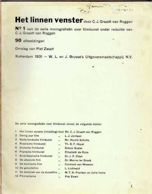
Monografieën over Filmkunst (Monographs on Art Films), edited by C.J. Graadt van Roggen (Rotterdam: W. & J. Brusse’s Uitgeversmaatschappij, 1931-1933). 10 vols. All in the original wrappers, designed by Piet Zwart (1885-1977). Graphic Arts (GAX) in process
This set of monographs on early twentieth-century film is as important for the graphic design of the covers, as it is for the discourses on cinema inside. The individual volumes are:
1) C.J. Graadt van Roggen, Het Linnen Venster (The Linen Window), 1931.
2) J.L.J. Jordaan, Dertig Jaar Film (Thirty Years Film), 1932.
3) Henrik Scholte, Nederlandsche Filmkunst (Dutch Cinema), 1933.
4) Th.B.F. Hoyer, Russische Filmkunst (Russian Cinema), 1932.
5) Simon Koster, Duitse Filmkunst (Coastal German Cinema), 1931.
6) Elisabeth de Roose, Fransche Filmkunst (French Cinema), 1931.
7) J.F. Otten, Amerikaansche Filmkunst (American Cinema), 1931.
8) Menno ter Braak, De Absolute Film (The Absolute Film), 1931.
9) Constant van Wessem, De Komische Film (The Comedy Film), 1931.
10) Lou Lichtveld, De Geluidsfilm (The Sound Film), 1933.
Each volume has a unique design created by the Dutch artist Piet Zwart, who had multiple careers as an interior designer, industrial design, commercial typographer, photographer, critic and lecturer. At the close of the twentieth century, Zwart was named ‘Designer of the Century’ by the Association of Dutch Designers.
He preferred the title of form technician to graphic designer. His innovative typography and jacket covers steal from De Stijl in his limited palette and geometric layout, without being weighed down by its rules. He flirted with Russian Constructivism and was one of the first designers to consider issues of ergonomics into his industrial projects. Structure, balance, and repetition are constants in his work, which often incorporated photographic images he shot himself. When this film series was complete, Zwart abandoned typographic projects to concentrate on industrial and furniture design.
For more information on Zwart, see: Arthur Allen Cohen, Piet Zwart, Typotekt (New York: Exlibris, [1980]). Marquand Library (SAPH): N6953.Z85 C654 1980
For informaton on Princeton University’s Film & Video Program, see: http://www.princeton.edu/arts/artsatprinceton/film/abouttheprogram/
SERIE MONOGRAFIEEN OVER FILMKUNST
A Complete Set in 10 Volumes
Piet Zwart [Designer]
C. J. Graadt Van Roggen et al. [Authors]
Piet Zwart [Designer] and C. J. Graadt Van Roggen et al. [Authors]: SERIE MONOGRAFIEEN OVER FILMKUNST. Rotterdam: W. L. en J. Brusse's Uitgeversmaatschappij N. V. , 1931 - 1933 [10 Volumes, all published]. Quartos. Text in Dutch. A complete set of the Dutch Film Art Journal uniformly bound in red cloth [6.81 x 8.56] with the Piet Zwart wrappers retained and tipped onto each cover. Each of the fragile Zwart dust wrappers have been carefully trimmed about one-eighth of an inch on each side. Zwart experimented with a fragile heat-activated tissue laminant on these covers to give a glossed varnish to the type and photos in his compositions. This laminant has stiffened over the years and has rendered this whole series virtually impossible to find in collectible condition. Offered here is a uniformly fine set, with trivial rubbing to a few covers, with Volume 7 lightly chipped and worn. Previous owners notations to title pages of two volumes, otherwise interiors unmarked and very clean. A full set of these Journals in exceptional condition; rare thus.Each edition features cover design, title page typography and interior layouts by Piet Zwart -- these covers of have been reprinted countless times in 20th century graphic design anthologies and stands as true high points of Avant-Garde graphic design.
C. J. Graadt Van Roggen and Piet Zwart: HET LINNEN VENSTER [Serie monografieen over Filmkunst, Volume 1]. Rotterdam: W. L. en J. Brusse's Uitgeversmaatschappij N. V., 1931. First edition. Quarto. Text in Dutch. 72 pp. 90 black and white illustrations of early film actors and directors, including Carl Dreyer and Sergei Eisenstein.
L. J. Jordaan and Piet Zwart: DERTIG JAAR FILM [Serie monografieen over Filmkunst, Volume 2]. Rotterdam: W. L. en J. Brusse's Uitgeversmaatschappij N. V., 1932. Original edition. Quarto. Text in Dutch. 80 pp. 84 black and white illustrations of early film actors and directors, including Lilian Gish and imagery credited to Germaine Krull.
Henrik Scholte and Piet Zwart: NEDERLANDSCHE FILMKUNST [Serie monografieen over Filmkunst, Volume 3]. Rotterdam: W. L. en J. Brusse's Uitgeversmaatschappij N. V., 1933. Original edition. Quarto. Text in Dutch. 64 pp. 98 black and white illustrations of early Dutch film actors and directors.
Th. B. F. Hoyer and Piet Zwart: RUSSISCHE FILMKUNST[Serie monografieen over Filmkunst, Volume 4]. Rotterdam: W. L. en J. Brusse's Uitgeversmaatschappij N. V., 1932. Original edition. Quarto. Text in Dutch. 84 pp. 90 black and white illustrations of early Russian film actors and directors, including Sergei Eisenstein.
Simon Koster and Piet Zwart: DUITSCHE FILMKUNST [Serie monografieen over Filmkunst, Volume 5]. Rotterdam: W. L. en J. Brusse's Uitgeversmaatschappij N. V., 1931. First edition. Quarto. Text in Dutch. 74 pp. 110 black and white illustrations of early German film actors and directors, including Fritz Lang, F. W. Murnau and Hans Richter.
Dr. Elisabeth de Roos and Piet Zwart: FRANSCHE FILMKUNST[Serie monografieen over Filmkunst, Volume 6]. Rotterdam: W. L. en J. Brusse's Uitgeversmaatschappij N. V., 1931. First edition. Quarto. Text in Dutch. 59 pp. 32 black and white illustrations of early French film actors and directors.
J. F. Otten and Piet Zwart: AMERIKAANSCHE FILMKUNST[Serie monografieen over Filmkunst, Volume 7]. Rotterdam: W. L. en J. Brusse's Uitgeversmaatschappij N. V., 1931. First edition. Quarto. Text in Dutch. 70 pp. 32 black and white illustrations of early American film actors and directors, including one shot of Josef von Sternberg engaging in his notorious foot fetishism.
Dr. Menno Ter Braak and Piet Zwart: DE ABSOLUTE FILM[Serie monografieen over Filmkunst, Volume 8]. Rotterdam: W. L. en J. Brusse's Uitgeversmaatschappij N. V., 1931. First edition. Quarto. Text in Dutch. 50 pp. 100 black and white illustrations of early film actors and directors, including work by Carl Dreyer, Man Ray, Moholy-Nagy, Fernand Leger, Ruttman, Fritz Lang, Hans Richter and others.
Constant van Wessem and Piet Zwart: DE KOMISCHE FILM[Serie monografieen over Filmkunst, Volume 9]. Rotterdam: W. L. en J. Brusse's Uitgeversmaatschappij N. V., 1931. First edition. Quarto. Text in Dutch. 56 pp. 40 black and white illustrations of early comedic actors and directors, including Larel and Hardy and Charles Chaplin and even Mickey Mouse.
Lou Lichtveld and Piet Zwart: DE GELUIDSFILM [Serie monografieen over Filmkunst, Volume 10]. Rotterdam: W. L. en J. Brusse's Uitgeversmaatschappij N. V., 1933. Original edition. Quarto. Text in Dutch. 79 pp. 53 black and white illustrations of the early technology of sound in motion pictures.
Zwart's use of photomontage and typography for this 1930s series of 10 books on modern cinema show the Dutch "typotekt" at the height of his powers. With nearly a decade of typographic experimentation under his belt, Zwart flexed his considerable muscles on the covers of the FILMKUNST series, being a stunning vitality to each volume. A highly recommended artifact from the heroic age of graphic design.
Piet Zwart (1885-1972) worked in many spheres, including graphic design, architecture, furniture and industrial design, painting, writing, photography, and design education. His association with the Avant-Garde and his acquaintance with artists such as Kurt Schwitters, Theo Van Doesburg, Vilmos Huszar, and El Lissitsky all helped to crystallize his own convictions and aesthetic visions.
In 1923 Zwart began an extraordinary client-designer relationship with the Nederlandsche Kabel Fabrick (Dutch Cable Factory). For the next ten years, he produced no less than 275 advertisements for the NKF. These typographic advertisements constitute Zwart's major contribution to Dutch typography and form. The NKF assignment can be divided into four segments: the magazine advertisements (1923-1933); Het Normalieenboekje (Normalization Booklet) (1924-25); the 64-page catalog published in Dutch and English (1928-29); and the information booklet Delft Kabels (1933). Het Normalieenbockje, one of Zwart's least known works, represents a turning point in his typography. One major difference is the use of an additional contrast, color, which was absent in the advertisements. However, color was included not as a decorative element, but more as a graphic cue.
Like most others during this period, Zwart was self-taught in typography, and although he had been designing printed pieces since the end of 1921, acquiring the Nederlandsche Kable Fabriek as his main client made him realize just how little he actually knew about printing technology:
"The first design that I made for the NKF was hand drawn. I was still not finished with it when the publication had already come out. At that time I realized that this was not a very good way to work and then plunged headfirst into typography. The nice thing about all of this was that I actually learned about it from an assistant in the small printing company where the monthly magazine in electro-technology was being produced.
". . . After going through the bitter experience of that piece being too late, I made more sketches and then played typographic games with the assistant in the afternoon hours, how we could make this and that . . .
"Actually, that's how I came to understand the typographic profession, I didn't know the terms, I didn't know the methods, I didn't even know the difference between capitals and lower case letters."
Zwart referred to himself as typotekt, a combination of the words typographer and architect. To a large extent this term did indeed express Zwart's conception of his profession — the architect building with stone, wood, and metal; the graphic designer building with typographic material and other visual elements. Le Corbusier defined a house as a machine for living, and in the same sense Zwart's typography could be called a "machine for reading."
Kamergymnastiek voor iedereen. In 10 lessen. W.P. Hubert van Blijenburgh. Rotterdam, W.L. & J. Brusse's Uitgeversmaatschappij, [1930]. Binding design by Piet Zwart. Brusse A 681
Piet Zwart
The extensive series of advertisements made between 1923 and 1933 for the Nederlandse Kabelfabriek in Delft was the major source of Piet Zwart's (1885-1977) fame as a typographical designer. In these advertisements he experimented above all with a wide range of mostly sans serif types, ingredients from the case of display types, and lines in all shapes and sizes, but from the end of the 1920s he added an important new dimension to his work by the use of photomontage. The best-known examples of this composite work are Delft Kabels, a brochure from 1931 and of course Het boek van PTT from 1938. In addition Zwart made a number of eye-catching covers for the Brusse publishing house in Rotterdam, in which photomontage featured largely and prominently. A striking example is the design voor Kamergymnastiek voor iedereen, by the ardent promoter of gymnastics, Hubert van Blijenburgh, who published five other works on the subject with the same publishers.
The design strikes us as very consistent because the lettering runs parallel to the fundamental elements of the photograph, while a dynamic vitality befitting the subject is achieved, which is intensified by the sharp diagonal between the orange, illustrated instruction sheet and the window frame. However, Zwart's work for this book was restricted to the binding design; the lay-out of the text block could hardly be called revolutionary - the preface starts with an orange ‘D’ from the Hollandsche Mediaeval series of initials by De Roos.
Bringing in a designer like Zwart is characteristic of the care taken of their publications by the Brusses. Earlier (cf. no. 85) they had already given an innovating designer like De Roos all the scope he needed, now they did the same to the pioneers of Realism Revisited. Examples resulting from such a broad-minded, progressive attitude are Zwart's binding designs for the famous series ‘Monografieën over Filmkunst’, and interesting typographical experiments like Paul Schuitema's design for Stad by B. Stroman (1932).
Literature
K. Broos. Piet Zwart 1885-1977. Amsterdam 1982
W.L. & J. Brusse's Uitgeversmaatschappij 1903-1965. Rotterdam 1993.
|
Andere auteurs: Menno ter Braak
Rotterdam : W.L. en J. Brusse; 50 p;
|
Fransche filmkunst, No. 6 van die serie monografieën over filmkunst onder
door Piet Zwart (Designer), Elisabeth; van Roggen de Roos, C. J. Graadt (ed.


Geen opmerkingen:
Een reactie posten