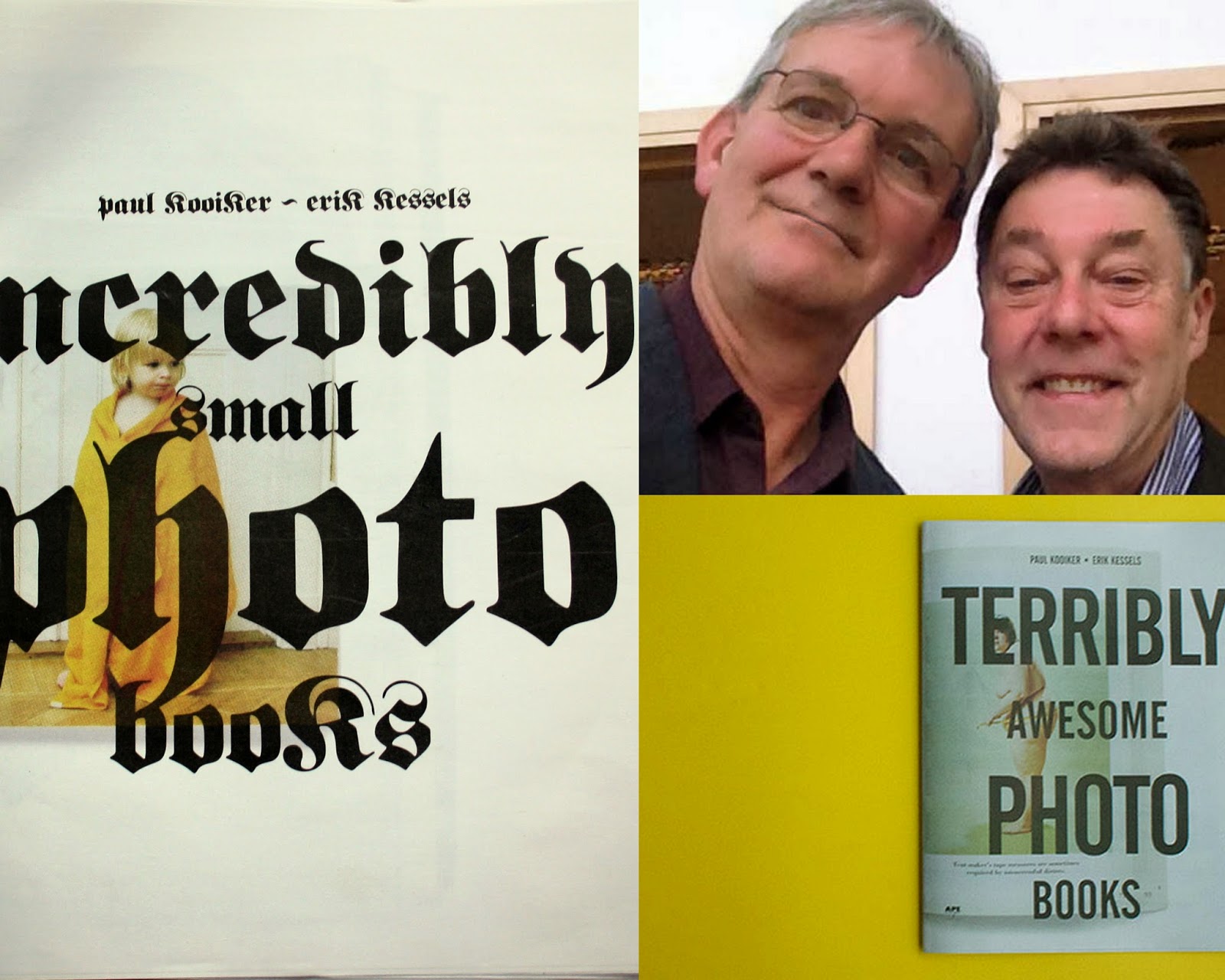
PHOTOBOOKS CHALLENGING THE EDGES OF THE MEDIUM. A conversation with Paul Kooiker about two newsprint editions on photobooks, in cooperation with Erik Kessels and published by APE: Terribly Awesome Photobooks and Incredibly Small Photobooks
Mirelle Thijsen (MT):
Why did you choose to publish both selections of 40, quaint photobooks in this way: as a newsprint and with Art Paper Editions (APE), a publisher based in Ghent? I read that they understand a book to be “an exhibition space”.
APE is a young publisher which is run by Jurgen Maelfeyt. He is also a graphic designer. It seems like an ideal combination for multiple emerging publishing houses: “publisher /designer”. External costs for a designer thereby cease. Production wise, the joined in-house expertise works very quickly and efficiently. FW:, Roma Publications,Van Zoetendaal – the latter has published all my books – and other publishing houses are becoming very successful because of the merging of disciplines to enhance innovation.
Maelfeyt loves my books and wanted to collaborate with me. He gave me carte blanche and offered to make a newspaper of 62 pages. He was eager to test what it is like to produce a newsprint publication, and test a newspaper press, on this tabloid format. Then I agreed.
At that time my new book Heaven was just released. Since composing the book had been a long and intensive process, I felt ‘empty’, too empty to start new work and a new book project. To quickly produce a book is not in my nature. On average, I make one book a year. I almost always don’t succeed in that, but it is my resolution. If something comes in between, it falls through. It’s is a luxury problem, of course…At the same time it was an attractive offer: “Do what you want”, on newsprint and in that format.
MT:
So the format was already decided?
PK:
Yes, Maelfeyt wanted to make a series of newsprint publications: tabloid newspapers. Obviously, the idea involved collaborating withErik Kessels, co-founder of creative communication agencyKesselsKramer, curator and collector. Because I have been collaborating with Erik since 2001 when Foam opened. In fact, the first exhibition hosted by Foam was curated by Erik and is titled Dutch Delight. In this realm, he came to my studio where I first met him. Then he looked at my bookcase and recognised all kinds of books he had been collecting himself. We became excited, exchanging opinions about the books we both owned. Afterwards, we met again and came up with the idea: Why not start a book club? A number of people coming together and showing books to each other. Such a thing was non-existent at that time. We have put it into action.
MT:
Yes. For years, Erik Kessels and you organized evening events where you shared striking and unusual photobooks with friends and colleagues. How did it work?
PK:
Those evenings were organized at Erik’s office or at my studio. We were the instigators. Just a phone call to each other: “When shall we do it?” We have invited people around the topic, book collectors and artists interested in these matters.
MT:
Who was involved?
PK:
Johannes Schwartz took part occasionally, Frido Troost – unfortunately deceased – Luuk Wilmering, Andre Thijssen and Hans Aarsman were present. We organized such events maybe once every six months.
MT:
What does it look like, such a meeting?
PK:
We all came in with a stack of books. We suggested: bring about 10 books. Then Erik would walk in with 40 books … Attributing to that flow of overenthusiasm that suits him, HAHA…We simply took turns by putting a book on the table and the owner would share his or her enthusiasm. Occasionally someone would make a note. Sometimes we discussed the book further.
MT:
Did you make any new discoveries in this manner?
PK:
I know many books. Since enrolling in the Royal Art Academy in The Hague, when I was about 17, 18 years old, I frequently visited antiquarian bookshops wanting to buy cheap books. New photobooks I could not afford. I went to Van Gennep on the Nieuwezijds Voorburgwal or was looking for curiosities at antiquarian booksellers. So I got started collecting in a very natural way. I know pretty much what books have been issued, I have seen so much…
So I was not always surprised by what was shown on the table. What has been published in the Netherlands, and also in your area [Dutch company photobooks], I do have an idea of what has been published. Still…Yes, real surprises were taking place…
MT:
Could you name some?

PK:
Rolf Dieter Brinkmann. He’s actually a writer, but also makes picture books. This is from the 1970s: Rom, Blicke (1979). It’s a combination of sets of images, but also a kind of diary …I have purchased more of his books. Brinkman is someone who shows great artistic freedom in using the medium of photography; his work is genuine. And as an artist he is entirely unknown, outside of Germany. For example, this poetry book by him, look how it starts…
MT:
Feldmann-like… What I mean is, insignificant black and white photographs seamlessly blended together.
PK:
Yes. There is another even more beautiful example of his work… Brinkmann, in fact, died early at the age of 35. This is unfinished work that was published posthumously in 1988.
MT:
Is this publication an exhibition catalogue or an artist’s book? It contains collages.

PK:
Acid. Neue Amerikanische Scene (1969) is a German-style publication. In Germany Brinkmann is a classic; he has a cult status. He deals with beatnik-like issues and what comes next: the drug scene. This book is considered to be a leading description of the American underground in German.
MT:
You seek to define a photobook NOT according definition; the lead is not reserved for photography.
PK:
No, indeed. Brinkmann is challenging dominant discursive constructions of photography. That is exciting…
MT:
What makes it exciting?

PK:
Because Brinkmann is not a professional photographer, he allows himself great artistic freedom. This attitude is very inspiring for photographers/artists who know much about the medium of photography and thus have a conditioned way of looking at photography. He also is aware of the limits of the medium. He just walks all over it. As an artist you should not take your own work too seriously … being somewhat reserved about your oeuvre creates greater freedom. Look at Boris Michailov: one time his work is faint, too flat, sometimes stupid, and every now and then it is pure genius. It’s fantastic if you dare. Every so often his work is too raunchy, sexist, but exciting at the same time.
MT:
The boundary between genius and madness is paper-thin…
PK:
Yes … Anything can go wrong! Both Michailov and Brinkmann are aware of the fact that they take that risk.
MT:
Okay, Let’s consider this as background: the origin of and breeding ground for these newspapers …So in 2012, the idea was conceived to make a newspaper based on the photobook evenings?
PK:
The whole process went very fast … Which is related to both the quality of the publisher and our way of working, Erik and me. Two weeks before the first newspaper was actually printed the subjectTerribly Awesome Photobooks came up. I called Erik and asked, what do you think about it? He said: let’s do it! We got together, gathered the books. Then I photographed them assisted by a student at theRietveld Academy. The next day the digital files were sent to Erik. He provides a layout which went straight to the publisher in Ghent. Maelfeyt prepared a DTP file and sent it to a newspaper printing press in England. Within a few days it was set. No ‘board meeting’ was held. We got together, choices were made within an hour: Yes…No…Yes.
MT:
Let’s take a look at the selection procedure …Books are chosen from both yours and Erik’s private collection?
PK:
Yes, it’s 50%-50%. We worked things out quickly, following our selection criteria.
MT:
Which criteria were used?
PK:
We selected seminal photobooks that harbour a certain degree of naughtiness…A kind of bad taste. We collect books that allude obliquely to the medium of photography, or to the photobook itself. And overall we continue to regard this newspaper project as a counter reaction to the photobooks lunacy created by Martin Parr and his way of dealing with photobooks.
We feel that there should be room for a significant trend reversal. It’s all so exemplary; of course the books of Robert Frank are great…We all are familiar with the classics, though. Everyone dives into the annual ‘best photobooks’ selections and purchases the mainstream classics. But there are still so many gems on the market for only one euro each! This newspaper expresses that too: it looks cheap. Actually, we determined what books we like very much and created these categories.
A classic author-photography book by Richard Avedon is nice, but I do not like to purchase it myself …I am happy buying a book for a few euros while I am convinced that hardly anyone knows it. I like to discover it myself and show it to others. During the photobooks sessions we share these finds: photobooks exploring the edges of the medium. And that’s where we connect. It’s an organic process.
MT:
You just mentioned making ‘categories’. How did you arrange categories in the newspaper? And are both newspapers compiled next to or after each other?
PK:
The two newspapers were made one after the other. As regards the categories: on the front cover of Terrible Awesome Photobooks you get the idea: depicted is a large naked woman who goes on a diet, and it concerns a cookbook: Bridget’s Diet Cookbook. It contains nude pictures. In all respects it is hilarious and disturbing. Very bad and very ugly but it’s also fantastic at the same time. The book was made in the 1970s and it’s incredible. Now you wonder how it ever could have been made. But I also see my own photographs reflected in this publication. Like on this page, these could have been my pictures….
And that’s the way I buy such a book. Hey…it resembles my work. As if you’re starting to collect your own work around you. Instead of the other way around; I’m not looking for inspiration, but what adds to my work. Photobooks evoking resonance around my work.
MT:
Like an oil slick?
PK:
Yes!

MT:
Where did you find Bridget’s Diet Cookbook?
PK:
Someone had put the book in the mailbox. The person knows what I consider interesting. In fact it turns out to be a series of books, on tennis, skiing, etc.
MT:
Let’s explore further the pile of selected books…

In this, her fifth book of photo graphs, world- renowned actress/ photographer Gina Lollobrigida has created a brilliantly colorful, surrealistic journey into a fantasy world of children and animals. The result of many years of travel to all corners of the world, The Wonder of Innocence offers a dreamlike, child's-eye view of life. Full of spontaneity, whimsy, and her great imagination, Gina Lollobrigida's photographs are the result of a new and personal technique she developed, one involving the painstaking joining of a multitude of images. The photographs are coupled with quotations from poets, philosophers, politicians, and artists as diverse as Shakespeare, Abraham Lincoln, John Keats, Charles de Gaulle, Oscar Wilde, Confucius, Mark Twain, and Albert Einstein, as well as by proverbs and snippets of local folklore. A foreword by Mother Teresa of Calcutta, an introduction by Lollobrigida, and essays by Carlo Rubbia, Ernesto Caffo, and Fulco Pratesi further illuminate the themes explored in the photographs.
This enchanting, original volume reflects Lollobrigida's love of children everywhere and her respect for animals, and offers the underlying hope that someday, children and adults and all creatures can live together in harmony, in a world free from destruction, war, and ecological disaster. Captured in her photographs is her belief that if we do not appreciate the nature that surrounds us, we lose the ability to dream. Gina Lollobrigida is not only an actress but also an accomplished painter, sculptor, and photographer. The Wonder of Innocence represents a departure from her previous books, which are more journalistic and dramatic. Lollobrigida is a photographer interested primarily in the human experience, searching for truth and the beauty around us. She tries to capture real emotions and does so with gentle humor, by, as she says, "creating with my camera the most beautiful images of my childhood dreams."
PK:
About 30% is about wrong eroticism. Other material relates to medical issues. Those are areas of interest of mine. The nude, how that is represented in books, but also propaganda I consider very interesting, and there are always other curiosities. For example the book The Wonder of Innocence (1994) by Gina Lollobrigida has been available at former bookseller De Slegte for 5 Dutch Guilders. And it’s so badly done, that makes it genius … And that was even before the photoshop era.
MT:
The Wonder of Innocence is from your collection? And what makes it so artificial or mannered?
PK:
Yes. The absolute innocence of it, but it overshoots itself… It’s so freaking kitch.
MT:
Who made this book?
PK:
She did! Gina Lollobrigida is a photographer, that’s the funny part! These are her pictures. At the same time, it’s over the top. In short, if Peter Fischli & David Weiss would have made it, I would have bought it too!

PK:
In my collection such a publication gains added value. Within the categories I collect, a book establishes a position; it’s representing something. And The Wonder of Innocence is matching a catalog of Fischli & Weiss, published by Musee d’Art Moderne de la Ville de Paris in1999. It is about: “Instants recreated in fantastic images and sayings from around the world”. This publication is about playing with that innocence. This is showing the skilfulness of the artists.
MT:
Yes, an interesting juxtaposition… And once again you use the metaphor of the “oil spill”.
PK:
Yeah, this makes it interesting for me. Look, also the design is similar: a loose-leaf edition, ‘posters’ in fact, reproduced on a high-quality paper type. I teach at the Rietveld Academy and discuss with students the graphic design of potential book projects and explain that this type of binding is an easy solution: posters are printed and folded, and it enables new sequences, new narratives to occur.
MT:
A new storyline based on one and the same content?
PK:
Yes, that aspect. The origin of this technique is very visible in the catalogue by Fischli & Weiss. And wonderful is the fact that the individual sheets are not clean cut. Further, there is no page numbering; you can determine the order. At the same time, it is an impossible book. No one will take a look at it…The catalogue just falls apart. It is an artist’s book that is inaccessible. I’m a big fan of Fischli & Weiss.

MT:
Interesting that you show this catalogue, in relation to the book by Gina Lollobrigida and the two newspapers. Let’s discuss the newspapers in further detail. Incredibly Small Photobooks contains a selection of approximately 40 booklets, in which photography does not always have the lead role, as for example in the exhibition cataloguegekleurde etsen en de rest (Colored Etchings and the Rest, 1972) by Piet Holstein. It contains illustrative work, small drawings mainly.


Also the second newspaper shows from each book a spread on a loose-leaf sheet of newsprint. This results into a new storyline when turning the page. The number of varieties is large: from classic flip books – sometimes that’s a comic strip flip – to illustrated children books, such as: Little Aaron me and my friends and In bad, eten, naar bed. From a product catalogue on Victorian glassware to a bulky artist’s bookletID400 containing self-portraits by Tomoko Sawada. An art magazine, a periodical: Kunstheft nr. 16 has been selected as well. The result is a wide range of publications. Who did what?
PK:
That was the easiest phase. The publisher asked: do you want to make yet another newspaper? Initially the idea of the publisher was Terrible Awesome Photobooks part II. We have made the restriction to select only small booklets. And within that limitation, we started looking for the same type of books in our respective collections. Both Erik and I consider this type of ‘vernacular’ book interesting; we have that in common. He, being an advertising executive, approaches the genre from a whole different angle from me, being an artist. We share our enthusiasm in this way with an audience.
MT:
And what was Erik’s contribution to this edition?
PK:
I felt that we should make a part II. Erik came up with the idea to devote the next newspaper to small booklets. He arrived at my studio with a stack of booklets, I put my pile on the table. Then we started to select …We are very hard on each other. There is no room for discussion. Yes or No. … Or: “that one everyone knows already”, and “that’s no good” …We accept that kind of comment from each other. Further, those are efforts to speed up the procedure. We make selections during a one-hour meeting. We drink a cup of coffee.
For this release we worked to a tight deadline in relation to the launch of the newspaper at the New York Art Book Fair. A week prior to the book fair everything was determined. A production-ready design was sent to the printer in England and from there the newsprint edition to New York. Hot off the press the newspaper was displayed on the table in the booth of APE. It happened all very fast! For us, the editors, this way of working does not affect our daily work load, it’s the mere pleasure of creating a publication.
MT:
Apart from the format, to what extent was the selection different from the first newspaper Terribly Awesome Photobooks?
PK:
The title alone tells you this is what to expect: Incredibly Small Photobooks. Furthermore, the choice is based on our private collections; not hinging on iconic, classic photobooks.

MT:
Would you please give a short explanation about the selection of Chinese booklets in Incredibly Small Photobooks? Chinese War Story(1984) is one, and another book, described with little bibliographic data, is: “Chinese book”. The most recent publication, I put it for the sake of convenience in this category, is Silvermine (2013) by Thomas Sauvin.
PK:
I went to China. I worked in China for three months in 2006. I was looking for certain book titles, and after a long search I found a few remarkable booklets. Now they come to the surface.

MT:
Like Chinese War Story?…. I consider that an impossible letter font! The font of this newspaper reminds me of the National-SocialistFraktur typeface. I can’t read the titles! This happens to be the letter font of Who Farted?

PK:
Probably yes! The great thing about this partnership is: we trust each other’s preferences. As soon as Erik proposes a letter font, I agree. We don’t need to discuss it. Somehow it is appealing that the titles are hard to read.
Furthermore, we are not aiming for a complete picture, in terms of offering guided instructions: these books you should buy and here is the extended bibliographical data. It’s much more the surprise, the fun of such a discovery. People acquainted with the world of books know where to find these publications. We show on a center-fold in the newspaper the front covers of the entire selection. And by the way, not all books are represented with a double spread in the newspaper.
MT:
As I mentioned earlier, a book selected and is just briefly described as “Chinese book”.

PK:
That’s right, we could not figure it out. That copy is part of a remarkable series of booklets on film. Movies for the people; this is a cinema movie on paper. I think such a booklet is even less expensive than a movie ticket. It’s a nice given!
MT:
Yes, maybe it is meant that way… Stills from a Chinese “Bollywood” movie. Somewhat similar to Who Farted? That is also a collection of movie stills, but then selected around a peculiar theme. The title puts you on the right road…
PK:
I have purchased some of those Chinese film booklets. They’re very cheap, maybe 30 cents per booklet. And all appear to be the same size.
MT:
And in this category I equally consider the booklet: Silvermine of Sauvin, containing original Chinese pictures.
PK:
Yes, Silvermine was just released. It is an exception, and now a strikingly popular photobook. Actually, it concerns an album of found photographs. It has a small circulation, but we liked it and considered it a good fit into the selection. It is a box with four booklets. Later it has been nominated for Deutsche Börse Photography Prize. In 10 years nobody will remember them. That’s the beauty of this kind of booklets; they are simply released, one time only….
MT:
In a way they seem invisible.
PK:
Yes …Although that applies less to Silvermine; a large publisher is behind this publication: the Archive of Modern Conflict (AMC) in London. But I also refer to, for example, booklets published by Walter König, [Steve McQueen] which have fallen into oblivion. And we are not so strict in making final selections in the newspapers; we just follow our guts.
MT:
That’s what makes this project so attractive….
PK:
We have nothing to lose. It is not meant to be a reference work. We love these books!
MT:
Your selection covers the full spectrum: from commodity to instruction book, from propaganda to artist’s book. Included are also a popular embroidery book, some flip books and a product catalogue. I appreciate the playful approach.

PK:
Like Little Aaron me and my friends. Are you familiar with that children’s story book? He appropriates 1970s family photography. The booklet was published in 2010. It includes photographs from his childhood, in full pages spreads. He collaged some personalized figurines into the pictures. Please read the blurb on the back cover…
MT:
“There might be more adventurous places to grow up then Kansas in the 1970s. But luckily I was surrounded by the best friends I have ever had”. Yes, wonderful! And it definitely appears to be a photobook! The ambiguity is extirpated. And I am looking forward to look atSilvermine. Do you have that booklet here?
PK:
No, unfortunately not, it’s Erik’s…
MT:
Well, let’s talk about market value of these books. Silvermine is an example of a recently published costly contemporary photobook. The selling price is: 210 Pounds Sterling and the book is already sold out.
PK:
Yes, you picked a real exception. …
MT:
And it contains a collection of found photographs.
PK:
Did you already hold this extraordinary book in your hands?
MT:
No…
PK:
It is a well-made book. Just the realisation that these are all original pictures, a kind of photo-album it is. Very small …
MT:
Like WeTv (2013), which also contains a selection of Chinese portrait photographs?
PK:
Oh yes, that was the result of a collaboration between Erik and Thomas Sauvin. The booklet is also produced in China. It’s all hand-made and production costs in China are very low…
MT:
Like manufactures having jeans made in China!
PK:
Haha…

[Andy WARHOL] Victor BOCKRIS
NOTHING HAPPENS
New York, Nadada edition, 1978. In-16 agrafé, n.p. [16] pp., couverture illustrée d'une photo de Warhol avec M. Ali en noir, photographies en noir.
- [Andy WARHOL]. Bern, Benteli Verlag, 1978. Catalogue de l'exposition à la Kunsthaus de Zürich, in4, 212 pp., relié sous jaquette illustrée. Textes de Erika Billeter, David Bourdon, John Coplans, Hans Heinz Holz, Jonas Mekas, Barbara Rose, Helmut Salzinger, Wolfgang Siano.
- [Andy WARHOL]. PORTRAITS OF THE 70's. New York, the Whitney Museum of American Art/Random House, 1979. Catalogue in-8 carré, 140 pp., relié sous jaquette illustrée. Texte de Robert Rosenblum.
- Andy WARHOL & Pat HACKETT. POPISM. New York-Londres, Harcourt Brace Jovanovich, 1980. In-8, 310 pp., relié sous jaquette violette illustrée.
- [Andy WARHOL]. BILDER 1961 BIS 1981. Hannovre, Kestner Gesellschaft, 1981. Catalogue, in-12, 214 pp., br., couverture illustrée. Textes d'Andy Warhol, Rainer Crone, Carl Haenlein, Jonas Mekas, Robert Rosenblum.
- [Andy WARHOL]. Nice, Galerie des Ponchettes,1982. In-12 carré, 42 pp., br., illustré, couverture illustré par Dollar Sign.
- WARHOL VERSO DE CHIRICO. Rome, Electa, 1982. Catalogue de l'exposition qui s'est tenue du 20 nov. 1982 au 31 jan. 1983, in-8 carré, 70 pp., relié, illustré.
MT:
Then you also selected expensive antiquarian books, as Nothing Happens (1978) by Victor Bockris [Andy Warhol]. The sales price on Auction.fr is 300 euros. Is this booklet part of your collection?
PK:
No, that’s Erik’s…
MT:
I read a description on Abebooks.com – in fact, I am able to find there more bibliographic data on the selections than in your newspaper, Haha …Apparently Nothing Happens is a catalogue of the Whitney Museum containing portraits from the 1970s.
PK:
What you see is Andy Warhol standing next to Mohamed Ali! It is a meeting between those two icons and they look past each other. There are four to six pictures in that booklet. And that’s it. You look at two celebrities, standing awkwardly close to each other. It is a mysterious book, one of my favourites. And square booklets are often so ugly, but this one’s just right. You hardly find square books these days…
MT:
And then a booklet which is hard to find: Potato head (1994) by Andrei Roiter. What kind of publication is it?
PK:
It is an artist’s book, produced in a very small edition. Made by hand, it contains original diary pictures with handwritten texts on the images. For example, a picture made at a shoe store. Roiter is not a photographer per se, but he is moving the medium itself forward, with artistic freedom. That makes it exciting. Very inspiring…
What I consider most amazing, is this book by Jürgen Becker. Have you seen it?

MT:
Eine Zeit ohne Wörter…a pocket.
PK:
It’s a novel in pictures. I still think it’s an avant-garde thing. The novel is extremely conceptual and very romantic at the same time. Becker examines the medium of photography. Providing examples of repetition elements. All cheaply carried out in a pocket.
MT:
1971 …Nice title, nicely printed, too. And beautiful in its simplicity. How does it start? A series of snowy landscapes, along the same creek. And a neutral layout, which is significant at the same time. Four, almost identical pictures, are printed on a spread, and separated by a horizontal vermicelli line. Followed by a series of pictures of felled trunks, stacked up, showing the front side of timber. There is the repetition element.
PK:
An approach to photography similar to that of Hans Peter Feldmann … Becker is not a photographer either; I think he is a writer, a novelist. The funny thing is…he is the father of Boris Becker, the photographer. He also has no trouble indicating what he considers captivating.
MT:
Yes, actually, the photography in these books is remarkably insignificant. That is the connecting element in this newspaper edition, the added value so to speak.
PK:
The book, as a presentation form, is necessary to bring it all together. When you visit an exhibition showing work by Feldmann, what is striking, is that all kinds of artifice are added to enhance the presentation, while his books are always to the point.
MT:
Why do sequences of insignificant photographs work well in book form?
PK:
Due to the page sequencing…In case of a book project, you need more visual imagery to tell a story. That’s the power of artists working with the book as an eye-opening medium. They don’t focus on a single subject, but use the power of page sequencing. To quote the APE publisher: you may consider the book as an exhibition space.
“ALL SHEETS ARE SPREADS (DOUBLE PAGES) FROM THE BOOKS AND THE COMBINATION OF THESE IMAGES MAKE NEW PLOT LINES. THE FORMAT ALLOWS YOU TO MAKE YOUR OWN COMBINATIONS. YOU MAY ALSO MOUNT THE SPREADS TO THE WALL”.
[Jurgen Malfeyt, graphic designer / publisher]
MT:
The concept lies in the sequencing…. And the format and the simplicity of the book thing in itself…
PK:
Yes, Yes…And it’s very cheap. Just type the title on your keyboard, and you can purchase the pocket by Becker in Germany for a few euros. That person is completely unknown.
MT:
Good that you mention Jürgen Becker in this regard.

PK:
Look, this is a young American artist: Asher Penn. I can’t imagine they have ever met each other, Penn and Becker. But the design ofAsher Mixtape Hell 2 (2010) is similar to that of the pocket Eine Zeit Ohne Wörter by Becker. And the content is too! This contemporary artist’s book was issued in an edition of 100 and is still available for … about 50 euros, new.
MT:
I like the way you draw a comparison: the echo that one photobook provides in the other…
PK:
And that is 40 years from now…It makes you realize how important the paperback of Jürgen Becker actually is. I still consider that book as ‘contemporary’, as daring. If I would set up a photobook museum,Eine Zeit Ohne Wörter would be nominated in the top ten. That aspect might also be the power of such a newsprint publication: we want to show things that no one knows. People wonder: “What is this”? “Where does it come from”?
MT:
Yes, both you and Erik love things like plot twists and red herrings and surprise endings: fooling the photobook historians, the collectors. That what is considered the canon is thrown overboard.
PK:
Yes, it is about searching and finding the gems yourself, and to excite other people. That is a great process! Someone comes by and the books are acclaimed, that’s pleasure. … Both newspaper editions stem from that principle. When Erik demonstrates a new book, he is enthusiastic from the bottom of his heart.
MT:
Filled with an almost childlike sense of wonder about the discovery…
PK:
Yes…Indeed.
MT:
What did you pay for Potatoe Head or for Passage by Telfer Stokes (1972)? I checked the selling price at Abebooks.com: £ 100 to £ 200.
PK:
Potatoe Head was a present…I have never spent that much on booklets. And Passage… Let’s see, where is it? It is tricky, reading that letter font….
MT:
Where do you find these books?
PK:
I don’t really go looking for them. I used to do that, and in fact I’ve already collected a lot. But when I’m on the road and travelling, I do buy books.
MT:
More or less casually?
PK:
Yes, but again I’ve been for a long time a ‘casual’ collector; it all adds up!
MT:
Could you name one or two titles that you purchased recently?

PK:
You have to see this, someone’s life’s work. A dancer who is also a visual artist has compiled this book from his archive, based on his career. It’s has a very inspiring, and energetic content. It seems such an easy concept: VA Wölfl (2011) looks like a bulky book full of pictures, but it’s more than that… Nobody knows about such a book, and it disappears altogether. The publisher has possibly destroyed everything, most of the print run. It is not a book that has made history. But if it were up to me, it would! A student of mine had bought this book in Germany and showed it to me.
MT:
A number of booklets, like you said, are still on the market for next to nothing. I myself have purchased Fleurs de laine for 8 or10 euros at Lordernieshop in Geluwe (B); Iedereen is een astronaut at Leo Smiet (at Silverenberg galleries) for 8 euros; Art Should have Nothing to Do With Money at Edition Taube in Stuttgart for 4 euros; Op Zoek-beeldverhaal by Hans Plomp & Jean-Paul Vroom at Boekenberg (Marktplaats) for 15 euros including shipping and Zum Wohnsystem. Materialen/ Materials at Abebooks.com (antiquarian bookstore Querido) for $ 26.60. I was wondering, how much do you spent per year on photobooks?
PK:
500 euros, maybe ..? I follow the development of the work by contemporary artists, such as Roe Ethridge. Le Luxe I bought new, and I paid 70 euros for it. On this kind of book I could easily spend my entire budget. I just come across these small finds and they cost peanuts.
MT:
Yes, I recently bought his earlier book Rockaway, NY. Looking at these images put you on the wrong track. It makes you wonder what is this all about?
PK:
Yes, in the books by William Eggleston you get the blurred and translucent effect too. The narrative remains a mystery, and is made with great conviction. And, for example, Holy Bible, I bought anyway. It definitely is a discussion piece. Some people consider Holy Bible a bad book, others think it’s fantastic. I cannot evade it, by looking the other way. But I try to limit such purchases.
MT:
And this type of book constantly touches you emotionally. The content is disturbing, and romantic at the same time, with a keen eye for detail. I understand why this type of photobook suits you.
PK:
You have to have the guts. Someone like Ethridge is testing how far can he go ..? What is still plausible? When the story becomes something of a fainter, or too cheap? Ethridge is challenging the limits.
MT:
Per book relatively few bibliographic data are listed in both newspapers. ‘Title’, ‘artist’, ‘publisher’, ‘format’ and ‘language’ are standard bibliographic descriptions clustered on a gate folded spread, the centrefold of the loose-leaf newspaper, and printed just under a thumbnail picture of the front cover of each of the chosen books. Further, the books are not numbered, there is no information added, no comments are made… Why is that?
PK:
Oh, sorry! HAHA…Because we take the book per se seriously. Nothing more dreadful than a preface, an afterword or an essay in a photobook! Those who dare to work with visual material without any text: with as little information as possible, then it’s at its best. After all, the photobook is not a catalogue.
MT:
The titles of the books you brought together appeal to the imagination, are metaphorical and remarkably short. Is that what catches your eye first when searching for books?
PK:
No, no.
MT:
It does work: Breasts; Potatoe Head; Who Farted? They seem to be invented by the Surrealists or by experimental poets, such as the Dutch movements the ‘Fiftiers’.

PK:
This is also a remarkable photobook: a spread from a children’s book … Hey, why is the front cover not listed here? How bizarre … Did we forget to include it? The Children We Remember (1987) is a school book for Israeli elementary school children. It explains what Nazis were. It is presented in such a way, that it uses the same propaganda techniques as ‘the other side’, so to speak; according to the same strategies. What is so extraordinary about propaganda is that it is a kind of … advertising! Many of the books represented in the APE newsprint editions cannot be found because they were too insignificant. And do you know this book: Weibliche und Männliche Körpersprache Als Folge Patriarchalischer Machtverhältnisse?

MT:
The format and folder make me immediately think of Fotonotities/Photo notes (2004) by Hans Eijkelboom.

Erotoscope
Jean-Claude Peretz ; Abigeo, Raymond
Published by Marie Concorde Editeur, Paris, 1970
Ring bound flip-book featuring three models and a variety of interchangeable levels of clothing and nudity. Famous photobook listed in Bertolotti's 'Books of Nudes', p. 207. 36 pages, 132 photographs.
Especially Terrible Awesome Photobooks tends to emphasize erotic photobooks: eroto-scope; Candy Sex Rapport deel 1; rockstars in their underpants – talking about titles! And photobooks on sex education as: wat kan mijn man anusje van alles (What is my Jack of All Trades up to). From whence the focus on ‘dreamgirls’, the ‘perfect woman’ and ‘manuals on body culture’?
Rock Stars in their Underpants
Yates, Paula
Published by Virgin Books, London, 1980
4to, 88pp. Printed wraps as issued, numerous colour and black & white plates. More images available on request. Phenomenally amusing first book from Yates. Is exactly as the title suggests, I groaned when I first saw it, but its actually very good. The amazing thing is it really is a who's who of rock i.e. Blondie, the Boomtown Rats, David Bowie, Elton John, The Knack, Macca, Ted Nugent, The Pretenders, the Rolling Stones, Sparks, Rod Stewart, Van Halen, Thin Lizzy, The Specials, Motorhead, Frank Zappa, Rob Halford (Priest) and a bewildering array of others. The mind boggles.
PK:
This kind of publication was quickly associated with a lower social status. Many books and magazines were published in the 1970s. At the time, they were for sale at Bruna-like stores. But now you think: what did people do in the 1970s? So violently…
I collect the way the nude is dealt with in books, not so much porn or sex, but all those other areas, such as photographs made in concentration camps –people starving and lying naked on the ground, or naked people in hospitals. Spanning the whole width from a very nasty situation to an aphrodisiac image. That category takes up a large part of my collection.
MT:
Could you mention one or two exceptional publications regarding the representation of the nude?

PK:
For example Breasts is a classic scholarly anthropological study. At the same time this publication is a feminist book about the acceptance of your breasts and the differences between them. On each page a pair of breasts is depicted, including name, age, hometown and occupation, followed by an interview with a particular woman … Imagine, you’re conducting an interview with a pair of breasts! That doesn’t reflect the serious nature of the book. It’s kind of funny.
MT:
It is considered a scholarly work, you say? When was this book published?
PK:
In 1979…


MT:
This page in Breasts reminds me of sequences in your recently published book Heaven! I refer to the series of polaroids reproduced on a single page. There again, the metaphor of spreading an oil stain!
PK:
Yes, exactly, you mean the photographs in which I turn around the subject…? That’s right! I bought Breasts 20 years ago, at De Slegte, for 5 Guilders…By the way, they are getting older the women depicted. In addition, the breasts are photographed flat and neutral and deliberately not meant to be lustre. Before World War II, in a similar way, popular race and ethnicity books were produced, as ‘the Hungarian woman’, ‘the black woman’…
MT:
A scientific form of the categorization of people …Remarkable. Included are also (popular) scientific publications such as International Cloud Atlas (1956), Book of Eye Diseases, Medical Photography(1973) and Moeder wat is er mis…? (Mother What is Wrong…?) Further anthropological and propagandistic tinted books as Breasts (1979) and Männliche und Weibliche Körpersprache and As Faisal Patriarchalischer Machtverhältnisse. (The umlauts are not included in the title description). This category of photobooks may possibly be referred to as: ‘vernacular photobooks’. Do you consider the typification ‘AWKWARD’ (a reference to one of the selected book titles: Awkward Family Photos) a central feature for these books?

PK:
I don’t know…. The main genres are the nude, propaganda and children’s books. These are sensitive topics. For example this publication on Berlusconi: Noi Amiamo Silvio. It was for sale in the super markets in Italy. Four years ago, and the selling price was 9 euros. It is similar to Third Reich propaganda machinery; Hitler was also portrayed this way.

MT:
Silvio Berlusconi looks like Mussolini, in profile, on one of those portrait pictures!
PK:
Yes…! Look, his face: professional facial retouching in Photoshop. This is unreal! He’s got ‘shoe polish’ on his head…! And it is still done this way. Look at Putin…. And look here, it’s a photomontage: Berlusconi has been pasted in the middle here, between Putin and Bush. This is the most trivial media use of propaganda, and it is more.
MT:
I meant the word ‘awkward’, which suggests ‘strange’, ‘disruptive’, ‘embarrassing’ and also ‘unwieldy’ or ‘painful’, simply to express that the content of the books fail to perfectly reflect reality or the current views. In that sense…
PK:
Yes, you’re right.
MT:
Finally, what are Erik’s collection points of interest? And to what extent does his collection differ from yours? And would you give an estimation of the size of both collections?
PK:
I’ve never seen it all together, but I suppose Erik has a lot of books …Maybe I have, compared with the size of his collection, about 10%. I presume Erik has a broader and more extensive collection.
MT:
Could you give me a figure?
PK:
I dare not say, you should call Erik! And as I explained earlier, I collect in reference to my own work.
I DO NOT LIKE TO FLAUNT THE AMOUNT OF BOOKS IN MY COLLECTION, APART FROM THE FACT I NEVER COUNTED THEM. THERE IS SOMETHING MATERIALISTIC ABOUT IT, NOT WORTH MENTIONING…ACTUALLY THERE ARE LOTS OF BOOKS!
[Erik Kessels in an e-mail message to Mirelle Thijsen, March 24, 2014]
MT:
Will there be a sequel to both newspapers?
PK:
It probably will end here. It depends on the publisher…As long as it communicates: the newspapers entice people to carry out research, figure out where to get the books; you somehow teach others… and it is meant to harass as well…
For the publisher it has been successfully. The first newspaper edition, the print run was a 1000 copies, was sold out after a year. However, such a newspaper is not directly a necessary good. It was a great pleasure to collaborate. And that is it.


Geen opmerkingen:
Een reactie posten