...a photoBook is an autonomous art form, comparable with a piece of sculpture, a play or a film. The photographs lose their own photographic character as things 'in themselves' and become parts, translated into printing ink, of a dramatic event called a book...
- Dutch photography critic Ralph Prins
IMAGES OF A LOST WORLD East Germany, Up Close and Personal By Karlheinz Jardner
When a West German photographer set off on a trip to the East German island of Rügen just after the Wall fell in the spring of 1990, he captured a world that would soon disappear forever. Twenty years after the epochal event, he looks back on his journey in a first-person account.
I remembered the painting from art class in school: The Chalk Cliffs on Rügen, by Caspar David Friedrich. It seemed legendary to me. On the one hand, I was fascinated by the colors, the pinks, the grays, the greens, and the shimmering blue of the water contrasting with the luminous white chalkstone. On the other hand, I was convinced that although I could always see the painting, I would never be able to contemplate the same scenery in reality. I wondered whether the landscape on the island of Rügen truly resembled the painting. It was a mystery to me.
And then the Berlin Wall came down. It was the spring of 1990, and I was 36 and living in the West Germany city of Essen. I was visiting a friend in Berlin when it all happened, and I decided to take advantage of the opportunity. It must have been May when I traveled to Rügen. I had grown up in the Ruhr region and all I knew about the other half of Germany -- other than Friedrich's painting of the chalk cliffs -- were the images of East Germany I had seen on television. One was of the Palace of the Republic, an image that led me to conclude that the German mentality over there was no different than it was where I lived. In other words, everything was very orderly and tidy. Other than that, I had seen a small slice of East Germany several times while traveling on the transit route between the Marienborn border crossing and West Berlin. I wasn't exactly tempted to see more. Read more...
80 jaar van Leer. [Photography Carel Blazer, Victor Meeussene.a. Illustrations: H. Pan. Layout: H. van Gemert].
Amsterdam / 1949 / 82 p. / spiral bound / 32x24cm / 44 b&w photographs, 1 color, in opdracht en uit bedrijfsarchief / bedrijfsreportage / rondgang door het drukkersbedrijf, activiteiten buiten werktijd). - Ill. 10 b&w photographs, 11 color / illustraties (in bijlagen) naar schilderijen, handschriften, mezzotinten, etiketten, schema, blindstempel / productiegangen en vis). / NN / Firmenschrift, Festschrift / Photographie - Anthologie - Auftragsphotographie, commissioned photography - Nederland, Niederlande - 20. Jahrh. / Printed by Van Leer & Co NV, Amsterdam (boekdruk, offsetdruk en lichtdruk). - Opdrachtgever: Van Leer & Co NV (80-jarig bestaan). - Foto-typo-taal. 80 jaar van Leer is een boekwerk over kwaliteitsdrukwerk. Met een viertal foto's van de actieve personeelsvereniging wordt de bedrijfsreportage afgesloten. Foto's brengen de individuele arbeiders in beeld en de stadia van verschillende drukprocédé's. O. Treumann heeft de omslag ontworpen.
Otto Treumann (1919-2001) is regarded as a major pioneer in the modernization of graphic design in the Netherlands. Premised on Swiss typographyand the Bauhaus, Treumann’s oeuvre is distinguished by an easy-to-read combination of visual elements and an iconoclastic treatment of colour. These benefit from his wide knowledge of printing techniques acquired during the Second World War when he forged documents for the resistance. He enjoyed a special relationship with industrial clients, invariably achieving top quality and innovation in the arena where economics meets culture. His work has proved eminently suitable for house styles and logos, including those for Wolters Noordhoff the publishers, the Kröller-Müller Museum, the Royal Institute of Dutch Architects and El Al Airlines. He also designed posters for the Industries Fair in Utrecht, the Rotterdam Ahoy’ and Tattoo in Delft. See for more Dutch Graphic Design...
Over the last few months, publishers have started to release their catalogues of upcoming releases. Surprisingly, despite the recession, the roster of forthcoming monographs is actually pretty robust. I thought I would take a moment to highlight a few of the books I'm looking forward to seeing...
"More than twenty years later, DuBois’s project has developed in remarkable ways. Doug DuBois: All the Days and Nights resonates with emotional immediacy, offering a potent examination of family relations, and what it means to subject personal relationships to the unblinking eye of the camera. Each photograph is rich with color, nuanced gestures and glances enveloping the viewer in a multivalent, emotionally tense world."
"Timber and salmon are the bedrock of a regional Northwest identity, but the environmental impact of these declining industries has been increasingly at odds with the contemporary ideal of sustainability. In this, his second book, Johnson reveals a landscape imbued with an uncertain future—no longer the region of boomtowns built upon the riches of massive old-growth forests."
"In 2007, Ruff completed his monumental Jpegs series in which he explores the distribution and reception of images in the digital age. Starting with images he culls primarily from the Web, Ruff enlarges them to a gigantic scale, which exaggerates the pixel patterns until they become sublime geometric displays of color. Many of Ruff’s works in the series focus on idyllic, seemingly untouched landscapes, and conversely, scenes of war, and nature disturbed by human manipulation." See for a review ...
"American artist James Welling creates work which challenges the technical and conceptual bounds of photography. In his abstract photographs of the 1980s he usually employed simple materials, like crumpled aluminum foil, draped fabric and pastry dough. Then in 1992 he began the series Light Sources, an open-ended accumulation of diverse portraits, landscapes and interiors. All these photographs indirectly refer to the process of perception and while many of the objects literally transmit light, the series acknowledges that everything we see reflects light and is also a source of light."
"Emmet Gowin Photographs presents a collection of 68 of these images, accompanied by a short personal text by the photographer. Inspired by the work of Walker Evans, Robert Frank, Harry Callahan and Frederick Sommer, Gowin approaches his subjects with a reverence for the relationship between photographer and sitter. Although his photographs often resemble home snapshots, he aspires to take pictures that succeed as more than just family records, in some cases allowing the camera lens to dictate the circular shape of the image."
"His colour work in the early and mid-1980s had a transformative effect on the black and white tradition that had dominated British photography to that point. Since this ground breaking early work, and what sets Graham apart from his peers of that time, is that rather than rest on such achievements, he has continued to radically explore the medium for the next two decades, showing a profound commitment to expanding photography’s artistic space, whilst remaining faithful to that core locus where the documentary and artistic aspects of photography coalesce."
"The fourth title in our “Parr/Nazraeli Edition of Ten”, Raimond Wouda’s Schoolshows groups of pupils at numerous secondary schools in the Netherlands. Rather than depicting classrooms, Wouda chose to photograph the places where students relax between classes, setting his large-format camera high on a ladder and triggering the shutter from the ground via remote control to capture specific moments. According to Wouda, the current debates about substance and behaviour in secondary schools have gone unnoticed by the students themselves, for whom school is a relatively safe place in which to meet and interact with their friends, and to discover their own identity."Lees een recensie... Read about adolescence ...
"Laura Carton created the photographs in “Stripped” by downloading a variety of pornographic images from the Internet, removing the bodies and then digitally reconstructing the backgrounds from the existing evidence. Looking beyond the camouflage of naked flesh, what remain are the carefully constructed and over-produced fictions of domestic space, suburban melodramas, utopian ideals and fantasies. These new narratives offer a number of sites from which to question underlying assumptions about sexuality, class, race, desire and commodification. “Stripped” is printed in a first edition of 500 copies. “What’s particularly alluring about these images is the way they implicate the viewer in the missing action . . . shorn of buffed, blow-dried actors, they lose their practical function and become open-ended. Your imagination does the rest.”
"Verene walks right into the lives of his folks, showing you how they are, without any embarrassment on either side. Their togetherness is taken for granted so openly that the viewer feels at each moment like one of them, a member of the clan. Verene’s color [is] tender, warm and sensual, though stops well short of being glamorous . . . flooding them all with a strange, sweet romance. These pictures convey his bittersweet fondness for a smaller world in which he grew up but no longer shares, but which has lessons to teach him about the inroads of ageing, disability and other difficulties. People do what they can to help each other and themselves, all from ‘leaking boats.’ Meanwhile, the dark room and the night bring tidings of their isolation. Many viewers are familiar with visits back home in this mood, which Verene renders luminous and fatal." See for more family photographyof Kors van Bennekom ... & Sally Mann... & L.P. Polhuis....
"Boarding House captures an imaginary space of transient residence, of comings and goings, focusing on the evocative drawings and sculptural objects as well as the people and animals found there. Compelling and thought-provoking, the 75 photographs (many of them previously unpublished) are like images from a waking dream, with layers of rich detail, flashes of dark humour and an altered sense of place."
Beirut Art Center screens retrospective of Dutch auteur's films
By Jim QuiltyDaily Star staff
BEIRUT: "I am fine, standing comfortably between the police and student protestors."
Johan van der Keuken's remarks, made during his 2000 autobiographical documentary "The Long Holiday," accompany a still photo of him doing exactly what he describes. Somewhat later in the film, the filmmaker is in Kathmandu, Nepal, receiving some advice.
"Everyone suffers the same way," a Buddhist monk reassures him. The pain the filmmaker will suffer results from an accumulation of karma, he continues, and no amount of prayer will prevent that pain. "Better to pray for less pain in your next life, less pain for humanity ... Prayer," the monk concludes, "is like a horse. It can be led left or right."
Situated quite close to one another in the film, the two sequences could be a pr�cis of van der Keuken's work. For the next two Wednesdays, the Beirut Art Center is screening "Homage to Johan van der Keuken," a miniature retrospective of the Dutch auteur's internationally renowned, artistically inflected documentary films.
Critics have found in van der Keuken's work a unique mingling of political and avant-garde filmmaking traditions. Other dualities are evident as well.
A gifted photographer before he turned to the moving image, one is between van der Keuken's still photographs and his films. Another, mentioned by the filmmaker during "The Long Holiday," is that film's dialogue between the 16-mm film camera he could no longer carry and the video camera he used to shoot many of the film's sequences.
There are also two tendencies in van der Keuken aesthetic. At times his work examines the human condition in the global south. At others, it focuses on the more intimate realities of his family and friends. "The Long Holiday," the filmmaker's final work, which opened the screening cycle last Wednesday, captures both sides of his aesthetic.
"The Long Holiday" is premised on the filmmaker's impending death. In late 1998, his radiologist informed him that prostate cancer cells were multiplying in his body and that he would live only a few more years. His filmmaking career had taken van der Keuken and his wife around the world and the couple decide the best way to respond to the bad news is to devote what remains of their time together to travelling in scenic locations.
The film recounts the period following the diagnosis, roving from Amsterdam and Rotterdam to rural Bhutan and Burkina Faso, to San Francisco. Within the frames afforded by these locations, van der Keuken's camera veers from interviews with doctors offering suggestions on what he can do to keep himself alive, to representations of life elsewhere, to the mundane trinkets the filmmaker has collected over the course of his life - particularly the pair of antique china cups, one rocking, cradled by the other.
Given the film's premise, the spectator might assume it could only be tragic or maudlin. Yet "The Long Holiday" is engaging precisely because, throughout its 142-minutes, it exudes enthusiasm for life - both the filmmaker's fascination with capturing its mutability and the extremes to which he is willing to go to extend his own.
One of the last things van der Keuken says in this film, released the year before he died, is, "It looks like I'll be around for a long time."
"Homage to Johan van der Keuken" was conceived in conjunction with "Closer," the BAC's opening exhibition, and the center's mediatheque director Lamia Joeige, who curated the selection, savors being able to screen the work of a master whose work is virtually unknown in Lebanon.
"'Closer' was a reflection upon intimacy on the border between what's intimate and what's public," says Joreige. "How an artist can bring his own body or his own family to an artwork that becomes exhibited or screened. The first artists we invited to screen their work have all worked with these themes in a different manner," and van der Keuken's oeuvre worked such themes extensively.
Canadian film scholar Robert Daudelin, who introduced the "The Long Holiday," has pointed out that the Dutch photographer-cum-filmmaker was reared a Marxist and matured to banish any sort of prejudice from his view of the world. "He was convinced of the importance of telling what he saw," Daudelin said, "to observe well, to become impregnated with things."
The other four films Joreige has selected for this cycle evince how the filmmaker came to "The Long Holiday," as if by separate paths.
The cycle's final two films provide fine examples of the filmmaker directing his camera at the rest of the world. "The Eye above the Well," from 1988, introduces the audience to the material realities of life in the Southern Indian state of Karalla, as accompanied by the narrative of an ancient Hindu folk tale. Released in 1975, the year the Lebanese Civil War started, "The Palestinians" documents the ramifications of the Palestinian Revolution among Lebanon's refugee community.
This Wednesday's two films find their lyricism in a more familiar landscape. Prescient of "The Long Holiday," the intensely personal 1998 film "Last Words - My Sister Yoka," is comprised of a pair of sickbed interviews with a strong and talented woman on the verge of death. Van der Keuken's camera is so unsentimentally insistent on its subject that the spectator may well want to bring a hip flask along for after the screening.
His more lyrical 1974 documentary "The Filmmaker's Holiday" weaves a series of apparently divergent stories into a single visual narrative. Van der Keuken commences the film by introducing the audience to his father, a strict socialist and natural-born skeptic committed to the craft of photography who, the filmmaker says, never recovered from having his favorite camera stolen. The film proceeds to weave back and forth among several subjects.
One centers on an elderly couple living in the French countryside being visited by a young mother and her infant boy Tony. The ill old man in a beret - the former village mayor, son and grandson of the previous mayors - seems incapable of speech. His wife more than compensates for his glaring silence with her continuous monologue - "Well, what can you do?" she says at the end of each anecdote. "There it is!"
Other documentary threads involve an expat American jazz player named Ben Johnson - whom van der Keuken observed "blew rage out of silence." Other sequences feature segments from an earlier film featuring his wife and her sons. Other footage features Dutch poet Remco Campert, playing basketball. Joining all these disparate elements are the filmmaker's ruminations upon the nature of photograph, film and memory.
A French film critic once said film is the only medium that can capture the transition from life to death, van der Keuken says while his camera watches a calf being prepared for bleeding. "I've filmed the transition and it's taught me nothing. The transition from death to life is harder ..."
The Beirut Art Center's Homage to Johan Van Der Keuken continues this evening with the 39-minute "The Filmmaker's Holiday" (1974) and the 52-minute "Last words - My sister Yoka" (1998). Tickets are L�3000.
Russian artist Mikhail Karasik's new book -- Great Stalinist Photographic Books -- lays bear the Soviet coffee-table books from the 1930s, "when this genre was at its artistic height" and "when sausage was plentiful."
Such coffee-table books were usually produced in costly limited editions, destined for members of the nomenklatura and libraries. Their contents could be dry, as suggested by titles such as "The Industry of Socialism" and "On Rail Transport in the Soviet Union," but the dynamic photographs and graphic design by artists including Alexander Rodchenko and El Lissitzky could make even features on tractors or steel production look attractive.
GREAT STALINIST PHOTOGRAPHIC BOOKS // Mikhail Karasik. Paradnaya Kniga Strany Sovetov.
Interest in grand editions of the Stalin era is nostalgia for the time past, a sort of a post-Soviet, post-communist Oedipus complex. We were witnesses to an unprecedented historic experiment, its participants and victims. We have had to live in two historical eras, in two different economic systems, to practise mutually hostile, mutually exclusive outlooks. We are all victims of Stalin's regime, for its victims are not only the generations of his contemporaries, but also the subsequent generations. Our historic experience is the experience of iconomachy, we treat the past like barbarians, destroying monuments. Today we are able at last to regard history as a cycle of inseparable events. The aesthetization of the past, the search for the grand style is not so much lack of wisdom or myopia affecting the whole nation as its defence reaction, because people have to go on living somehow together with their terrible history. And if in the early-middle 1990s we felt a little ashamed of this history, today we are again ready to be proud of it, that is to stick to our aberrations. Historical, personal pain is disappearing and we are less prone to take the moral high ground when dealing with works of art. I turn the leaves of illustrated propaganda editions and become scared, terrified, but filled with admiration as well. This ambivalence appears every time I open books designed by Lisitsky, Rodchenko, Stepanova or Telingater. The Stalin Book draws our attention by its artistic value, and studying this material not only helps expand our knowledge but also change the accents in the history of Russian and Soviet book art. There is a certain lacuna in established beliefs about the stages of book development in the first half of the 20th century. The era of the Russian book which started with the Mir Iskusstva (World of Art) movement, was then transformed by futurists and later by constructivists, went on into the 1930s. In bibliophile practice and art criticism the Soviet book of the 1930s is reduced to children's books, illustrated editions, GIHL (State Publishing House of Literature) and Academia. A whole stratum is still not researched. It is the Stalin Grand Book, which includes The Soviet Union builds socialism, Worker-Peasant Red Army, Food Industry by El Lisitsky, Moscow under Reconstruction, The First Cavalry, Red Army, 10 years of Uzbekistan by Varvara Stepanova and Alexander Rodchenko, Railway Transportby Nikolay Troshin and others. Without them, the history of book art seems not only incomplete but also inauthentic. And talking of peaks, the Grand Book is a peak as absolute as the Avant-Gard book which precedes it. It is thanks to books of that decade that the profession of book artist developed, along with its specialization: layout artist, illustrator, cover-maker, sign-writer and above all designer. The Book became a universal discipline, began to solve problems of space and composition, appeared in large format, regained the character of bibliophile editions. The books which are nowadays considered masterpieces of book design, which are among the most famous photobooks of the century, were published literally within a few years of each other. Great Stalinist Photographic Books is the first publication specifically devoted to Soviet photobook and propaganda album design. The edition includes an historical essay and the description of more than 70 books of 1920s-1930s, most of which are practically unknown to bibliophiles and art critics, and to the general public as well. See for a review by 5B4...
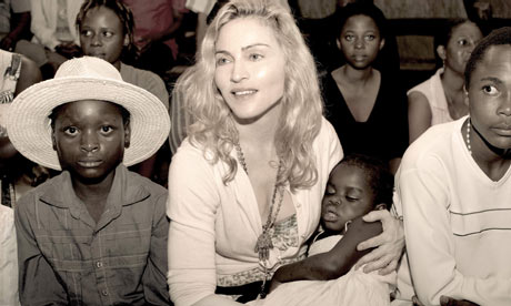
Pop star Madonna holds the child named Mercy, whom she hopes to adopt, in an undated sepia publicity photo taken in Malawi. Photograph: Publicity handout/Reuters
Madonna has released an image of herself holding Mercy, the Malawian baby she hopes to adopt. It's in sepia. Why?
Choosing sepia is all to do with trying to make the image look romantic and idealistic. It's sort of a soft version of propaganda. Remember when the colour supplements used to run black-and-white pictures of famine and hardship? Some still do. They do that because they want to make it look more authentic. But it's a fabrication. You can't shoot in sepia, so converting into black and white and then into brown makes everything feel less real.
Madonna is a clever person and this image is all part of a rigorous attempt to persuade the Malawian courts that her adoption should be allowed to go ahead.
As well as the photo being sepia, there appears to be a subtle soft pink hue on Madonna herself. I guess this is the colour of reassuring, concerned maternity. You can imagine Madonna and her team thinking this through in the same way an advertising campaign is orchestrated.
This predilection for sepia is all part of the baggage we have about photography. Despite all the above people seem to think it looks more real. Only 30 years ago, if you were a serious photographer, part of the art world, you had to work in black and white. You were almost scorned as commercial if you shot only in colour. When I first started doing colour in 1982/83 there had only been one serious exhibition in colour (that was Peter Mitchell at the Impressions gallery in York in 1979, with an exhibition entitled A New Refutation of the Viking IV Space Mission). It was a scandal in the world of photography. But it convinced me that colour wasn't the domain of the commercial and snapshot photographer.
Some, however, still harbour the notion of a black and white humanist photographer. Sepia in particular tends to make everything look a bit romantic and almost sentimental, hence the fact that it remains such a popular choice for wedding photographs.
It suggests old values, and in our days of modernisation, we hanker after that.
Ed van der ElskenJapan Focus december 1988. While travelling around the world in 1959/1960, Ed van der Elsken visited Japan, a country that would become a lasting source of inspiration for the photographer. He was able to capture aspects of the culture in such a way, that even the Japanese themselves were deeply impressed. See for Tokyo Symphony - The unfinished installation of Ed van der Elsken rediscovered...
...Photography is the visual medium of the modern world. As a means of recording, and as an art form in its own, it pervades our lives and shapes our perceptions...
 IMAGES OF A LOST WORLD