dinsdag 28 augustus 2018

A Photographic Documentation of the early Punk Scene in Paris London Birmingham I’m a Cliche BAUDOUIN Photography


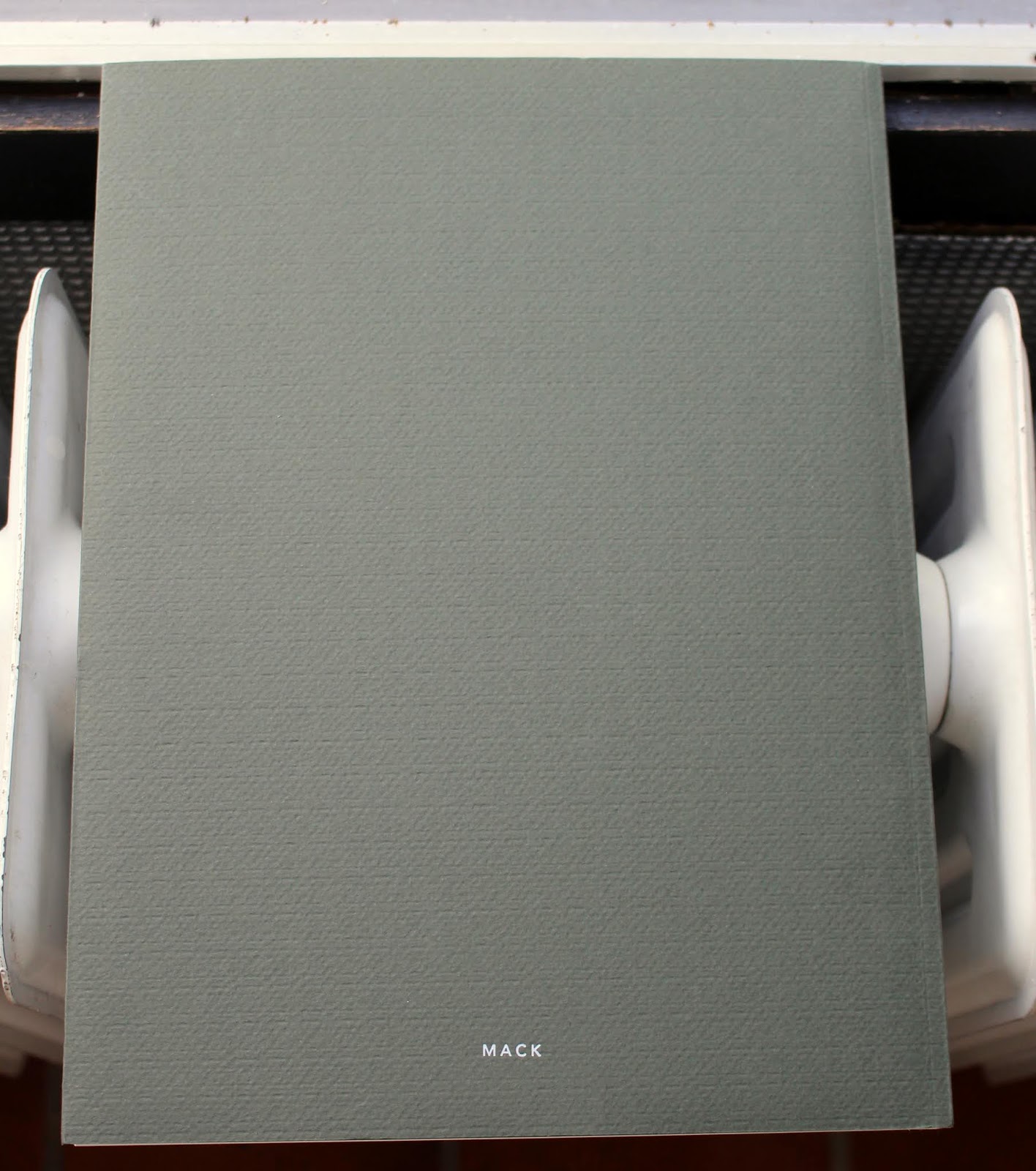
BAUDOUIN. I’m a Cliche.
(Paris): Editions de Nesle, 1979. First edition. Square Quarto. Unpaginated. Increasingly scarce and little known photographic documentation of the early Punk scene in Paris, London and Birmingham. Introductory essay by Marc Villard, text in English and French. A very good plus copy in glossy wrappers. OCLC locates just one copy in the U.S. at University of Colorado at Boulder.

See also

Punk Kids Eighties Paradiso Amsterdam Max Natkiel Photography


Create your own video slideshow at animoto.com.


rare photos of parisian punks in the early 80s
Memories of the scene preserved thanks to photo booths – "like Amélie, but punk."


It's 2017 and we're still hungry to excavate punk's past. The political and cultural era we now find ourselves in is reminiscent of the late 70s climate — the era that spawned punk. It was tumultuous, deeply divided and marked by rising inequality, though it also saw the rise of a new consciousness and strong pockets of resistance. Conversations about punk usually revolve around England, but across the channel, France had its own tight-knit scene (though cultural recollection is limited by the lack of documentation of the Gallic experience). However, if you dig deep enough and know where to look, you'll come across some gems — like this series of mostly photo booth pictures, taken and preserved by a group of friends who have now shared their punk youth on Facebook. It's a collection of images that captures the fun and freedom of a kind of family, who spent their time making music, filming low-fi videos, dressing up, and raising their middle finger to the world. After we came across these photos we tracked down tracked down Laul, one of the guys in the photos and former member of punk/ no wave band Lucrate Milk, who shared more of his personal archive and gave his account of being a young punk in Paris. Read for more ...

Masto

Belle Journée en perspective : la face cliché du punk
François Gorin  François Gorin  Publié le 18/10/2013. Mis à jour le 01/02/2018 à 09h01.


1977. Des photographes immortalisent les débuts du mouvement punk à Paris : un curieux mélange de zonards, de travestis et de fils à papa...L'exposition Europunk, à Paris, raconte leur histoire.
Ils étaient trois photographes de 20 ans et quelques, fixant leurs objectifs sur les dérives de la jeunesse des années 70. Issus de deux groupes (on ne disait pas encore « collectifs »), Alain Bali, David Cosset et Jean-Luc Maby en ont monté un troisième, Belle Journée en perspective. Ils démarchent des journaux, des éditeurs. Aux Humanoïdes Associés, Manoeuvre et Dionnet leur suggèrent un sujet rock. Puis un jour : « Arrêtez tout, mettez-vous sur le punk. » On est en 1977. Le trio commence à traîner dans des lieux nocturnes où aucun d'eux n'avait mis les pieds. « Le Gibus, mais aussi une boîte rue Mouffetard, se souvient Maby. Le punk, à Paris, ça se résumait à une bande de vingt zozos qui se retrouvaient tous les soirs. On les suivait, on se mêlait à leur faune, en cherchant surtout à faire des portraits. »

Les chasseurs d'images gardent leurs distances et leur look soixante-huitard, sauf Jean-Luc Maby, le plus caméléon des trois, qui se coupe les cheveux. « On était là en observateurs, raconte Alain Bali, mais il ne se passait rien. » Maby : « Comme l'a écrit Patrick Eudeline [journaliste à Best et chanteur d'Asphalt Jungle, NDLR], une des figures de cette scène avec Alain Pacadis [chroniqueur à Libération], il fallait faire croire aux kids qu'il se passait quelque chose. Tout le monde jouait un peu le clown de lui-même. Nous, on emmagasinait des images en se disant que ça prendrait peut-être un sens, une cohérence. » David Cosset : « Il y avait un phénomène de mode, mais aussi des personnages attachants, qui passaient au studio, situé derrière le siège de l'Unesco, et se racontaient. On faisait aussi de la formation photo ; notre travail a toujours eu une dimension sociale. »

"New boots and panties" in "We are not into music... we are chaos" / © Belle Journée en perspective

Le punk invente un curieux mélange de zonards, de travestis et de gosses des beaux quartiers. Alain Bali se rappelle « un fils d'ancien ministre gaulliste, un dénommé Blaise, qui un jour s'est payé la tête d'Andy Warhol à un vernissage. Tout le monde lui faisait signer des trucs et lui se pointe avec Le Monde, Warhol autographie la une, l'autre insiste et lui tend la page 2, puis la 3, etc. Warhol continue de signer mais s'énerve. A la fin, Blaise prend le journal et y met le feu. Un parfait geste punk ».

Le vrai choc arrive par les concerts. Bali : « J'ai pris une claque avec The Clash au Gibus, un soir à une 1 heure du matin. Quelle énergie ! Joe Strummer crachait, les types au premier rang gobaient ses crachats. » Quand le trio traverse la Manche, il découvre une autre dimension du mouvement, « plus politique, plus working class ». Il se rend à Londres, où le punk est minoritaire mais très présent dans les clubs et les bars ; à Birmingham, où il est bluffé par X-Ray Spex et sa chanteuse Poly Styrene, mais aussi agressé par Ari Up (15 ans), celle des Slits.

"On a tout fait à la façon punk, assez sauvage,
avec des erreurs exprès."

Leur matière, les photographes vont plutôt la chercher dans la salle. Maby : « On travaillait la nuit, surtout au flash ; les prises de vue frontales donnaient quelque chose d'agressif. On estompait ça au tirage en ajoutant du flou. » D'où le style « BJEP », un noir et blanc esthétisé, identifiable, où chacun des trois fondait sa personnalité. Les photos ne sont jamais signées individuellement. Maby : « L'important, c'était de tout assurer nous-mêmes, les planches contact, le tirage, l'editing. Ce système collectiviste a fonctionné pendant cinq ans. » Au bout de huit mois d'immersion, les BJEP apportent leur reportage aux « Humanos » qui le refusent. Maby : « On ne valorisait pas assez les groupes. L'ennui, c'est qu'il n'y avait pas eu de contrat. Presque un an de travail et on se retrouvait à tirer les sonnettes. » Un éditeur-soldeur, Baudouin, accepte finalement d'imprimer I'm a cliché, un livre devenu culte. « On a tout fait, la maquette, les légendes, à la façon punk, assez sauvage, avec des erreurs exprès. » En 1978, l'épicentre du punk parisien s'est déplacé au Palace. Belle Journée en perspective existera encore à travers des expos, des pochettes de disque (Le Chat bleu, de Mink DeVille, Cherchez le garçon, de Taxi Girl...) ou des parutions dans la presse (Actuel, Rock & Folk). Mais l'esprit du groupe a vécu. Les trois compères se dispersent. Il leur reste en commun ce témoignage d'une époque. Bali s'est exilé à Los Angeles, Cosset a longtemps été reporter-images à TF1, Maby fait de la photo d'objets d'art. Eux qui, jadis, ironisaient sur les « artistaillons » grisés par l'appel des cimaises, participent aujourd'hui à l'entrée du punk au musée. Mais sous la forme d'une frise d'une cinquantaine de photos (redevenues nettes). BJEP fondu dans la masse.

Et Christian Chapiron devint Kiki Picasso
A 18 ans, étudiant aux Beaux-Arts, Christian Chapiron voulait refaire le monde, imaginant un Kikiland plein de couleurs. Hippie, il devient punk en 1976. Entre les deux, il a formé le commando Bazooka avec ses amis Jean-Louis Dupré et Olivia Clavel. Un nouveau Kiki est né, baptisé Picasso par dérision. Le flash est venu par la musique : adieu Pink Floyd et Zappa, hello Damned, Sex Pistols et Clash. « A Paris, c'était juste quelques disques, mais à Londres, on pouvait aller d'un club à l'autre et voir cinq concerts punk en un soir. » Le groupe, élargi à six ou sept, partage deux appartements, un goût de la provoc visuelle et l'envie de créer ses propres journaux. « On faisait les choses au feeling, sans hiérarchie ni concurrence, on se repiquait des idées, on montait des coups. » Après quelques titres lancés comme des cocktails Molotov, dont le fameux Bulletin périodique, Bazooka infiltre la presse. En 1977, Libération lui ouvre ses pages. « C'était de la folie totale. On arrivait à 17 heures en évitant les journalistes politiques qui nous haïssaient, et on travaillait jusqu'au bouclage. » S'ensuit le mensuel Un regard moderne, interrompu au bout de sept mois. La belle énergie du groupe s'épuise dans les tensions, les drogues... « Aucun d'entre nous n'était carriériste », résume Kiki Picasso, qui se consacre aujourd'hui au spectacle vivant (le Cirque électrique). « L'art, je n'en ai jamais fait. C'est juste un support de communication. »


zaterdag 25 augustus 2018

Views & Reviews The Dead Animal Book 't Dooie Beestenboek Artist's Book Hans de Vries Photography


Hans de Vries - 't Dooie Beestenboek - 1972
Hans de Vries, de Harmonie, 1972. Illustrated stiff wrappers (softcover), 32,4 x 23,5 cm., unpaginated (approx. 90 pp.), text in Dutch with b/w illustrations.
Rare Artist's Book. Hans de Vries kept a diary for almost a year to make notes of all the animals wich were killed by traffic in Beerta (Netherlands).


Hans de Vries ‘Works 1968–1975’
23 January – 19 March 2016
Opening 23 January 6–8 pm

With a new publication published by Kunstverein Publishing
Partner: Rietveld Academie, Amsterdam
Curated by Krist Gruijthuijsen


Hans de Vries concentrated on the study and registration of processes and appearances that occur in and are created by nature. De Vries was a close observer, an onlooker, an eyewitness, whose aim was to discern and document the relationship between man and his natural environment. His practice has been referred to as “micro-emotive art”, a term coined by the Italian artist Piero Gilardi. Micro-emotive art was art that arose from the interest in minimal sensations and experiences (micro-emotions) –the results of slow processes otherwise not readily perceived.

De Vries’s practice was fully integrated in his daily life. He lived in the countryside and registered every detail of his domestic existence. Developments in nature were studied and phenomena one might consider superfluous, were highlighted. This accumulation of facts and observations has been captured in his publications – the artist books of Hans de Vries.

His first book, Het Tuinboek, [The Garden Book] was published in 1971 as part of the Atlas voor een nieuwe metropool [The Atlas For a New Metropole], edited by Jan Donia and published by the Rotterdam Fund For the Arts. Een jaar rond: huiselijke activiteiten en het weer [A Full Year: Domestic Activity and the Weather], Hilversum, Becht, 1971, was published with the help of collectors Agnes en Frits Becht. An example of a self-published book is Kruisingen [Intersections] published in 1973 in Finsterwolde. These publications were only distributed in galleries (like Seriaal) in Amsterdam.

The illustrated De geschiedenis van de citroengeranium [The History of a Citrus Geranium] was published in 1973 by Art Animation in Groningen. This book was the result of a close study of a Citrus Geranium De Vries and his wife, Emmy, initiated in September of 1970. The artist book Stijgbeelden van vruchten [Growth Images of Fruits] is a folder with an original photograph published alongside the exhibition of the same title in the print gallery of the Gemeentemuseum Den Haag in 1975.

Het Dooie beestenboek [The Dead Animal Book] published by De Harmonie Amsterdam a year before Stijgbeelden van vruchten, is the first book that was available in Dutch bookstores. It is a registry of all the dead animals he and his wife came across in 1971 on their way to Winschoten from their home town, Beerta in the north of the Netherlands. This publication’s design reflects De Vries’s manner of working: showing things as they are, plainly, and with little to no formal concern. Het Dooie beestenboek straightforwardly displays each dead animal accompanied by a handwritten text and a sketch of the situation in which it was found.

Hans de Vries ‘Works 1968–1975’ is De Vries’s first exhibition since he stopped producing art at end of the 1970s. It is a retrospective of all the publications and book-related works including parallel articles and essays about his practice.


Hans de Vries
Maak kennis met de maker van 't Dooie Beestenboek
08.02.2016 | FEATURE — Domeniek Ruyters

Hans de Vries, 't dooie beestenboek

Notulist van het onopgemerkte onopmerkelijke. Hans de Vries is een bijna vergeten figuur uit de Nederlandse kunstgeschiedenis. Zijn specifieke vorm van ecologische kunst staat momenteel centraal in een tentoonstelling in de Kunstverein Amsterdam.


‘Spurensicherung’ heette het in de jaren zeventig in het Duits. Kunstenaars die hun hele hebben en houwen vastlegden in precieus samengestelde dagboeken met veel op de typemachine getikte notities en zwart-wit foto’s. Lucy Lippards The Dematerialisation of Art staat vol met kunstenaars die dit deden, er zijn talloze tentoonstellingen aan gewijd en catalogi over gepubliceerd.


In de 21ste eeuw horen we er zelden meer over. Afgezien misschien van Douglas Huebler en Sophie Calle lijkt iedereen vergeten. Zelden verlaten de notities het depot, ofschoon de kunstwereld al jaren wordt overspoeld met hedendaagse ‘notitie-kunst’ in de vorm van eerst studieuze archivalische kunst en later massa's selfies.

Pas recentelijk maken de notitiekunstenaars van weleer een comeback. Fier voorop loopt herman de vries, de Nul-kunstenaar die in 2014 vereerd is met een grote solo in het Schiedams Museum, en een half jaar later het Nederlands Paviljoen op de Biënnale van Venetië mocht verzorgen. Zijn tuinstudies werden er prominent gepresenteerd, waaronder honderden gedroogde planten uit een vierkante decimeter tuin die in plastic mapjes waren opgehangen. Hij toonde er ook zijn ‘journaals’, gebaseerd op verzamelingen spulletjes, steentjes, aarde en groeisels van een bepaalde locatie. In Venetië hing een wand van vondsten uit de lagune.

Kunstverein Amsterdam komt nu met een weliswaar onbekendere, maar minstens zo interessante 'kunstklerk': Hans de Vries (geen familie), aan wie momenteel een tentoonstelling is gewijd en over wie een nieuw boek wordt gepubliceerd – inclusief up-to-date interview van curator Krist Gruijthuijsen. Waar herman de vries opereert in de traditie van Zero en Zen, haakt Hans de Vries in op het verhoogde ecologische bewustzijn dat eind jaren zestig vanuit de West-Coast van Stewart Brand op de hele westerse kunstwereld neerdaalde. Hans de Vries opereerde vanuit Almelo en Finsterwolde, waar hij een enthousiast boer annex notulist van het natuurleven werd. Geboekstaafd werden tal van handelingen op en om het land, alledaagse natuurverschijnselen, natuurexperimenten die op de een of ander manier een tijdsverloop visualiseren, tot en met dode beesten in 't Dooie Beestjesboek. Rond 1970 nam hij ook geregeld de filmcamera ter hand om iets opmerkelijk onopmerkelijks te observeren, zoals de gang van de koeien uit de stal. Het leidde in tekst tot de weinig verbloemde maar des te schitterende Barbarber-achtige poëzie. Ik noteer: ‘When I cycle to Winschoten, in a cold side-wind, I sometimes have to stand on the pedals where there are breaks in the shrubbery.’ 1971, idee voor een film staat erbij.

Sommige van Hans de Vries’ natuurexperimenten hadden een kosmische dimensie. Dan werd er iets gesnoeid en tot rotten gebracht, met als idee om het in een quasi-homeopatische ritueel vervolgens aan de natuur terug te geven, ter verbetering van de totale atmosfeer. Maar meeste wat deed is vrij banaal van aard, en genoteerd zonder bedoeling. Bij hoog en bij laag beweert de kunstenaar tot op heden dat het openbaar maken van zijn werk niet het doel was.

In een tekst uit Kunstlicht (2006), herdrukt in de Kunstverein-publicatie, legt onderzoeker Sarah Maso uit dat Hans de Vries wordt ingekaderd bij de micro-emotive art, naar een idee van Paulo Gilardi. Het staat voor kunst waarin geduldig observerend veranderingen worden genoteerd. ‘Verandering als vormgevend principe’, noemde Wim Beeren het op zijn beurt. Uit een in het boek gepubliceerd interview wordt duidelijk dat Hans de Vries een kortstondige carrière had als kunstenaar. Net te laat voor Op Losse Schroeven, hoeft hij niet ontevreden te zijn. In 1978 stopte hij ermee en ging zijn koeien verzorgen, eerst in Groningen, later in Duitsland en Denemarken. Met de kunst wilde hij niks meer te maken hebben. Hij vertelt dat sommige werken gewoon in stapels in zijn huis zijn opgeborgen. Zoals de ‘rising pictures’ waarin planten elkaar in beeld brengen via een ingenieus proces. Ik ben benieuwd of de verkleurde papiertjes straks in de Kunstverein in Amsterdam te zien zullen zijn.

Hans de Vries
Kunstverein Amsterdam
23.1 t/m 19.3.2016


maandag 20 augustus 2018

The Shade of a Plane Tree Ombra mai fu Andreas Scholl Cécilia Bartoli Enrico Caruso


"Ombra mai fu" is the opening aria from the 1738 opera Serse by George Frideric Handel.
The title translates from the Italian as "Never was a shade". It is sung by the main character, Xerxes I of Persia, admiring the shade of a plane tree.

Frondi tenere e belle
del mio platano amato
per voi risplenda il fato.
Tuoni, lampi, e procelle
non v'oltraggino mai la cara pace,
né giunga a profanarvi austro rapace.

Ombra mai fu
di vegetabile,
cara ed amabile,
soave più.

Tender and beautiful fronds
of my beloved plane tree,
let Fate smile upon you.
May thunder, lightning, and storms
never disturb your dear peace,
nor may you by blowing winds be profaned.

Never was a shade
of any plant
dearer and more lovely,
or more sweet.


zaterdag 18 augustus 2018

Views & Reviews Redesign the Ringier Annual Report 2010 Kerstin Bratsch and Adele Röder Artists Book Photography

Das Institut
The German artist duo Kerstin Bratsch and Adele Röder redesign the Ringier Annual Report 2010, a convergence of fashion, information system and the art economy.

AUTHOR
Francesco Garutti
PUBLISHED
22 July 2011


Das Institut: Ringier Annual Report 2010, 
Edited by Beatrix Ruf, JRP|Ringier 2011 (pp. 192, US $24.95)

Who is Kerstin Bratsch? Why do the names Das Institut and that of the young German artist sparkle—changeant—on the cover of a Vietnamese fashion magazine like "Thoi Trang Tre"? Who designed those decorated nails attached to the magazine? And again, how does this apparently ordinary editorial product relate to JRP|Ringier, Lionel Bovier's art publishing house?

The plot is well woven together; leafing through the magazine, its multiple identities are revealed. To solve the enigma and begin to answer some questions, perhaps it is necessary to cite some data. Ringier AG is a global leader in the information market. A multinational with headquarters in Zurich, the company manages brands and magazines in the world of print, web, television and in the expanding segment of mobile digital information. The Ringier Group's portfolio spans various domains and all editorial content distribution systems.

Interior spread from Das Institut: Ringier Annual Report 2010, by Kerstin Brätsch and Adele Röder.

Every year, the company publishes an annual report and for some years now, it has been curated by Beatrix Ruf, director of the Zurich Kunsthalle as well as curator of the Ringier Collection. She has transformed the report into an artist book that can expertly mix economic data and business reports with the contributions of such visual artists as Richard Prince, Fischli / Weiss, Josh Smith and John Baldessari.

Called to work on the 2010 report, Kerstin Brätsch and Adele Röder decided to "hybridize" some editorial formats and mix and merge the company's report with the pages of a Vietnamese fashion and lifestyle magazine, "Thoi Trang Tre," not coincidentally one of the company's leading products on the Asian market. Thus, it is not simply a parasitic publishing strategy but a clever way to bring into play the multiple identities that are used by artists in their practices and transform the product into an ambiguous and seductive Chinese box mechanism in which artist, client and customer mix.

The plot begins to unfold.

Front cover of Das Institut: Ringier Annual Report 2010, by Kerstin Brätsch and Adele Röder.

The two artists—based in New York and in this period shown in the space curated by Bice Curiger for the Venice Biennale—infiltrate the sections of the magazine published in Ho Chi Minh City: on the cover in an interview, in the "Faces" section and in the main section of the "Style" section personally presenting and wearing the QUASI-FASHION line by "SchröderLine" recently produced by them for Das Institut. Now it becomes necessary to resolve a last question in order to reveal the entire project completely. What then is Das Institut?

Formally, DI is an import/export agency founded in 2007 by two artists whose collaboration regards the production, handling and exchange of strategies for the dissemination of images and information.
 Formally, Das Institut is an import/export agency founded in 2007 by two artists whose collaboration regards the production, handling and exchange of strategies for the dissemination of images and information.

Interior spread from Das Institut: Ringier Annual Report 2010, by Kerstin Brätsch and Adele Röder.

Kerstin and Adele themselves define their agency as a character who plays several roles, a windowless room, a public garden obstructed from view by some half-closed shutters. DI means "to not know your own name," to build a multiple identity for production and, subtly, to undermine the very notion of the artist within the system.

Das Institut produces templates, stencils, patterns and images that migrate from one domain to another. In the case of this artist magazine, the brand and graphic motif that dominate the entire work—a folded, colorful ribbon—moves, like a small parasite, from the fashion collection presented in the Vietnamese magazine to the design of the attached artificial nails to the economic data graphics in the Ringier annual report in "Thoi Trang Tre" to the volume's closing section containing a sequence of graphics illustrating the economic balance sheet of Kerstin's work as an artist over the past 3 years.

Interior page from Das Institut: Ringier Annual Report 2010, by Kerstin Brätsch and Adele Röder.

Some of Kerstin Brastch's paintings can become stickers or decals. Graphic icons or small knit works can change scale and be redistributed in prints or other publishing media.

In a highly commodified art system, in which the only weapon of communication seems to be creating a certain recognition of the work or the product, Brätsch and Röder intentionally practice camouflage as a strategy; they hide among the folds of the art and information system.

Interior page from Das Institut: Ringier Annual Report 2010, by Kerstin Brätsch and Adele Röder.

And as Alice and Kerstin both claim, providing an "Import/Export" service means, not by chance, working in a market sector of exchange and redistribution, carrying out a practice that is on the edge of many worlds, whose processes and dynamics are not often particularly transparent, through chains of actors on the market who, most of the time, are never known to the client.
Francesco Garutti

Interior page from Das Institut: Ringier Annual Report 2010, by Kerstin Brätsch and Adele Röder.

Interior page from Das Institut: Ringier Annual Report 2010, by Kerstin Brätsch and Adele Röder.

Interior page from Das Institut: Ringier Annual Report 2010, by Kerstin Brätsch and Adele Röder.


donderdag 16 augustus 2018

Views & Reviews THE EVERYDAY LIFE TRANSFORMED Veramente Guido Guidi Photography


Guido Guidi Veramente

Veramente encompasses Italian photographer Guido Guidi’s entire oeuvre, bringing together excerpts of his series from 1959 to the present day to illuminate the distinctive photographic language he has forged over a 40-year career.

Guidi, a pioneer of new Italian landscape photography, was influenced by architectural history, neorealist Italian film, and conceptual art. Using photography as a process and an experience of understanding, Guidi’s body of work frames a visual discourse that revolves around what it means to see, or what it may mean to offer up an image.

Veramente is published to accompany a touring exhibition of the same name opening at the Fondation Henri Cartier-Bresson in January 2014, and then moving to Huis Marseille Museum voor Fotografie, Amsterdam in June and the Museo d’Arte della Città, Ravenna in October.

Guido Guidi was born in Cesena, Italy, in 1941. He studied in Venice at the University Institute of Architecture (now IUAV), where he followed the courses of Bruno Zevi, Carlo Scarpa and Mario De Luigi, and at the Advanced Course in Industrial Design with Italo Zannier and Luigi Veronesi.


Guido Guidi, Veramente
By Loring Knoblauch / In Photobooks / July 29, 2014

JTF (just the facts): Published in 2014 by MACK Books (here). Paperback, 172 pages, with 121 black and white and color photographs. Includes texts by Marta Dahó and Agnès Sire. The monograph is also the catalog for a retrospective exhibit, with 2014 stops at the Fondation Henri Cartier-Bresson (here), the Huis Marseille Museum voor Fotografie (here), and the Museo d’Arte della città di Ravenna (here). (Spread shots below.)

Comments/Context: Given the dramatic influence that urban and suburban sprawl has had on American societal development and the large number of extremely talented photographers (New Topographics branded and other) who have chronicled this massive post war expansion, we often tend to have the blindered, myopic view that ours is the only place in the world that has gone through these kinds of wrenching architectural and environmental transformations. Of course, that conclusion is patently false, and great photographers from all over the globe (particularly the UK, Germany, Japan, and more recently China) have investigated the seen and unseen consequences of rapid economic expansion, watching carefully as the old has been incrementally supplanted by the new. For many of us, we haven’t often thought about this process in a more integrated global fashion, comparing results from alternate geographies and artists to look for commonalities and differences, both in the ways the physical built environment has evolved and in the variety of artistic approaches being applied to capturing the ongoing changes.

The Italian photographer Guido Guidi has spent a forty year career observing the exurban evolution in his own native landscapes (and in other nearby European locales), and this retrospective volume provides a succinct summary of his thoughtful approach to documenting the kind of overlooked, marginal places we have become accustomed to finding here in America. His story begins in the early 1970s, with rich, squared off black and white views of vernacular suburban architecture (multi-unit concrete or stucco buildings), stylistically reminiscent of the frontal geometric formality of Lewis Baltz or Judy Fiskin. By the mid 1990s, he had transitioned to small format color, stepping back and capturing overlapped layers of open streets, vacant lots, ugly apartment blocks, and decayed infrastructure, often with an eye for new covering old or groups of people caught in some in-between space, interrupted by a telephone pole (like Lee Friedlander), a cast shadow, or a parked car. More recent images have moved on to large format color, diving deeper into the lush textures of rotting planks, faded plastic crates, stained walls, rusted oil drums, and stray dogs, with worm’s eye views of the sidewalk bringing us right down into the gutter, where every loose pebble becomes an item of interest.

Interleaved with this consistent look at Italian transitional landscapes has been an ongoing conceptual investigation of the elemental nature of photography, from experiments with light and shadow to multi-image time elapsed series. Early black and white works find him playing with sequential diptychs, pushing us into the dilated space between the turning of a newspaper page, the arrival of a wave at the beach, or the twist of perspective looking up at a ceiling light. By later in the 1970s, Guidi had colonized abandoned John Divola-like rooms, making ephemeral diptychs as the sun cast parades of ever changing angular shadows through the windows. After his transition to large format color, he reprised some of these same themes, moving outdoors to track light as it crossed a wet underpass, a muddy rooftop, and an intrepid clump of grass on a sun baked walkway. Each pairing is a meditative investigation of transient fluidity, of subtly changing mood in otherwise fixed circumstances.

Seen together, the two picture making methodologies inform each other more than we might normally expect. With Guidi’s time series works in my head, his undefined, empty suburban spaces started to look less like lucky snapshots or formally composed individual observations, and more like points in a larger continuum of broad thinking about societal transformation. Minute changes across textural surfaces show us one kind of close up evolution, while faded signs, torn posters, and cannibalized architecture tell us something similar about the molting surfaces of our cities.

While many of the New Topographics photographers easily edged into hectoring, caustic tones, Guidi never wavers from straightforward realism – a dose of quiet visual humor now and again, yes, but never outright irony or intentional lecturing. His results are less stark and more contemplative than his contemporaries, providing a look at neglected landscape spaces that encourages slow, deliberate investigation to uncover its nuances. For all their wasteland ugliness, these pictures never feel discouraging. Instead, they feel attentive and reflective, their judgments left open ended.

Collector’s POV: Guido Guidi is represented by Pedro Alfacinha in Lisbon (here), but I was unable to discover any US agent. His work has very little secondary market history here or in London/Paris, so gallery retail likely remains the best option for those collectors interested in following up.

Guido Guidi "Veramente", 2014. Photograph: Courtesy Mack

“THERE ARE THINGS I DO NOT LIKE IN THIS WORLD. I COULD BE IRONIC, BUT I’M VERY CAREFUL NOT TO BE.”

GUIDO GUIDI VERAMENTE

Two dogs snoozing away on a greyish dust road. Fenced in horses next to high piles of wooden pallets. Or a man reading a newspaper in a café. Banal situations which at first glimpse don’t offer much to take a photograph of. Not so for Italian photographer Guido Guidi.

As the recently published retrospective of his 40-year-career titled “Veramente” shows, Guido Guidi broke with the rules of what had generally been considered “photographable” up to the 1960’s.

As Marta Dahó writes in her accompanying words of the book:

“THE CONCEPT OF THE LANDSCAPE GRADUALLY MUTATED, VEERING TOWARDS A NEW FOCUS ON SPACES AND TERRITORIES THAT HAD PREVIOUSLY BEEN DEEMED UNDEFINED OR MARGINAL, RATHER THAN MORE CANONICAL SITES.”

Guido Guidi Veramente
Atri, Italie, 05.2003 © Guido Guidi

“SILENT WITNESSES OF A LANDSCAPE UNDERGOING PROFOUND CHANGES.”

The dominant subject matter throughout Guido Guidi’s work is territorial transformation. Born near the city of Cesena in the northern part of Italy in 1941, Guidi has dedicated a great part of his oeuvre to documenting the changes in that area.

His images are silent witnesses of a landscape undergoing profound changes: Once an agricultural area on the edge of a suburb and now traversed by a highway.

The artist himself once referred to his photographs as “ugly”. But he doesn’t care.

His approach to photography is a reflection of his character. Unpretentious and observant.

Agnès Sire puts it like this in her afterword to “Veramente”:

“WHAT HE LOOKS AT IS THE EVERYDAY LIFE AROUND HIM, BUT ONE WHICH IS BEING TRANSFORMED, REGARDLESS OF WHERE HE IS.”

Guido Guidi’s images don’t offer explanations. He shows reality. A reality formed and shaped by changes either so subtle that most are people not even aware of them. Or they don’t wish to pay attention to them thus avoiding to think about the consequences of what little changes – seemingly insignificant when looked at individually  – might add up to in the long run.

Guidi’s photographs are sober and stripped down to the core reminders of “what’s there” or “what’s real” – veramente.

More information about Guido Guidi “Veramente”
“Veramente” by Guido Guidi (2014): Published by MACK with an essay by Marta Dahó and an afterword by Agnès Sire.

Guido Guidi Veramente
Guido Guidi “Veramente”, 2014. Photograph: Courtesy Mack