maandag 13 augustus 2018

Views & Reviews Anastasiia Photobooks of the year 2018 (so far) Christian van der Kooy Photography


Published on 2 August 2018
Photobooks of the year (so far)
Written by Izabela Radwanska Zhang

From the series Anastasiia © Christian van der Kooy


Foam founder Marloes Krijnen, curator Yumi Goto, and photographers Rob Hornstra, Mark Power and Mariela Sancari highlight the photobooks that have impressed them most so far in 2018

Anastasiia by Christian van der Kooy
Published by Eriskay Connection
Nominated by Rob Hornstra, photographer and self-publisher

Dutch photographer Christian van der Kooy has spent over a decade working on a number of projects around eastern Europe. The photographs in his new book are shot over two years in Ukraine, a country subject to fluctuating tensions with neighbouring Russia, particularly prior to and after the annexation of Crimea, while also being a place of continuing uncertainty, socially and politically, since it ceased to be a communist state.

This is observed through the eyes of Anastasiia, and narrated as a love affair with Van der Kooy. The photographer interlaces documentary images of her daily life with screenshots of Skype conversations and text messages. His motivation is neatly described in an introduction by the publisher: “There is an urgent need to capture a visible, understandable cultural identity that listens to the ideas of a younger generation…[Van der Kooy’s] depiction of Ukraine demonstrates the creative way the Ukrainian people deal with the current developments in Kyiv, Odessa and Crimea.”

“The book serves as a subtle counterpart to the hard news that has highlighted Ukraine in the past years, and beautifully balances the intriguing line of reality and fiction,” says Rob Hornstra, who picked the book as his favourite of the year so far. “Jörg Colberg perfectly expressed my feelings towards the book by stating that he was unable to read Anastasiia in one sitting, simply because he didn’t want the experience of spending time with the book to end.”


Zonder titel (vier volmaakte perziken op een schaal) | Christian van der Kooy
• 26 JULI 2018 • WERK


[ Deze tekst schreef ik in mei 2018 in opdracht van de fotograaf ter begeleiding van zijn boek.
Ze is ook te vinden op zijn website www.christianvanderkooy.eu ]

Dit boek is een atlas. Een atlas van een mentale ruimte gevuld met betekenissen uit twee belevingswerelden.

Deze atlas stelt je in staat een reis te maken van buiten naar binnen, van West naar Oost en weer terug, een reis van het ene perspectief naar het andere, en van zachtheid via verwarring en irritatie naar begrijpend voelen. Het is een lange tocht, heen en weer, zonder duidelijke bestemming en met verlangen als tijdelijke pleisterplaats. We kruipen voorbij Cliché, doen Neurose en Ontzetting aan, struikelen over Gewoonte terwijl we ons langzaam en geduldig – sporen in het landschap helpen ons de juiste weg te herkennen – een weg het onspectaculaire binnenland in banen, waar Begrip, Extase en Overgave liggen te wachten. Waarom zo metaforisch? Omdat bij een boek waarin intellect en emotie elkaar in zo’n complexe choreografie ontmoeten, het begrip alleen op metafysisch niveau kan ontstaan.

Hoe dit boek te lezen? Van voor naar achter, bijvoorbeeld. In één ruk, misschien – hoewel een tegenargument kan zijn dat de romance zo lang mogelijk gerekt moet worden – , meerdere keren, dat is onvermijdelijk. Waar te starten met de duiding van dit objet d’amour? Zomaar een idee: WE BEGINNEN BIJ DE LIEFDE voor een grensland vol pracht, drama en absurditeit. De fotograaf-bewonderaar – hij maakt zijn foto’s van op afstand, alsof hij niet aan de overrompeling wil toegeven – transformeert gaandeweg van buitenstaander naar ingewijde. Onherroepelijk verandert zijn blik mee, wordt die bijgestuurd, gekleurd.

christian van der kooy, the eriskay connection, anastasiia, spread

Liefde blijkt uit de manier waarop het boek is vormgegeven en uitgevoerd. Het roze van intieme dingen. De sensuele dimensie van de kattentongen-ruwe lichterroze linnen rug, dat voorhoofd (om een zoen op te drukken) en die wang (om de jouwe tegenaan te vleien). En ja, ook het roze van de verliefdheid die de kiem van dit boek vormde en de kleur van de brillenglazen waar eigenlijk heel het leven doorheen bekeken zou moeten worden.

Liefde ook van de fotograaf voor zijn tweede thuisland dat hij met de onbevangen blik van een jongeling streelt. De dansende krullen, de ontblootte billen, een godin op een steen, warme kiezels onder een handdoek, vier volmaakte perziken op een schaal, de gewelfde lippen van een vreemdeling, hypnotiserend geel, gras dat kietelt en fluisterende bomen. Maar vooral: de liefde tussen Anastasiia en haar Christian. Een zinnelijke, jaloersmakende liefde waarin de protagonisten elkaar tot poëtische hoogtes stuwen in een samentaal – een kenmerk van goede liefde.

“No. I imagine you in Koktebel learning to play durak. Or, no, in a scary garage under a grey sky in the rain when we were searching for the flying house on one leg! All I feel now is love in every cell, in every drop of my blood! I’d love to appear on your couch now, covered in salt and some lemon juice maybe, we would have a shower of tequila and dance.”

De liefde is zowel onderwerp als voertuig. Het is de liefde die een perspectief op het onderwerp Oekraïne biedt dat dichter bij een waarheid op menselijk niveau komt dan de spektakelbeelden uit de media die ons ongenadig achtervolgen. Ze komt ook tot uitdrukking in de innige relatie tussen tekst en beeld: hier trefzeker, daar weifelend, soms conflicterend. Ze ontluikt in de dialoog tussen twee fysiek van elkaar gescheiden geliefden die te midden van verandering een fundament voor hun samenzijn proberen te leggen, terwijl ze simultaan grip proberen te krijgen op het zelf in relatie tot de ander, terwijl onbegrip en verwijdering op de loer liggen.

De liefde is een psychose, een hardnekkig vasthouden aan een droombeeld dat al lang door de werkelijkheid is ingehaald; een droom die aanvankelijk al het andere naar de achtergrond verdrijft en zelfs vervangt door een eigen realiteit met het uitnodigende karakter van een ménage à trois.

“News on radio: they put love diagnosis to the world list of mental diseases…”

BUITEN DE COCON DAVERT DE ACTUALITEIT. Terwijl de ontdekkingsreis vordert, de verzengende liefde een gematigder temperatuur krijgt en het winter wordt, manifesteren de gebeurtenissen zich hoe langer hoe meer in de berichten. Hoop is nodig, ondanks de vreemdeling op het bankje die wijst op onwaarschijnlijke gebeurtenissen uit het verleden. We moeten blijven geloven in de kracht van liefde, de kracht die je een beter mens doet worden, de kracht waarop een land zichzelf kan doen verrijzen en haar stof en ballast kan afschudden.

“We are drinking a milkshake that tastes like lipstick from an old pleasure madam who sticks her nose in dusty books to get high; but reality is to absurd and grotesque to sink in pages!”

Het hele boek lang speelt het spektakel op het tweede plan. De politieke gebeurtenissen lijken zodoende buiten de foto plaats te vinden. Ze verstoppen zich in en tussen sporen die slechts door de geduldigen gelezen kunnen worden, in plaatsen en lichamen waarvan de betekenis zich enkel prijsgeeft door een minutieus verkennen van details, ook de schijnbaar onbeduidende, omdat die net zoveel zeggen als de schreeuwerige. Alleen in rust ontvouwt zich de rest van het karakter. Te weten waar en wanneer we precies zijn, wiens bloed of welk roet wordt weggepoetst, welke deals worden gesloten en welke leuzen onleesbaar gemaakt is van ondergeschikt belang. “Da Pravda!”, schrijft onze hoofdpersoon, de waarheid is echter subjectief en pluriform.

christian van der kooy, the eriskay connection, anastasiia, spread

Eén waarheid is dat er naast de actualiteit van tumult en bominslagen ook het dagelijks leven is, dat de koelkast gevuld moet worden, de zon altijd en overal ruggen verwarmt; de warmte van een eindeloos lijkende zomer die zich alleen laat verjagen door een koele duik. En in elke actualiteit is er is altijd ook de liefde. Het boek staat bol van dergelijke tegenstellingen –  Christian versus Anastasiia, oude versus nieuwe overtuigingen. Welk – en wiens – Oekraïne we krijgen voorgeschoteld is een onmogelijk te beantwoorden vraag. Daarbij, het is onzin om te streven naar een antwoord als er nog gezocht wordt, onderwijl in de wetenschap verkerend dat er alleen fragmenten gevonden zullen worden.

TERUG NAAR HET BEGIN. De fotografie heeft steeds een relatie tot tijd en plaats, maar binnen de grenzen van dit boek, deze roze cocon, vormt ze haar eigen universum dat op geen enkele kaart te vinden is. Dit boek is de atlas van een poëtisch land waarin de schilferende verf van een betonnen zwembad de bast van een plataan imiteert en de omgewoelde aarde rond de stam van diezelfde boom op haar beurt zich aan de vorm van het zwembad spiegelt. Het is ook een land van wensen, dromen en mogelijkheden, zoals nieuwe naties die geboren worden uit de dromen en speeches met het doel verandering te brengen (en worden omgebracht omdat de niet gedroomde wereld bang is voor wat zou kunnen zijn).

Terug naar die ongelofelijke titel, ontleend aan het werk van de schrijver Joseph Brodsky. Herinneringen als valscherm voor een veilige landing in het heden of de toekomst. Herinneringen als drijfhout die ons, door ze te delen, helpen onthouden dat we niet gek zijn, terwijl we al dobberend ook nieuwe herinneringen maken. Dat geldt zowel de liefdesrelatie als de zoektocht van een land naar een eigen culturele identiteit.

Is het mogelijk nostalgisch te zijn naar een plek waar we nooit zijn geweest? Wel als die besloten ligt in een boek dat even fysiek is als de realiteit. Bij het elke volgende keer openslaan zal de betekenis van wat zich op de pagina’s bevindt veranderd zijn, zoals tijd ook de facetten van een geliefde prijsgeeft. Zelfs die gestolde vorm is niet voor altijd vast.

christian van der kooy, the eriskay connection, anastasiia, spread


woensdag 8 augustus 2018

How Selfies killed the Postcard Photography


How selfies killed the postcard
Andy Dawson
Even the rain in Spain couldn’t persuade me and my family to send a humble card. But now a leading postcard firm is closing, let’s celebrate a lost art
• Andy Dawson is a freelance writer and author of Get in the Sea

See also

Mail Art Postcards A visit to all 863 municipalities in The Netherlands 1972 Wim Gijzen Martin Parr Artist's Book 

 ‘I recently bought a postcard, dispatched from Woburn Abbey in the 1950s, solely because of the message on it.’

Tue 26 Sep 2017 13.24 BST Last modified on Thu 22 Feb 2018 16.27 GMT

Last month I spent an occasionally fraught week in Spain with my two kids – and for the first time, we didn’t send a postcard home to their grandparents.

We almost did. On day five we were in the little supermarket round the corner from our hotel and as I walked past the revolving rack of postcards in the doorway, I briefly stopped and looked at them, before deciding that we wouldn’t bother.

Postcards on the edge as Britain’s oldest publishers signs off

There didn’t seem to be any point. The previous evening a freak thunderstorm had left our balcony and the hotel lobby underwater, with two of the three pools knocked out by flash flooding.

My nine-year-old son, a keen YouTuber, quickly flipped into cyber-journalist mode, reporting on the drama as I pointed my smartphone at him. Minutes later, the video had been uploaded and friends and relatives had been emailed a link.

This is the way it is now. We go away on holiday but it’s easier than ever to remain in touch. Facebook, Snapchat and Instagram all provide the means for us to keep everyone back home abreast of our movements (assuming they haven’t muted us as a result of irritation, jealousy or apathy).

But today I am appalled by my decision not to send a postcard, having read about the imminent demise of Britain’s oldest postcard publisher. J Salmon will shut its 140-year-old operation at the end of the year, blaming shrinking markets and the rise of social media for nose-diving sales.


Look what we’re doing. We’re killing off the postcard and none of us even realise it, because we’re too busy tweeting pictures of our hot dog legs by a nondescript pool somewhere sun-drenched.

See also

Views & Reviews Selfish Terribly Awesome PhotoBook Kim Kardashian Photography


There used to be a genuine thrill associated with receiving a holiday postcard; even if the words on the back were bland, with just a weather report and a list of sights that had been seen, it gave us a chance to gawp at the destination while reassuring us that the sender hadn’t been killed by a shark or some dodgy foreign food.

Postcards on the edge: curator's homage to a dying tradition

That is, of course, if the postcard made it back to the UK before the holidaymakers themselves. The sight of the postcard on the doormat four days after you had got home was par for the course if you had travelled abroad, unless military precision was applied and postcard duties were carried out on day one.

Of course, the humble postcard used to be more versatile than just a holiday bulletin device – in the days before email and premium-rate phone lines, we would turn to it to enter a newspaper competition or vote for a singing binman on Opportunity Knocks. But no more.

One of my favourite places on earth is the indoor weekend market at Tynemouth station on the coast near Newcastle. There’s a fantastic stall with hundreds of old postcards divided into various categories, some blank, others used and decorated with stamps, offering glimpses into the lives of strangers.

The sender Ruth, wrote ‘I remembered I’ve left my button-up green dress in the sitting room. Please could you send it as soon as possible’

I recently bought one, dispatched from Woburn Abbey in the 1950s, solely because of the message on it. The sender, Ruth, wrote: “I remembered I’ve left my button-up green dress in the sitting room. Please could you send it as soon as possible.”

After that came some mundane space-filling about what Ruth was up to in the next day or two before she signed off with some thinly disguised passive aggression: “I would like my dress by Saturday.” Hopefully Mr and Mrs SJ Ashby of 10 High Street, Polegate, got the message.

Postcard from the past: a nostalgic glimpse into holidays of yesteryear

Unlike vinyl, there will probably be no revival for postcards, which is a shame. As they slide towards extinction, you could do a lot worse than visit postcard-killing Twitter and check out the @pastpostcard account. It promises “fragments of life in real messages on postcards from the past” – and boy, does it deliver.

There are more than 6,000 tweets there, with cards from across the globe, accompanied by snatches of ephemeral information from the senders. We can only wonder about the whole story behind “Raymond looks well but very quiet. Doesn’t say much at all” on the back of a picture of a bloke sitting in the Howard Davis Park in Jersey with his shirt off.

I’ve just ordered the spin-off book, mainly from guilt at having contributed to the death of the postcard industry. I’m blaming the rain in Spain.

• Andy Dawson is a freelance writer and author of Get in the Sea

Boek: Boring postcards – Martin Parr
demaakbarewereld / 10 september 2013

IJslandse boring postcard
De boring postcard is nog altijd actueel. Deze kaart nam ik in 2011 mee uit IJsland.

Over de jaren heen hebben zich in mijn boekenkast naast heel veel romans, graphic novels, natural history en reisverslagen ook de nodige fotoboeken verzameld. Sommige bekend, anderen obscuur, maar altijd leuk om weer eens door te bladeren.

Zo is daar het boekje Boring Postcards van Martin Parr. Martin Parr is een beetje een held van me. Zijn foto’s zijn van een geniale lulligheid, die de mens in al zijn ontluisterende platheid tonen. Ontluisterend, maar op een bepaalde manier ook ontroerend en troostend. In momenten van twijfel en zelfhaat is het heerlijk om even op zijn fotoserie Bored Couples, of de strandfoto’s te Googelen en te zien: we zijn allemaal maar arme sukkelaars.

De Boring Postcards zijn niet door hemzelf gemaakt, het is een bloemlezing uit zijn collectie saaie ansichtkaarten. Viaducten, betonnen winkelcentra, caravanparken, fabrieken, de meest saaie onderwerpen zijn ooit door iemand op een ansichtkaart afgedrukt. Je hoopt bij het doorbladeren maar dat een deel van de kaarten ooit uit marketingoverwegingen is gemaakt, en niet serieus bedoeld om naar vrienden en bekenden te worden opgestuurd. (“In deze vertrekhal hebben we vijf uur op onze vertraagde vlucht moeten wachten. Heerlijk geklaverjast met een stel uit Beverwijk.”)  De meeste lijken uit de jaren ’50, ’60 en ’70 te komen, en de rood, geel of blauw uitgeslagen foto’s ademen dan ook een fijne vintagesfeer.

Nu ik dit stukje schrijf, kan ik me weer helemaal verliezen in de foto’s, die overigens zonder enig commentaar of bijschrift worden afgedrukt. Neem het plaatje van het interieur van een wegrestaurant boven de M6. We zien een lange bar, gedekt met een hele rij bordjes en bestek, inclusief servetjes. Erachter een ober in wit uniformjasje met strikje die de bestelling opneemt van een vrouw met opgestoken jaren-zestigkapsel. Ik zie donker zeil, nepleren stoeltjes, en 16 fantastische, knalrode, druppelvormige lampjes die ik dolgraag zou willen hebben. Door het muurvullende raam een stukje grijze snelweg, een wit-met-glazen bijgebouw, en een oplegger.

Het gaat allemaal nergens over, en toch fascineert het me mateloos, dit soort foto’s. En voor je het weet ben ik weer verzeild geraakt in een nutteloze maar entertainende Google-sessie over Britse wegrestaurants uit de jaren ’60…

Boring Postcards
samengesteld door Martin Parr
Uitgeverij Phaidon, 1999
ISBN 9780714838953


vrijdag 3 augustus 2018

Views & Reviews Does Yellow Run Forever? Paul Graham Photography


Does Yellow Run Forever
Graham, Paul
ISBN 10: 1910164062 / ISBN 13: 9781910164068
Published by Streidl

Signed by the Photographer Paul Graham - Does Yellow Run Forever? Paul Graham?s Does Yellow Run Forever? comprises a series of photographs touching upon the ephemeral question of what we seek and value in life ? love, wealth, beauty, clear-eyed reality or an inner dream world? The work weaves in and out of three groups of images: photographs of rainbows from Western Ireland, a sleeping dreamer, and gold stores in the United States. The imagery leads us from reality to dream and illusion, between fact and spectral phenomena, each entwined one within the other. Does Yellow Run Forever? refuses to reduce the world to a knowable schema, but instead embraces the puzzle - that there are no singular meanings, direct answers, or gold waiting at the end of the rainbow. Yet, there are startling visions in the everyday, be they ?beautiful? or ?ugly?, that there are dreams worth dreaming, magical scenes to be seen, and true moments of wonder to be found as we shiver the mirror of life. SBN 9781910164068 Embossed hardcover 96 pages 31 colour plates 13.5 cm x 19 cm.

REVIEW – DOES YELLOW RUN FOREVER BY PAUL GRAHAM
Posted on September 29, 2014 by Disphotic


Does Yellow Run Forever?
Paul Graham


I’ll say it straight away, as photographers go Paul Graham ranks high in my estimations. Looking back across the span of his career in advance of writing this review acted as a reminder for me that few photographers have exhibited his diversity of subject matter, his willingness to experiment, or his knack for the manipulation and application of the unique attributes of photography and the book format. This reputation means that on the one hand I’m pretty prepared to gobble up anything new he puts out, but it also means the bar has been set pretty high, and his new work has much to live up to.

Graham’s latest book is Does Yellow Run Forever? a small volume which consists of just three types of photographs. The first photograph shows a young black woman asleep in a series of bare walled rooms, an image which is then followed by three photographs of rainbows in the west of Ireland. This pattern repeats again, then in the middle of the book a new feature is injected, three photographs of gold merchants and pawn shops in American cities. This pattern repeats once more, and then returns to the original pattern of sleeper and rainbows through to the end of the book. The final photograph shows a rainbow disappearing into the ground, the location of the proverbial pot of gold.

And that’s it, there’s no text apart from the title and a small amount of publishing information at the back. At first glance it’s disarmingly simple, even slightly disappointingly so. But then Graham’s best projects have always had this first glance simplicity about them, which on repeated inspection gives way to more and more discoveries. It’s true here as well, even if the discoveries definitely don’t feel as revelatory as in some of his previous works (and given the small size of the plates one has to hunt rather harder in the images to find them). Graham’s intended meaning is also rather harder to identify than in his previous works, perhaps partly because the total absence of text leaves our interpretations to hinge so heavily on the photographs. Thats fine with the rainbows and gold merchants which are fairly self-explanatory, but it took finding out that the sleeping woman is Graham’s partner for the book to suddenly make a whole lot more sense as a meditation on the things that keep us all running on the treadmill of life. The inexpressible loves, the awe inspiring beauties, and the fickle pots of gold.

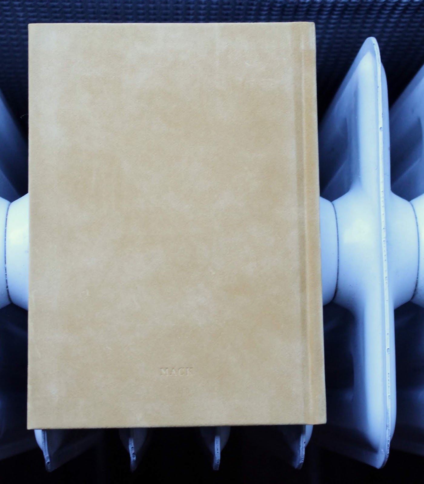
I wouldn’t normally mention the production quality of a book except in passing, but here it deserves a little more attention. Does Yellow Run Forever? has been very consciously constructed, with its gold coloured felt like cover and debossed lettering, gold marbled end papers (reminiscent of the almost abstract photographs of clouds in Graham’s 1994 project Ceasefire) and gold edging on the pages themselves. The combination of these three elements leaves the book hovering (rather like real gold) between opulence and tackiness, with only its diminutive size and the restraint of the photography helping it to avoid plunging into the latter. That said given gold isn’t the only topic at work here it’s questionable whether the design gives the viewer certain pre-expectations about the book’s subject that perhaps colours the way they subsequently interpret the photographs. Certainly for me there was an element of that.

Does Yellow Run Forever? is undeniably slight compared to some of Graham’s previous epic works like Troubled Land or New Europe, or the ambitious multi-volume Shimmer of Possibility. It’s also I think in some ways one of Graham’s least accessible works, which is a pity because part of why I’ve always admired his photography is his knack for making difficult topics and ideas relatively accessible but without being simplistic. That said it’s also a nice little volume, which rewards repeated contact. I don’t think it’s up to his usual standard, but at the stage Graham is at in his career I can forgive him a little abtruse indulgence.

Does Yellow Run Forever? is published by MACK.

Paul Graham: ‘Does Yellow Run Forever?’

“Senami, Shambhala, New Zealand” (2011), in Paul Graham’s show, organized by Pace and Pace/MacGill.Credit2014 Paul Graham, Pace Gallery and Pace/MacGill Gallery

By Karen Rosenberg
Sept. 25, 2014

A sentimental lyricism, with strong Romantic leanings, distinguishes Paul Graham’s latest show of photographs, organized by Pace and Pace/MacGill, from his social-documentary efforts. Here, his subjects include rainbow-streaked landscapes in western Ireland, pawnshop storefronts in New York’s rougher neighborhoods and tender portraits of a woman — the photographer’s partner — asleep in various rooms in New Zealand.

Mr. Graham sticks to his signature installation format, hanging prints of different sizes at varying heights. But as is rarely the case in his shows, the relationship between placement and content seems almost too obvious: The rainbows hang high on the wall, and the street views skirt the floor, with the sleepers sitting at roughly bed-height in between. The pictures of the sleeping woman, however, change the entire dynamic of the show: its emotional highs and lows, its contrast of Constable-esque countryside and urban grit. They are exceptionally lovely images, framing the sleeper’s graceful features with colorful blankets and reveling in the strange poses of deep slumber (arms swaddling head, back curling away from pillows). They give the pawnshops and rainbows a magical, somnolent quality, making them part of her dream world, even as they present their own dream of contentment.

PAUL GRAHAM
‘Does Yellow Run Forever?’
Pace
510 West 25th Street, Chelsea
Through Oct. 4

Paul Graham: Does Yellow Run Forever? @Pace and Pace/MacGill
By Richard B. Woodward / In Galleries / September 17, 2014

JTF (just the facts): A total of 20 color photographs, alternately framed in white/gold and unmatted, and hung against white walls at different heights (from floor level to above eye level) in a series of four interconnected gallery spaces (11 walls). The prints are a mix of pigment prints and c-prints mounted on Plexiglas (15 pigment prints, 5 c-prints), made between 2011 and 2014; the show includes 1 triptych and 1 diptych (all pigment prints). Physical sizes range from as small as 32 x 43 inches to as large as 63 ½ x 96 inches, and the prints are available in editions of 5+2AP. A monograph of this body of work was recently published by MACK Books (here); it is an austere 96-page hardcover catalog (7 7/8 x 5 5/8), with 31 color plates and no essay, priced at $50. This show has been jointly organized by Pace and Pace/MacGill, and is on view at the Pace space on West 25th Street; it is not on view at the Pace/MacGill space on East 57th Street.

Comments/Context: To display photographs of rainbows in a prominent  New York gallery, an artist today had better have a good explanation. Paul Graham never provides one in this sweet, nervy, if unduly hermetic show, but he has enough confidence in himself to make pictures of this Romantic cliché in the belief that we will follow the arc of his thought wherever it leads and ultimately feel rewarded.

Before the publication of A Shimmer of Possibility in 2007, he spoke of a wish to do with photographs what Chekhov did with words: to construct stories about ordinary people out of familiar elements, adhering to the tenets of realism while altering our preconceptions of its boundaries.

Does Yellow Run Forever? (a candidate for worst title of the year) seems to be asking us to fashion a love story from three ostensibly unrelated parts. The eleven different rainbows constitute the largest group of pictures here. Five portraits of his partner, Senami, asleep in bed, and four urban landscapes of pawnshop facades, emblazoned with signs advertising that they buy gold, are the other two subjects.

Each subject was photographed in a distinct place and style. The rainbows were observed in Ireland and all have wild, outdoor settings packed with clouds, mist, greenery, rocky hills. In one Claudean landscape a tree protrudes into the foreground beside a slate-gray body of water.

In the portraits of Senami, taken during a 2011 trip to New Zealand, she is covered in brightly colored sheets or a blanket, her dark face and arms the only visible parts of her. The rooms are plain, windowless, and she is angled into one or another corner. The pawnshops are pictured head-on. All are located in the outer boroughs of New York City, where the British-born Graham now lives.

How we choose to edit these three groups of pictures into a narrative is up to us. Graham offers no manual. The duality of yellow may be one theme. It represents both the “natural” warmth of the sun’s energy and, in a darker hue, the “crass” materialist substance of gold. As such, we can sense here the adventurous life of an artist invited to travel the world is engaged in a Wagnerian struggle with the responsibilities and burden of making a living back home in Manhattan.

Rainbows are full of symbolic resonance (they appear after the storm, signaling its end) and scientific wonder. Ethereal embodiments of the color spectrum, they depend on two properties of light, reflection and refraction, and were of special interest to Descartes and Newton, as well as the scholar-poet Goethe. They are also dazzling meteorological events—and sufficiently rare, like gold—that for seconds or minutes they can turn the head of almost anyone, no matter how rushed or jaded, toward the heaven. Like photographs, rainbows are both commonplace and deeply magical.

It is brave of Graham to gamble on these responses from us. It is also borderline foolhardy, as rainbows have been thoroughly exploited to make us feel good about dozens of commercial products, everything from Lucky Charms to Ben & Jerry’s discontinued ice-cream flavor Chubby Hubby. The rainbow is now politicized, as the symbol of gay marriage, not to mention as the name for Greenpeace’s environmental attack yacht and for Jesse Jackson’s defunct presidential organization. Maybe the only subjects that Graham might have chosen that would be riskier would be sunsets and unicorns.

What saves him in this case is the absence of irony and the space he has left around the pictures for interpretation. He wants to reclaim rainbows from their debased status and he almost succeeds because they aren’t the most precious subject of these pictures. Senami is. The show revolves around her sleeping head, leaving us to ask: Is she dreaming these images? Or is he? Or are we?

Collector’s POV: The works in this show are priced between $35000 to $65000 each. Graham’s work has surprisingly little consistent secondary market history, so gallery retail likely remains the best option for those collectors interested in following up.


zaterdag 28 juli 2018

Views & Reviews Sonne Mond und Sterne Ringier Annual Report 2007 Peter Fischli David Weiss Company Photography


Sonne, Mond und Sterne
Peter Fischli & David Weiss
Artist's book: a collection of advertisement photos, slogans and messages that constitute our contemporary media landscape.

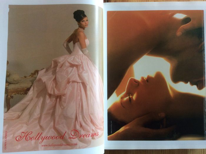
This artists’ book by the celebrated Swiss artist-duo gathers 800 images taken from worldwide magazine advertisements. Designed by NORM in close collaboration with the artists, the book, stemming from Fischli/Weiss’ contribution to the Ringier AG Annual Report 2007 (following Richard Prince's Jokes & Cartoons), is a very generous if slightly nauseating collection of photos, slogans, and messages that constitute our contemporary media landscape. Organized in loose categories, they plunge the reader in a flow of images whose commercial dimension recedes to let their (often unplanned) narrative qualities freely develop into an unlikely account of life’s journey.
Peter Fischli (born 1952 in Zurich) and David Weiss (born 1946 in Zurich, died on 27 April 2012) have been collaborating since 1979 on a body of work that humorously celebrates the sheer banality of everyday existence. Indebted to Dada, Surrealism, Pop Art, and Conceptual Art, utilising a variety of media including photography, film, video, artists' books, installation and sculpture, their work playfully ignores the traditional distinction between high and low art, while at the same time commenting on the human condition. Fischli & Weiss have represented Switzerland at the Venice Biennale several times during their career.

The sun, the moon, and the stars

This new artists' book by the celebrated Swiss artist-duo gathers 800 images inspired by magazine advertisements. Designed by NORM in close collaboration with the artists, the book, stemming from Fischli/Weiss' contribution to the Ringier AG Annual Report 2007, is a very generous if slightly nauseating collection of photos, slogans, and messages that constitute our contemporary media landscape. Organized in loose categories, they plunge the reader in a flow of images whose commercial dimension recedes to let their (often unplanned) narrative qualities freely develop into an unlikely account of life's journey.


Sonne, Mond und Sterne by Peter Fischli and David Weiss by 5B4


Seeing as North America's rampant unregulated free market-style of capitalism is collapsing in on itself, Fischili and Weiss' Sonne, Mond und Sterne (Sun, Moon and Stars) may serve as exhibit A when we finally step back and sift through the wreckage.

Sonne, Mond und Sterne is an 800 page artist book comprised of hundreds of magazine advertisements arranged loosely into a narrative of 20th and 21st century temptations. Unrelenting in its scale, their barrage approach is perfect for a subject as obnoxious as the continual bombardment we face to advertising. Originally conceived as a corporate annual report from Ringier AG for 2007, this volume was edited by Beatrix Ruf of the Kunsthalle Zurich.

I take this as proof of a society gone mad but I imagine Fischili and Weiss are too smart for such a simplistic reading. Their's seems to be an art of embracing the nature of the societies we have made, and I could guess that this collection is their scrapbook of pleasurable "ready-mades" that for them induce more of a wide grin than a grimace of horror. Deadly sins such as gluttony and greed can be both disgusting and desirable after all.

Sonne, Mond und Sterne
 is paperback and the size feels like a super heavy phone book. There are no accompanying texts or explanations of what it is or why it exists. It was published by JRP/Ringier of Zurich.

The promise of fulfilling needs (and creating new ones) is what advertising does best -- offering the idea of a more manageable life where convenience is a given and happiness is available right off the shelf. In short, promising the Sun, Moon and Stars at a good price.

Fischli & Weiss Shape the Ringier Annual Report 2007
Like the last ten editions of the Ringier Annual Report, the 2007 edition is also shaped by artists. With Peter Fischli and David Weiss; this time with two of Switzerland's most renowned contemporary artists.
Fischli/Weiss' moniker for this year's 840-page Ringier Annual Report, a rather hefty tome by any measure, is Sun, Moon and Stars. The title evokes nursery rhymes as well as the universe as a focus for our longing and desire to escape. In short, following their works dealing with the worldly, Sun, Moon and Stars is about what holds our world together. The encyclopedic element in all Fischli/Weiss pieces is just as evident in this Annual Report which is best described as an encyclopedia, obtained from hundreds of magazines, of the temptations and yearnings that mark contemporary life. The artists clearly consider print ads the most powerful embodiment of the economic principle and show their fascination with the never-ending flood of products in our lives that shape our very identities. They paired up 800 different ads and put them in an order that allows many interpretations - but tells no story.
About the Artists 
Swiss artists Peter Fischli, 55, and David Weiss, 61, creators of a wide-ranging oeuvre using photography, sculpture, installation and film as media, are important members of the international art world. Working as a team since 1979, their works frequently appear in the world's most prestigious institutions and collections, from New York's Guggenheim Museum and MoMA to the Walker Art Center in Minneapolis, Basel's Kunstmuseum, Museum Ludwig in Cologne and others. Their Flowers & Questions retrospective has been on tour since 2007, beginning at the Tate Modern, the Musée d'Art Moderne de la Ville de Paris and Zurich's Kunsthaus, is currently showing at Fondazione Nicola Trussardi in Milan, to go on to Deichtorhallen in Hamburg.
The two artists' works deal with aspects of our daily lives, what we feel and do during and off work, life in the suburbs, travel, beauty, horror and fear, events big and small, the favorite destinations of the common man. And how little our everyday lives and desires change, no matter how much we fight them. By examining the common sense that governs our plans and living conditions - similar no matter where we live - the artists reveal human frailties in understated fashion and with a slight wink, while poking fun at the pretensions rife in today's art world.
Fischli/Weiss toy with food (Sausage Series, 1979), build fragile sculptures from kitchen utensils (Equilibres - Quiet Afternoon, 1984-87), shoot self-portraits against sites around the world (Visible World, 1987-2000), ask profound questions while traveling the globe wearing rat and bear costumes, (The Least Resistance, 1980-81; The Right Way, 1982-83), commission polyurethane carvings of various objects (Polyurethane Sculptures, from 1983), and in Suddenly an Overview, depict in raw clay events, inventions and ideas that shaped the world. The questions that torture them are the same as everyone else's (Questions, 1981-2003) and they find beauty in the same things we all do (Flowers and Mushrooms, 1997-98). Often, their works feature what we consider playful and useless, at the same time giving us effective clichés about artists to bandy about, clichés that make mini-dramas out of freedom, obsessions, relativity, responsibilities and self-determination.
Ringier Group Communications

Ringier is the largest internationally operating Swiss media company, producing over 120 newspapers and magazines. It alsoruns printing plants, several radio and TV stations and well over 80 web and mobile platforms with a worldwide staff of approximately 8,000 employees. With its 180-year history, Ringier stands for a pioneering spirit and individuality as well as independence, freedom of expression and diversity of information. The company’s hallmarks are excellence in products, journalistic quality and exceptional entertainment. Founded in Switzerland in 1833, Ringier has been family run for five generations.

Buying into the Norm cosmos

The Swiss practice’s typefaces are quirky, oddly popular, and deceptively simple – also a critical response to neutrality

For Zurich-based graphic designers Norm, their career has been like a ride through the evolution of designer-friendly computer technology. But, while their founders claim to have been the first in their school to work with digital technology back in the early 1990s, they have resolutely stuck to designing for print, adopting type design as their medium for pushing the boundaries.
Your first point of contact is likely to be their website (www.norm.to). In an unprepossessing window, one word appears, lowercase, underlined, ‘norm’, rendered in Simple, the second of their four typefaces. Click on ‘norm’ and all hell breaks lose, with mini pop-up windows littering your screen.
‘I’m sorry about that website,’ says Manuel Krebs, one of the studio’s founding members, in a resigned tone that suggests he has moved on from that moment of playful anarchy. ‘We did that in 1999 when Flash was hot, and we programmed it; that was when you could make a website yourself. We had lots of time, no commissions.’ Krebs’s contrition signals more than simply an evolution in taste. ‘We love print, we’re not Web designers, we’re graphic designers for print, and typographers.’ . . .
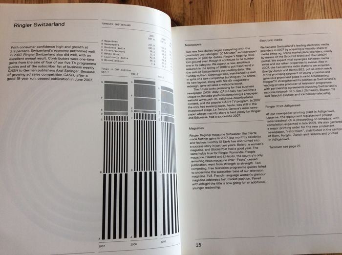
Norm comprises its founders, Manuel Krebs and Dimitri Bruni, both born in 1970, plus Ludovic Varon, who has worked with them for several years. Their work includes book designs for galleries, artists and some of Europe’s most discerning publishers, including Steidl, JRP Ringier, Die Gestalten Verlag and Tate Modern. They also regularly collaborate with the multimedia installation artists Peter Fischli and David Weiss (famed for their filmed experiment The Way Things Go), see p. on exhibitions and books. One such collaboration was the 2007 annual report for the Swiss media conglomerate Ringier AG, which every year invites artists to design its most important public document. In this no-nonsense monochromatic presentation, horizontal rules delineate the pages, with information graphics demarcated as graduated bands of black and white stripes, sitting perfectly within the grid, gently oscillating like an Op Art experiment. Norm reconfigured some of this material for Fischli and Weiss’s book, Sonne, Mond und Sterne (JRP Ringier, 2008), a hefty – 800 pages – flow of imagery, slogans and information. The designers are happy to rework elements, seeing it as an opportunity to perfect formats and rectify mistakes.
A cryptic Introduction
Krebs and Bruni met at the Schule für Gestaltung in Biel / Bienne, Switzerland, in 1991. ‘When we got to college, there was one computer. When we left in 1996, there were twenty . . . but we still designed by drawing one letter at a time, by hand,’ recalls Krebs (who speaks for the studio throughout this piece). ‘I remember a third-year student talking about Photoshop – “It’s too complicated, you’ll never be able to use it!” But we were really happy with technology. School was for research, we weren’t into commercial work.’
Aware that in ‘the real world’, designers such as Neville Brody and the Emigre circle were making ‘very basic’ typefaces, they started designing them too. ‘We’d make a new typeface for a flyer. You could do that then, you could make a pixel typeface in a day or two, constructing letters on a square; it was an okay solution, a thing of its time.’
Norm_03
They founded the studio on 1 January, 1999, after a brief and less than satisfactory period working separately in corporate identity and advertising (Bruni in Zurich and Krebs in Geneva), when they were always last in line, after the art director, creative director, head of the studio, and the client had had their say. In their words, their roles were reduced to ‘deciding whether to use Helvetica or Univers’.
Norm set up shop on Pfingstweidstrasse in Zurich, where their neighbours include Cornel Windlin and Stephan Müller, the founders of Lineto, which now distributes their typefaces and self-published books (lineto.com). Having ‘no commissions’, Krebs and Bruni produced their first self-initiated book in 2000. Part manifesto, part type specimen, Introduction – ‘this is us’ – showcased Normetica, their first commercially available typeface.
Introduction was ‘cryptic’, admits Krebs. ‘That wasn’t a strategy. We just did it, after talking about it for years [they had experimented with a magazine prototype when they were at college]. We can only self-publish if we develop the contents ourselves and are not in debt to any need to explain. The first book was cryptic because
we weren’t sure about it, and it’s easier to do something complicated than to be clear.’
Normetica (2000) displayed steadfast feet on the ‘i’ and a generous bucket to the ‘y’. Despite Norm’s claims to being ‘totally self-centred and self-focused’ when it comes to the designers’ own publishing projects, their typefaces are, by contrast, playfully pragmatic hinting at their useful nature by displaying a beguiling openness, thanks to the addition of ‘feet’, ‘hooks’ and ‘bowls’.
Fancy free
Norm’s second book, The Things (2002) – ‘this is our world’ – was a mash of graphs and diagrams, highlighted in process colours, with layers of information so thick and treacle-like they defy explanation, as Krebs admits. ‘We did the visuals first, then the writing and realised that didn’t work. By adding words, the visuals lost their impact.’ Like Introduction, they edited, published and produced it themselves, but this time approached Die Gestalten Verlag to handle the distribution (‘the investment of time is too big’).
The book may have been visually confused, but the accompanying typeface, Simple (2002), was not. It is monospaced, with similar family values to Normetica, and you could catch fish with the hook of the ‘r’, but its slimmed-down silhouette makes it more user-friendly than its predecessor. (Readers will note that Simple is the face used for the Eye Forum announcements.)
EYE_70_192RET2
When Ruedi Baur of Integral produced his successful pitch to design the signage for Cologne-Bonn airport, Simple was the type he specified. The idea, Krebs says, was to have ‘a very particular’ typeface that would identify the airport’s official communications within a crowded visual landscape. The problem was that a monospaced typeface could not work for such a complex commission, so Norm had to redesign it as a proportional typeface. The result, SimpleKoelnBonn (2003), is an almost completely new face; all the letters have been reshaped, with the exception of the ‘o’. Though the generous ledges have been reined in, this ‘corporate’ version is still quirky enough to stand out.
Slower off the grid
Replica (2008) is a very different animal. While Simple took three months to design, this typeface has taken almost as many years. Krebs puts this down to technology, and the way the means used to develop a typeface has an inordinate effect on the result. As the software has evolved, the look and functionality of typefaces has also changed, not least because of the requirements of Open Type faces, running to tens of thousands of characters. ‘Replica is a thing of its time, so it’s more sophisticated.’
Like Simple, Replica was conceived in tandem with a book project on the theme of ‘two-dimensional space’. This time, Norm adopted a more conventional approach, writing the words first, so that its argument would be clear. But although the book is yet to be designed, the typeface has already been launched.
While ‘test driving’ Replica on live projects, Norm recognised that the early ‘more standard’ version had ‘no key reason for being unique’, so they set about finding one. ‘We wanted to make a “virgin” typeface – not a variation on a theme but a new Grotesk,’ says Krebs.
Technology was the key. While FontLab Studio – the preferred tool for today’s typeface designers – is an incredibly sophisticated program, Krebs and Bruni argue that its underlying grid structure is too prescriptive. Going against the received wisdom that the finer the grid, the more choice and flexibility the designer enjoys, ‘we decided to create an opposition to technology, by restricting the number of grid lines we draw with, using only every tenth line’. This offered the possibility of creating a typeface that was both universally functional and had enough eccentric characteristics to be recognised alongside similar Grotesks and in the wider chaos of our crowded typographic landscape.
Norm’s solution was two-fold: the same diagonal bevels were used for both inside and outside joints – ‘Print technology is so good these days you don’t have to worry about ink traps’ – and the designers made vertical cuts on all the diagonal lines so you can set it ‘really tight’.
And the name? Again, two distinct reasons: ‘From afar, the typeface looks familiar – a replica – but close up you can see it’s something new,’ says Krebs. ‘Also, the French word ‘réplique’ means a harsh answer, and this is a réplique to Helvetica, Univers and Unica.’
Cornel Windlin, who works closely with Norm to bring the studio’s typefaces to a wider audience, sees the advantage of creating ‘quirky’ typefaces, however deceptively simple. ‘Each of Norm’s typefaces is popular, which is unusual, as
quirky does not usually sell. But people seem to buy into the ideology of “Norm-ness”. The fonts may be limited in some respects, but we have reached an audience that appreciates those limitations as enriching.’
Replica may be more problematic, though, as its ‘quirks’ become obvious only when used at larger sizes. At text size, all Grotesks and sans serifs are prone to overcrowding and bad spacing, and need to be handled with care. But while no typeface designer can totally mitigate misuse, the two special features of Replica, the diagonal bevel and the vertically cut diagonal stroke, address the most glaring issues to afflict such typefaces: the variations in letter width that are obvious at smaller sizes, and the ungainly bites out of joints at larger sizes.
Nearly normal?
Making something unique but universal in a cultural climate that strives for novelty and declares that everything is possible, is a daunting prospect. By embracing technological invention without being dictated to, Norm’s designers have found their own method for dealing with those endless possibilities. ‘We narrow the fields of what is possible,’ says Krebs, unabashedly.
For Norm, it is all about standards, parameters and templates, setting them and pushing against them, to discover creativity and innovation within a set of limits, by way of repetition and constant refining.
Windlin has observed that method at work: ‘They are clearly working on creating their own Norm cosmos, which has its own sets of rules and preferences. Their fonts are an important part of their aesthetic, and they always have a clear reason to do things the way they do. They’re meticulous about their typefaces . . . to the point of obsessive compulsion.’

Peter Fischli & David Weiss. 'Sonne, Mond und Sterne'

Het nieuwe werk van het Zwitserse kunstenaarsduo Peter Fischli & David Weiss is een omvangrijk boek. Het bestaat uit achthonderd kleurige advertenties op evenveel grote bladzijden. Fischli & Weiss knipten of scheurden de reclamepagina’s voorzichtig uit West-Europese tijdschriften en brachten ze samen in de nieuwe gebonden schikking van Sonne, Mond und Sterne. Tekst of toelichting wordt er niet gegeven. Na een typografische, donkere cover volgt een witte pagina, en dan de eerste advertentie, voor “Mallorca’s first private residence resort”: een glimlachende vrouw in een witte jurk zweeft boven het blauwe wateroppervlak, een glas wijn in haar rechterhand. Een lichte zon – of is het de maan? – gaat nog net niet onder in een donkerblauwe hemel. De begeleidende tekst kan als motto dienstdoen bij Sonne, Mond und Sterne – en bij de problemen van de westerse wereld: “I’ve been privileged to have tasted the finest food and wines in the world. Now, my biggest luxury is ignoring all this if I choose.”

Wat geenszins kan worden genegeerd, is het auteurswerk dat Fischli & Weiss verricht hebben bij het samenstellen van dit boek. Van willekeur in de volgorde van de advertenties is er nergens sprake. Uit dezacht suizende white noise die het doorbladeren van magazines veroorzaakt, vormen zich hier al snel melodieën; die melodieën zijn de thema’s van Sonne, Mond und Sterne en het zijn de doelwitten van het leven in de 21ste eeuw. Nagenoeg overal staat de vrouw en haar lichaam centraal, maar wat zo’n vrouw kan teweegbrengen is opmerkelijk divers, hoewel het sinds Madame Bovary misschien niet eens is veranderd. Al op de vijfde advertentie prijkt een jonge bruid, en de huwelijkstaferelen blijven volgen. De start van Sonne, Mond und Sterne is dus de productie van een koppel. De rest van het boek maakt aannemelijk dat de verbinding tussen man en vrouw nog steeds de motor vormt van alles wat er in onze westerse wereld gebeurt – of althans: van alles wat geld zou kunnen opbrengen en waarvoor dus reclame moet worden gemaakt. Zwangerschap, babyproducten, speelgoed, tienerspelletjes, sport, snelheid, lichaamsverzorging, juwelen, kledij, accessoires en meubelstukken, reizen, vliegtuigen, auto’s, computerspelletjes, pistolen, jachtgerei, voedsel, delicatessen en drank. Fischli & Weiss hebben geen nieuwe productcategorieën bedacht en ze hebben die categorieën ook niet in een revolutionaire volgorde geplaatst. Ontsnappen aan de verhalen die onze verlangens vertellen – of die ons worden ingefluisterd door de verlangens van de commercie – lijkt niet mogelijk. Want wie kan met volle overtuiging zeggen dat hij of zij niet graag een koppel zou vormen of geen baby wil of niet houdt van een mooi lichaam of geen lange tweeloop wil hanteren of niet graag lekker eet? Wie bezit werkelijk de luxe om die objectieven te negeren? En is het erg om in de eerste plaats gelukkig te zijn omdat men in de eerste plaats een succesvolle consument is?

De thematische categorieën van Sonne, Mond und Sterne werken dus nagenoeg documentair. Een kritische narrativiteit lijkt onmogelijk, tenminste als advertenties en wat ze aanprijzen de bouwstoffen vormen. De stijl die Fischli & Weiss hanteren, zeg maar op het niveau van de pagina, als romanciers op het niveau van de zin, werkt echter wel degelijk ironiserend of bekritiserend. Dat blijkt bijvoorbeeld als twee advertenties, links en rechts in het boek, een enigszins pervers huwelijk met elkaar aangaan door vormelijk of inhoudelijk naar elkaar te verwijzen. Een advertentie voor het nieuwe album van Britney Spears… voorafgegaan door een knalgele papegaai. Een biefstuk met dauphin gratinois… gevolgd door een bikinibabe bij het zwembad. Een flatscreentelevisie… met ernaast een vlakke, flinterdunne open haard. Een man in maatpak kijkt vooruit naar de volgende pagina… waarop een vrouw in zwart negligé op een loopband net niet in slaap valt. De donkere huid van een vrouwelijke mannequin… weerspiegeld in het ebbenhout van een keukenensemble. Enzovoort. Als het dan zo is dat we in het waterdichte kapitalisme allemaal hetzelfde leven moeten leven, dan is het toch mogelijk om op gerichte wijze niet helemaal geleefd te worden – dankzij details, kleine subversies en bewuste ironie.

Toch is er in Sonne, Mond und Sterne meer aan de hand dan de zoveelste vorm van bescheiden verzet – of van de apologie van het kapitalisme door het kritiserend of ironiserend tonen van de deugden en ondeugden ervan. Er is vooreerst die mysterieuze titel – de zon, de maan en de sterren. Dat verwijst natuurlijk naar het belang van kunstmanen of satellieten in het inrichten van een mensenleven, waarbij navigeren een centrale activiteit is. Er is echter meer: Sonne, Mond und Sterne is een gekende frase die opduikt in vele Duitstalige kinderliedjes die worden gezongen op de feestdag van Sint-Maarten. Op Martinstag wordt de heilige herdacht die zijn mantel aan de armen gaf. Kinderen lopen in processie met lantaarntjes en snoepgoed rond, terwijl ze zingen van “Laterne, Laterne/Sonne, Mond und Sterne/ brenne auf mein Licht/brenne auf mein Licht/aber nur meine liebe Laterne nicht”. Hun ouders geven “einige Krümel vom reichgedeckten Tisch” aan de armen en de arbeiders. Zo was het althans vroeger. Sinds een dertigtal jaar is Martinstag het officiële begin van het eindejaarsshoppen. Vele kruimels vallen daarbij niet meer van tafel. De parade van kunstmatige lichtjes die de duisternis van de wereld verhinderen, blijft eeuwig aan de gang.

Tot slot is er de verschijningsvorm van dit wonderlijke kunstenaarsboek. Sonne, Mond und Sterne is in twee vormen beschikbaar – en dat is essentieel voor een werk waarin alles als een boek naar twee kanten openvalt. Als kunstenaarspublicatie is het uitgegeven bij de kleine uitgeverij JRP Ringier, die het omvangrijke werk distribueert aan 50 euro. Het volle pakket, 800 bladzijden, zit echter ook in het gratis te verkrijgen jaarverslag 2007 van het Zwitserse mediaconcern Ringier (dat JRP Ringier overvleugelt). Dit familiebedrijf probeert al jaren een monopolie te verwerven op alle tijdschriften en kranten in de Duitstalige wereld. Voorheen werden de financiële verslagen van Ringier uitgegeven met bijgevoegde kunst van bijvoorbeeld Richard Prince, Matt Mullican of Liam Gillick. Fischli & Weiss schuiven zichzelf met Sonne, Mond und Sterne als een paard van Troje, beladen met splinterbommen, naar binnen in de bedrijfslogica van Ringier – of van de commerciële pers in het algemeen. Zoals ze dat eerder deden met hun gesimuleerde readymades in het museum, zoals ze vorig jaar met Flowers & Questions een revolutionair concept van de oeuvrecatalogus presenteerden, zo zetten ze met dit werk de logica van het artistieke kijkboek op scherp. Zo apocalyptisch én feestelijk tegelijk als in Sonne, Mond und Sterne is het gelukkige leven in het westen nog niet eerder voorgesteld.

• Peter Fischli & David Weiss, Sonne, Mond und Sterne,  Zürich, JRP|Ringier Kunstverlag, 2008, (www.jrp-ringier.com). ISBN 9783905829419.