 |
| Martien Coppens Impressies 1945 |
COPPENS, MARTIEN - Impressies 1945 - Geteisterd Nederland
Eindhoven, De Pelgrim. 1947, 35x25cm.
Martin Parr and Gerry Badger : The Photobook: A History volume 1/ Memory and Reconstruction : The Postwar European Photobook
Martien Coppens was responsible for a number of topographical photobooks during the 1930s and 1940s, documenting the architecture, landscape and art of his native Brabant. These were in a similar vein to the Publishing house Contact's De Schoonheid van ons Land (Our beatiful Country), showing a comparable focus on the cultural heritage of Holland. As the title of Contact's series implies, the kind of photography employed was traditional, large-format, topographically precise, with an emphasis on the picturesque, on heritage and continuity rather than change.It was this kind of rhetoric that was employed by Coppens for his 1947 book Impressies 1945 (Impressions 1945), but his subject was radically different. He still concentrated on the Dutch landscape and architectural heritage, and photographed it in his usual romantic style, but now his theme was the Dutch heritage interrupted by the discontinuities and disruption of war. He chose the lighting carefully, often a combination of sun and cloud that would allow him to set a ruin picked out by sunlight against a glowering, cloudy sky. Add luscious gravure printing, and Coppens's ruins look less like real buildings than stage sets. In all of his work, and in this book in particular, Coppens opposed the prevailing trend in Dutch photography of the time, which was progressing towards a gritty, Existensial realism, and he was criticized for it by other photographers.Coppens, who habitually dealt in nostalgia, photographed this devastated landscape in the only way he knew, even exaggerating the romantic rhetoric of the ruin. But like Jean Cocteau and Pierre Jahan in La Mort et la statues, Coppens demonstrated that there were many different ways in which artists and photographers could come to terms with what had happened to Europe.
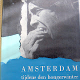 |
| Amsterdam tijdens den hongerwinter |
Amsterdam tijdens de hongerwinter.
Amsterdam / De Bezige Bij/ Uitgeverij Contact / 1947 / First edition / 72 p. / cb. in wrappers / b&w photographs / NN / Buch / Zeitgeschichte, Zweiter Weltkrieg - Photographie - Anthologie - Nederland, Niederlande, Amsterdam - 20. Jahrh. - Andriesse, Emmy - Blazer, Carel - Breyer, Charles - Oorthuys, Cas - Taconis, Kryn - Windig, Ad
Amsterdam tijdens de hongerwinter by Martin Parr and Gerry Badger in : The Photobook: A History volume I The book was published two years after the liberation of Holland from the Nazis. It marks both an end and a beginning. When it was published, the leading members of the Underground Camera group, like the country, were about to move on. As members of a new group, GKf, most of them took part in the exhibition 'Foto'48'. Amsterdam tijdens de hongerwinter looked back, while 'Foto'48' looked forward, but both shared a manifesto that made a passionate plea for an anti-formalist documentary photography that would help forge a more just and free Holland, following the occupation.
Thus this not simply a book remembering and commemorating Amsterdam's dreadful winter of 1944-5, but also a political rallying cry for the future. As the journalist Max Nord wrote in the book's introduction: 'Was it not those times that we dreamed our most beautiful dreams?...While uniformed Germans marched along Amsterdam's canals, their clipped songs resounding past the overcrowed prisons, we had a clear vision of the most perfect freedom.'
Nevertheless, the publication's first task was to bear witness, as photographers like Cas Oorthuys and Emmy Andriesse knew when they made these pictures, often at some risk. The story told is of extreme hardship - hunger, poverty and cold. People stand in food queues of search desperately for firewood, while others lie dead or dying on the streets. But, it also showed resilience and resistance: the forging of identity cards, the printing of underground magazines. Much of the book is shot in a style that could be ragarded as the opposite of formalist - not exactly anti-formalist, but a mode where the primary considerartion was getting the picture, no matter how out-of-focus or blurred it might have been. This snatched, off-kilter approach generated an immediate, spontaneous aesthetic of its own, which fed directly into postwar Dutch photography in an extremely positive way. So this was an important book in that sense also. It was a landmark publication by a group of photographers with both an ethical and an aesthetic attitude, a group who would exert a great influence on Dutch photography and the Dutch photobook in the late 1940s and 50s.
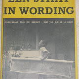 |
| Cas Oorthuys Staat in wording 2006_02_27 |
OORTHUYS Cas, texte d'Albert de la Court. Een Staat in Wording.
Uitgeverij Contact, Amsterdam. 1947. Original edition, 1st printing of this rare documentation covering the history of the Dutch colony, after the capitulation of the Japanese army 1945, the liberation of Indonesia 1947, wonderfully presented with a rich collection of b&w photographs by the noted Dutch photographer Cas Oorthuys. Hard cover, 8vo, 24.5 x 17cm, bound in brown boards with illustrated dust jacket. Unpaginated, ca. 122 pages, 4pp. text in Dutch followed by numerous images reproduced in gravure.
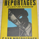 |
| Emile van Moerkerken Reportages in licht schaduw |
Folio, unpaginated, 106 photographic plates. Green printed cloth with original illustrated wrappers. With portraits of E. du Perron, Menno ter Braak, S. Vestdijk, Andre Gide, Paul Leautaud, Henry de Montherlant, Brassai, Carel Willink, portraits of women and examples of his ‘surrealistic’ photography.
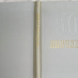 |
| Carel Blazer Bruynzeel 50 Jaar 1897 1947 |
50 jaar Bruynzeel 1897-1947. [Text M. Redeke [Maurits Dekker] (firm's history). Photography Carel Blazer, Eva Besnyö. Illustrations, Layout: Jan Bons, Jaap Penraat].
Zaandam / 1947 / 130 p. / hb. / 33x26cm / 154 b&w photographs, in opdracht en uit bedrijfsarchief / bedrijfsreportage, documentaire foto's / productieproces, ontspanning, opleiding). - Ill. 20 color / schematische ontwerptekeningen en komische pentekeningen. / NN / Firmenschrift / Wirtschaft, Firmengeschichte - Photographie - Anthologie - Auftragsphotographie, commissioned photography - Nederland, Niederlande - 20. Jahrh. / Printed by Firma L. van Leer en Co, Amsterdam (offset). - Opdrachtgever: C. Bruynzeel & Zonen (50-jarig bestaan). - Voorloper van bedrijfsfotoboek met kenmerken van beeldverhaal. De indeling van het boek is thematisch, naar type eindproduct. In het laatste hoofdstuk is aandacht voor de sociaal-maatschappelijke kant van het bedrijf. De fabriek wordt metaforisch voorgesteld als een levend organisme.
An excerpt from "The Photobook: A History, Volume 2" by Martin Parr and Gerry Badger: "Almost as much as the Soviet propaganda books of the 1930s, postwar Dutch photobooks were total products. That is to say, the photographers were often just part of a larger team that included writers and graphic designers, with no single element having prominence over another.This was particularly true of company books in the 1950s and 1960s, but the trend was apparent even by the late 1940s, as seen in this fine early example of the way Dutch graphic designers eagerly grasped the opportunities that had been cut short by World War II. The photographer for 50 Jaar Bruynzeel was Carel Blazer, a leading light in the 'Underground Camera' and the radical GKf Group of documentary photographers. As such, and as a member of the Dutch Communist Party, his involvement in the production of a commercial company book may seem contradictory, but apart from the obvious reason of making a living, reconstruction was the main priority in postwar Holland, and as Bruynzeel was a timber and building products company, commerce and communism had overriding motives in common. Blazer's pictures are stolidly conventional in any case; the book's radicalism lies in its design, and the way in which the images are incorporated into the total graphic package.As is typical of many company books of the period, [this book's] ideological message presents man and machine as two aspects of a single entity. The complicated services and communications systems of the factory are compared to the human body with its arterial and neurological systems. In a famous double-page spread, ducting and pipes look like arteries or nerves, either feeding or cleaning the body corporate." (Martin Parr & Gerry Badger).


Geen opmerkingen:
Een reactie posten