donderdag 27 maart 2014

Photographic Works Ruud van Empel Photography


Ruud van Empel

15 februari t/m 8 juni 2014
After a successful world tour, the work of artist Ruud van Empel is now to be exhibited for the first time in Brabant: thirty superb photographic works including four new ones from 2013 and an immense wall filling print featuring Van Empel's preliminary sketches. Eleven of the displayed photographic works have never previously been seen in the Netherlands.
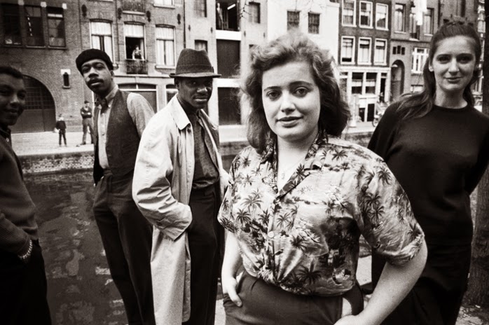
Ruud van Empel (Breda 1958) is one of the most extraordinary artists of the moment. He composes spectacular digital photo collages using a technique he developed himself. We see people - often children - and landscapes in an aura of innocence and vulnerability. Beauty and identity are also important themes in his work. Van Empel's works seem like photos but with closer examination a feeling arises that there is more going on than meets the eye: unsurprisingly as these are self-constructed wonder worlds. He first makes pencil sketches of the scene he has in mind and then photographs models in his studio. Finally, at the computer - using hundreds of loose details and with the greatest precision - he designs a completely new picture. Details of the original models appear only as fragments.

Van Empels werk is mooi. Te mooi
Door  DONDERDAG 27 MAART 2014 
Hij heeft bepaald niet te klagen over aandacht. De Bredase fotograaf Ruud van Empel (1958) viert de komende maanden met een overzicht in het Noordbrabants Museum in Den Bosch de afsluiting van een succesvolle internationale tournee. Zijn werk gaat als warme broodjes over de toonbank bij internationale galeries, veilinghuizen en op beurzen.
Van Empel is opgeleid als grafisch vormgever. In een tijd dat het modernistische principe van less is more in de kunst de toon aangeeft, ontwikkelt hij zich in tegenovergestelde richting: kitsch met een knipoog. Geen wonder dat hij zich als een vis in het water voelt als stilist bij de jeugdserie van Theo & Thea die tussen 1985 en 1989 heel Nederland aan de buis kluistert.
Maar de autonome kunst trekt, en vooral de digitale techniek die eind jaren tachtig in de kinderschoenen staat. Van Empels eerste schreden op dit pad worden gevormd door een nog steeds prachtige, aan surrealistische collages herinnerende serie The Office(vanaf 1995). In Den Bosch zijn twee ‘bureaus’ uit deze serie te zien: de ene, uit 2001, toont een man, verzwolgen door camera’s en lampen. De andere, uit hetzelfde jaar, toont een man, omgeven door eindeloze rijen van knopen in alle kleuren en maten. Beide mannen zijn gekleed in tot in de puntjes verzorgde kostuums. Beide foto’s zijn behalve mooi ook ademstokkend. De geënsceneerde schoonheid waarmee de mannen zijn omringd, is als een strop die steeds strakker wordt getrokken.
Die strop is sindsdien het uitgangspunt voor Van Empel. Het is zijn handelsmerk geworden, dat – zo blijkt op de tentoonstelling in Den Bosch – inmiddels behoorlijk wat slijtageplekken vertoont. In wisselende series als Moon, World, of Brothers and Sisters voert Van Empel een jeugdland ten tonele waar nimfachtige jongens en meisjes vaak in jarenvijftigkleding tussen groen struweel staan of liggen. Soms drijven ze in een vijver. Zowel de kleren als de kinderen zelf zijn onwerkelijk mooi en schoon. Geen pukkel ontsiert een wang, geen blauwe plek een blote arm. Dat kan ook niet anders, want alles – van wenkbrauw tot onderlip – komt uit de digitale plak- en knipdoos. Iedere gestalte is opgebouwd uit duizenden fragmenten van foto’s. Smelten we bij de aanblik van grote reeënogen? Dan neemt Van Empel de ogen van de één en plaatst die in het hoofd van de ander. Verdwijnen we in oceanisch blauwe irissen? Dan verandert Van Empel de kleur van de ogen van een jong meisje in ijl blauw, even blauw als het water van de vijver waarin het meisje zwemt.
De overduidelijke kunstmatigheid van de afbeelding veroorzaakt een licht schurend gevoel bij de kijker. Want natuurlijk weten we beter en is de kindertijd in werkelijkheid helemaal niet zo perfect. Nieuw is die notie niet – zeker niet in de kunst. Verontrustend is ze evenmin. Daarvoor zijn de fotowerken te esthetisch en is hun idioom te voor de hand liggend. Nee, als dit overzicht iets duidelijk maakt, dan is het dat Van Empel hard toe is aan een moedige stap het onbekende tegemoet.


2703kunempel2.jpg


Zondag volgens Ruud van Empel: Sunday #4, 2012, 70×50 cm.
 
Courtesy: Flatland Gallery, Amsterdam


woensdag 26 maart 2014

Dutch Notable Photobooks by Martin Parr & Gerry Badger THE PHOTOBOOK: A HISTORY VOLUME III

The Photobook: A History Volume III: by Martin Parr and Gerry Badger

PAT PADUA MARCH 13, 2014 0
photobook3
Rating: 4.5/5 ★★★★½ 

Martin Parr and Gerry Badger’s ambitious series The Photobook: A History is a blessing and a curse. These are essential reference books for anyone interested in photography, and especially for the photobook collector. The volumes include titles that the seasoned collector may well own—I am lucky to have books from each volume in my own photobook library. But watch your checkbook.
 Parr and Badger’s subjective histories potentially send the acquisitive personality on a hunt for elusive, pricy books they may have heard of but can’t afford, or that amazing Dutch or Japanese photobook they never knew existed. Get out your credit cards, or if you’re lucky, your library card.
The doorstopper tomes each feature a few hundred photobooks. Parr is himself the author of some, one of which, The Non-Conformists, I reviewed here last year. Parr and critic Gerry Badger select the books for inclusion in each volume, and Badger contributes text that puts the book into historical context. The text can be dry, but what you come for is the photography, artful covers and selected page-spreads laid out in tantalizing miniature, with detailed publication information to aid your acquisitive fever.
The first volume of Parr and Badger’s survey was published in 2004. In the 10 years since, the market has changed. The latest volume continues the historical survey with important post-war books left out of previous volumes, but the emphasis is on the contemporary photobook. If you follow these trends at all, you will recognize titles that reflect the state of the collector’s market.
And what a market! Photobooks are frequently published in runs of a few hundred copies, if that. When that first printing is gone, prices can skyrocket. I still think about the handful of times I had a chance to buy Cristina DeMiddel’s The Afronauts, first at its original cost of $40, then as the asking price went to three figures and finally a limited edition that was out of my budget at $250. Last I checked, that limited edition goes for $5,000 and up, for a book whose thousand copies went on sale in spring 2012 and fetched high prices in a matter of months.
The contemporary photobook is an art object and an investment, edutainment and fetish. DeMiddel’s book is one of the recent titles featured in Volume III’s final section, called “Cannibalizing Photography: Representing and Re-Presenting the Medium.” The chapter covers one of the most exciting developments in the medium, the rise of collections of found and repurposed photography. Such collections can shift the emphasis in a photobook away from the photographer to the editor. Volume III represents one of the most inventive editors, Erik Kessels, with a title from his series In Almost Every Picture, which takes the vernacular photo trend to a new level. These books take the kind of photos you find at flea markets, not as discrete snapshots but as an entire body of work, as in the volume of souvenir photos made at a Montreal restaurant in which patrons had their picture taken feeding a piglet out of a milk bottle.
The Photobook: A History Volume III is such a dense tome that I could write a full review about every chapter. The authors divide it into sections on Propaganda (also covered in Volume 1), Protest, Desire and other themes, with the caveat that a book may well fit into more than one category. The fluid categories lend an element of surprise to a narrative that doesn’t follow a straight line. The chapter on Propaganda encompasses the kind of political works you expect, but also includes a meat catalog from Czechoslovakia as well as a book promoting tourism in Marienbad, in which clever design combines with ordinary images to make a book that sings.
This is a theme that comes up again and again: a good photobook is more than a collection of good photographs. A fully-realized book marries design, image and text into a coherent narrative that is a work of art in its own right.
This volume, and perhaps the series, ends with a look to the future of photography: Google Street View. Doug Rickard poured through terabytes worth of street view images to put together his 2010 book A New American Picture. Rickard used this anonymous technology to capture the life of the underprivileged in America, and selected images that referenced the work of classic street photographers.
Throughout The Photobook: A History Volume III, Parr and Badger note the rise of Flickr and Facebook, and the seemingly bottomless pit of photography online. The challenge of the photobook consumer and creator is more than just sorting out one’s own aesthetic, but making sense of the image saturation that we face on a daily basis.
Physical books that expand the form, like The Afronauts, continue to appear, but that elusive book points to another direction for the future, one that the authors allude to but do not select for inclusion. DeMiddel’s highly collectable book has since been released in an affordable iPad version. But if a digital experience is what you want, what are you doing with this hardcopy contender that weighs in at over five pounds? The audience for this book, bibliophile and photographer alike, already knows they want it. I’m just going to confirm that they need it.

Actueel | 24 maart 2014 | Door: 

Groot aantal Nederlandse fotoboeken in Volume III van Parr/Badger

In het zojuist verschenen derde deel van The Photobook: A History staan net als in de eerste twee delen van dit internationale standaardwerk over fotoboeken 22 titels van Nederlandse fotografen en ontwerpers.


Samenstellers Gerry Badger en Martin Parr richten zich in Volume III van hun gezaghebbende overzicht op de periode vanaf de Tweede Wereldoorlog. Op een bepaalde manier is dit boek een uitwerking van het hoofdstuk ‘Modern Life’ uit Volume II, aldus Badger en Parr. Volume I verscheen in 2004, Volume II in 2006.
In de drie delen worden meer dan 700 titels getoond en beschreven. De publicatie van deze overzichten sloot aan bij de wereldwijd groeiende populariteit van het fotoboek. De eerste twee delen zijn invloedrijke naslagwerken geworden. Zo leidde opname van titels inThe Photobook vaak tot grotere verkopen en stijgende prijzen. Dat zal voor Volume III vast niet anders zijn.
Een opsomming van de in Volume III opgenomen boeken van Nederlandse fotografen en ontwerpers:
• Blauwe Maandag, 1975, verschillende fotografen, over de Nieuwmarktrellen, ontwerp Albert Blitz en Loe van Nimwegen


• The Virgin Sperm Dancer, 1972, Anna Beeke, ontwerp Anton Beeke
• Bisnisjongens/On the Game, 2006, Rob Philip, ontwerp Ineke Teeninga
• Communism and Cowgirls, 2004, Rob Hornstra, ontwerp De Russen


• What we Wear, 2011, Pieter van den Boogert, ontwerp Heijdens Karwei


 How Terry Likes His Coffee, 2010, Florian van Roekel, ontwerp Sybren Kuiper

Florian Van Roekel // How Terry Likes His Coffee from haveanicebook on Vimeo.

• De Politiekapel van Suriname, 2010, Sara Blokland, ontwerp Willem van Zoetendaal
 Empty Bottles, 2007, WassinkLundgren, ontwerp Kummer + Herrman


• Gomorrah Girl, 2011, Valerio Spada, ontwerp Sybren Kuiper
• Interrogations, 2011, Donald Weber, ontwerp Heijdens Karwei, uitgave Schilt Publishing
• Olifantenpaadjes, 2001, Jan-Dirk van den Burg, ontwerp Erik Kessels
• Go No Go, 2003, Ad van Denderen, ontwerp Roelof Mulder


• Baghdad Calling, 2008, Geert van Kesteren, ontwerp Mevis en Van Deursen
• Black Passport, 2009, Stanley Greene, ontwerp Heijdens Karwei, uitgave Schilt Publishing


• Infidel, 2010, Tim Hetherington, ontwerp Heijdens Karwei
• Concresco, 2012, David Galjaard, ontwerp Katie McGonigal
 Retrieved, 2011, Charlotte Dumas, ontwerp Tessa van der Waals
• Sochi Singers, 2012, Rob Hornstra en Arnold van Bruggen, ontwerp Kummer + Herrman
• Flamboya, 2009, Viviane Sassen, ontwerp SYB
In Almost Every Picture IV, 2005, verzameld en ontworpen door Erik Kessels
• Lang zal ze leven/Happy Birthday, 2011, Anouk Kruithof


• In de krant, 1978, Hans Eykelboom


• Portraits and Cameras 1949-2009, 2009, Hans Eykelboom
photoq-bookshop-parr-badger-III-cover-43

dinsdag 25 maart 2014

Mr Barack Obama What you have missed in Amsterdam Report #6 Theo Niekus Street Photography


Photomagazine Report #6 Theo Niekus

Theo Niekus, one of Holland’s great street photographers and author of “Damrak” and “Passengers” began publishing “Report” in 2009. This magazine format monograph is a vibrant collection of street photographs. The images are printed full page without text. Each issue individually continues the series of Theo Niekus’ street photography, a life’s work. Report was originally inspired by Reportage magazine by Menno van der Koppel and Colin Jacobson, and Daido Moriyama’s equally tireless street photography photozine “Record”. Each issue is printed on a small print run of just 500 copies, each stamped on the back cover with its individual copy number.

De straat op! Drie Amsterdamse straatfotografen
Van 6 juni t/m 21 september is De straat op! Drie Amsterdamse straatfotografen te zien in de centrale hal van het Stadsarchief, met recent werk van Hans Eijkelboom, Reinier Gerritsen en Theo Niekus.


De natuurlijke habitat van de straatfotograaf is de grote stad. Hij of zij zoekt plekken waar de interactie tussen mensen maximaal is, waar inwoners, middenstanders, dienstverleners, bezoekers, reizigers en toeristen zich mengen en het straatbeeld bepalen. Vooral in het centrum van de grote stad leven mensen met verschillende sociale achtergronden dicht op elkaar en komen elkaar dagelijks tegen op straat. In Amsterdam ligt het werkterrein van de straatfotograaf rondom het oude centrum. Dat gold voor Ed van der Elsken en dat geldt voor Hans Eijkelboom, Reinier Gerritsen en Theo Niekus.


zondag 23 maart 2014

Coming soon Amsterdam! Old Photographs 1947-1970 Design Anthon Beeke Collectief Ed van der Elsken Photography


Amsterdam! (ENG)

Old Photographs 1947-1970
Ed van der Elsken

'My Amsterdam. My Amsterdammers.' That's what Ed van der Elsken wanted to capture, preferably in close shots. 'People from decent neighborhoods: Nieuwmarkt, the Jewish quarter, De Pijp, Kattenburg. People who never make it over to Apollolaan or to the ritzy Goudkust... well maybe as a milkman, or as a burglar.'

Ed van der Elsken liked commotion, action. He photographed demonstrations, markets, fairs, traffic. But also workmen, rebellious young people and beautiful girls. And the 'mean, boorish cops' who often took drastic measures during riots. The photographs taken in 'his city' between 1947 and 1970 were compiled in the book Amsterdam!, the first edition of which was published in 1979. His innovative style has made this book a classic. Now it is being republished. New scans of all the original negatives have been made for this, and the resulting photographs are more beautiful than ever.

Ed van der Elsken (1925-1990) was a photographer and filmmaker who managed to find huge delight in ordinary people and scenes. His photographs instantly convey what life, to him, was about: courage, individualism and freedom. He published more than twenty books of photographs, including Een liefdesgeschiedenis in Saint Germain des Prés (Love on the Left Bank) (1956), Eye Love You (1977) and Parijs! Foto's 1950-1954 (Paris! Photographs 1950-1954) (1981). 

The book will be ready at the end of May 2014. Order your copy in advance.

240 pages
29 x 30 cm
260 photographs
design Anthon Beeke Collectief
English edition of the famous photo book Amsterdam! by Ed van der Elsken
Published in cooperation with Top Notch and Lecturis


Amsterdam! Ed van der Elsken (Vanaf 6 juni)

Mijn Amsterdammers. Vaak gabbertjes, waar je „Ha die ome Sjaak” tegen zegt, of „Tante Nel!”, of „Hee, ouwe ruigpoot”, of „Dag moppie”. Ed van der Elsken in zijn fotoboek Amsterdam! Oude foto’s 1947-1970

Tentoonstelling

Van 6 juni t/m 14 september is de tentoon stelling Amster dam! Ed van der Elsken, oude foto’s 1947-1970 te zien in het Stads archief Amster dam.


Het Stads archief Amsterdam presenteert Amsterdam! Ed van der Elsken, oude foto’s 1947-1970, naar aanleiding van de herdruk van het gelijknamige fotoboek. De expositie van vintage prints in combinatie met niet eerder getoonde beelden geeft een nieuwe kijk op Ed van der Elskens bijzondere beeldverhaal van Amsterdam in de jaren ’50 en ’60. Velen hebben de beroemde foto van het meisje met het suikerspinkapsel op de Nieuwmarktkermis of de opgeschoten nozems van de Nieuwendijk op hun netvlies staan. Minder bekend zijn echter de andere foto’s uit het boek, van bijvoorbeeld de vervallen Jodenbuurt.

Met het beeldverhaal dat grafisch ontwerper Anthon Beeke en fotograaf Ed van der Elsken (1925 – 1990) in 1979 samenstelden, lieten zij een heel eigen en nieuw geluid horen. Op de tentoonstelling zal het voor de bezoeker zijn alsof hij door het boek loopt.


Broodjeszaak op de Jodenbreestraat, Amsterdam, ca. 1965. ©Ed van der Elsken/Nederlands Fotomuseum, courtesy Annet Gelink Gallery

Boek

Eind mei wordt het fotoboek Amsterdam! Ed van der Elsken opnieuw uitgegeven door Top Notch in samenwerking met Lecturis en Uitgeverij Bas Lubberhuizen. Top Notch is in 1995 opgericht, het platenlabel is marktleider in de Nederlandse hiphop. Ook verschijnen er regelmatig films en boeken bij het label.


Ruim 300 negatieven zijn door het Nederlands Fotomuseum opnieuw ingescand en bewerkt voor de unieke heruitgave van het boek. De opmaak van het boek is in handen van het Anthon Beeke collectief, geheel in lijn met de originele opmaak. Amsterdam! verschijnt zowel met de originele Nederlandse onderschriften als in een Engelstalige uitgave.

Schutting

Half maart gaat de Amsterdam!-campagne van start met een metershoge bouwwand op de Nieuwendijk (ter hoogte van nummer 196), de oudste winkelstraat van Amsterdam en een werkplek voor Ed van der Elsken. Elf foto’s uit het boek zullen gedurende de werkzaamheden deze wand sieren. Vanaf dat moment is de intekening voor Amsterdam! Ed van der Elsken begonnen.


De straat op! Drie Amsterdamse straatfotografen

Van 6 juni t/m 21 september is De straat op! Drie Amsterdamse straatfotografen te zien in de centrale hal van het Stadsarchief, met recent werk van Hans Eijkelboom, Reinier Gerritsen en Theo Niekus.


De natuurlijke habitat van de straatfotograaf is de grote stad. Hij of zij zoekt plekken waar de interactie tussen mensen maximaal is, waar inwoners, middenstanders, dienstverleners, bezoekers, reizigers en toeristen zich mengen en het straatbeeld bepalen. Vooral in het centrum van de grote stad leven mensen met verschillende sociale achtergronden dicht op elkaar en komen elkaar dagelijks tegen op straat. In Amsterdam ligt het werkterrein van de straatfotograaf rondom het oude centrum. Dat gold voor Ed van der Elsken en dat geldt voor Hans Eijkelboom, Reinier Gerritsen en Theo Niekus.

Wie staan er op deze foto’s?

Wij zijn op zoek naar mensen die op foto’s staan van Ed van der Elsken, uit het boek Amsterdam!. Herkent u zich of herkent u iemand in één van de onderstaande foto’s? Of kunt u iets vertellen over de plek waar de foto is gemaakt? Wij zijn ontzettend benieuwd naar de verhalen achter deze foto’s. De informatie willen we graag gebruiken bij de voorbereiding van de tentoonstelling die 6 juni opent. Stuur uw informatie voor 30 april naar: edvanderelsken@stadsarchief.amsterdam.nl


Drie jongetjes op de Snoekjesgracht. Amsterdam, 1961 ©Ed van der Elsken/Nederlands Fotomuseum, courtesy Annet Gelink Gallery


Groenburgwal, Amsterdam, 1956 ©Ed van der Elsken/Nederlands Fotomuseum, courtesy Annet Gelink Gallery
'In die tijd begonnen Surinamers en zwarte Amerikaanse militaire verlofgangers de Cotton Club, een jazzclub, op de Nieuwmarkt te bezoeken.' Uit: Once Upon A Time (Amsterdam, Uitgeverij Fragment, 1991).


Kermis op de Nieuwmarkt, meisje met suikerspinkapsel. Amsterdam, 1956. ©Ed van der Elsken/Nederlands Fotomuseum, courtesy Annet Gelink Gallery
‘Ik had een Leica met een hele lichtsterke lens: 1.1, waarmee je bij weinig licht toch een perfect gedekt negatief kreeg en een mooie onscherpte op de achtergrond.’ Uit: Once Upon A Time


De Bouwvakrellen in de zomer van 1966. Damrak, Amsterdam, 1966. ©Ed van der Elsken/Nederlands Fotomuseum, courtesy Annet Gelink Gallery
Bouwvakrellen 14 juni 1966, Amsterdam. Bouwvakkers, woest geworden door een verkeerd begrepen incident, bezetten de binnenstad, belegeren het gebouw van het dagblad De Telegraaf op de Nieuwezijds. De rel rolt door de stad en de Amsterdamse jeugd werpt een steentje mee. Uit: Jong Nederland “Adorabele rotzakken” 1947-1987.


Waterlooplein nr. 100-102, Amsterdam, 1962. © Ed van der Elsken/Nederlands Fotomuseum, courtesy Annet Gelink Gallery


zaterdag 22 maart 2014

Coming soon Errata Editions Martin Parr: Bad Weather Richard Billingham: Ray's a Laugh Donigan Cumming: The Stage Photography

A spread from The Stage, Maquam Press, 1999, featured in Errata Editions' Books on Books #19.

Read more: The Stage: Donigan Cumming’s Photography of the Absurd - LightBox http://lightbox.time.com/2014/03/20/photos-of-the-absurd/#ixzz2whtqTVqI


Martin Parr's Bad Weather is the debut book from Britain's most world-renown and prolific photographers. Armed with wry humor (and a water-proof camera), Parr captured the social landscape of the UK during downpours, snow storms and the most challenging elements. Published in 1982, Bad Weather has been long out of print and is one of Parr's most sought after books. Books on Books # 17 offers an in-depth study of this important photobook including a new essay by Thomas Weski called Even the Queen Gets Wet. 

Books on Books #17
Martin Parr: Bad Weather
Essays by Thomas Weski, Peter Turner, Jeffrey Ladd
Hardcover w/ Dustjacket
90 pp, 9.5 x 7 in.
50 Duotone illustrations
ISBN: 978-1-935004-33-2
$39.95
Release date: May 2014
Limited Edition Set also available


Richard Billingham's Ray's a Laugh is considered one of the most important contemporary photobooks from Britain. Centered around Billingham's working-class family who live in a cramped Birmingham high-rise tenement apartment and his father Ray - a chronic alcoholic - these candid snapshots describe their daily lives in a visual diary that is raw, intimate, touching and often uncomfortably humorous. Books on Books #18 contains every page spread from this classic book including a contemporary essay by Charlotte Cotton. 

Books on Books #18
Richard Billingham: Ray's a Laugh
Essays by Charlotte Cotton, Jeffrey Ladd
Hardcover w/ Dustjacket
108 pp, 9.5 x 7 in.
90 Color illustrations
ISBN: 978-1-935004-35-6
$39.95
Release date: May 2014
Limited Edition Set also available


Donigan Cumming's The Stage is one of the most challenging photobooks published in the last century. Collaborating with his subjects to explore a kind of psychological portraiture, Cumming created a theatre of domestic and institutional interiors peopled by the strange and eccentric. Books on Books #19 presents an in-depth study of this remarkable and little known Canadian photobook with an essay by Richard Enright called The Overwhelming Quotidian: Donigan Cumming and The Stage. 

Books on Books #19
Donigan Cumming: The Stage
Essays by Robert Enright, Jeffrey Ladd
Hardcover w/ Dustjacket
240 pp, 9.5 x 7 in.
275 Duotone & Color illustrations
ISBN: 978-1-935004-37-0
$39.95
Release date: May 2014
Limited Edition Set also available