zondag 23 februari 2014

L'Uomo in Fabbrica For CEO’s Only Foto Industria Bologna 2013 Fiat Company Photography


L’uomo in fabbrica [Man in factory]
Publisher: Gruppo Fiat, Turin
Year of publication: 1971
Binding: hardcover (with paper dust jacket)
Size: 280 x 158 mm
Number of pages: 96
Number of illustrations: 92 black & white photographs; 12 color
Type of illustrations: documentary
Type of reproduction: offset
Photography: Aldo Moisio; Filiberto Rota; Enzo Isaia; e.g.
Text: Umberto Agnelli
Type: promotional book
Collection: Bart Sorgedrager, Amsterdam

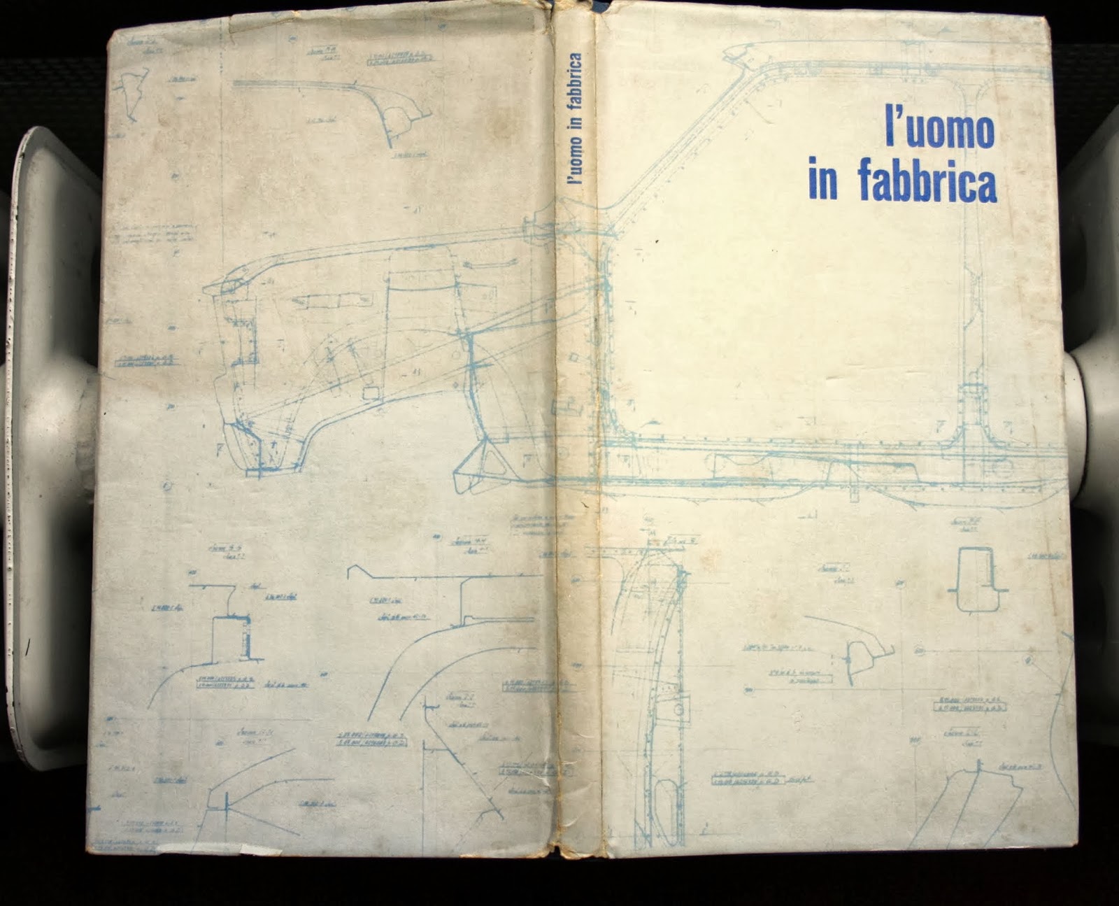
In the publication L’uomo in fabbrica the automobile manufacturer Fiat expresses its affinity with its employees working on the shop floor, its focus on the importance of human workforce in factory work. A technical drawing of the Fiat 128 model is printed on the dust jacket. After a short introduction the book contains only photographs. A compilation of thumbnails, bleeding images and large images bordered with white bars show the reader a day at work in the factory. The variety in image size and the mixture of black & white and color photographs generate a dynamic flow in the visual narrative. The story begins with the employees going to work and it ends when they leave the Fiat complex; in addition, the storyline shows the fabrication of the Fiat 128. Captain of industry of the Fiat Group, Umberto Agnelli, is portrayed on the shop floor and wrote an introductory text.

For CEO’s Only is a selection of international company photobooks from the private collection of professional photographer Bart Sorgedrager, based in Amsterdam. Research assistant Clara Jankowski (MA Master Photographic Studies, Leiden University) has compiled a bibliography and captions for this particular selection of company photobooks and is presented in the exhibition as FOR CEO’S ONLY (alluding to the title of a company photobook by Richard Avedon for M&A Group in New York).


FIAT

logo-fiat-design-auto-motors
Fabbrica Italiana Automobili Torino (FIAT) è stata fondata a Torino nel 1899 da un gruppo di investitori tra cui Giovanni Agnelli che più tardi divenne l’Amministratore Delegato della società. Per celebrare questo evento fu creato un manifesto e il nome della società in alto a sinistra del poster divenne il primo logo della società. Nel 1901 la società cambiò il suo logo con una lastra di ottone con il nome FIAT al centro. Nel 1925 il logo divenne circolare, rispetto alla forma ovale del 1904. La corona d’alloro attorno al cerchio era per celebrare la vittoria della società nella prima gara di auto a cui partecipò. La forma del marchio continuò a cambiare continuamente nel corso degli anni e ritornò alla forma circolare nel 1999. Il nuovo logo FIAT fu lanciato per la prima volta nel 2006 su una Bravo.

fiat 127 (1971) vs. fiat 127 concept
images courtesy david obendorfer

designed according to the stylistic canons of the 1970s, the resurrection of pio manzù’s fiat 127 is quite risky: the original model
was one of the first truly innovative cars of the 70s designed to be rational in style with clean volumes and pure, simple lines.
the danger of creating a car already seasoned at birth, as it were, with an imperceptible nostalgic effect is that it may not be
particularly attractive. with this being said, designer david obendorfer tries to unite the past and future in one car of updated
proportions and boasting with the unique combination forms influened by the model launched in 1971 with high-tech
solutions such as a multifunctional touch screen in the center of the dashboard.

enlarged in size compared to the original model, the fiat 127 concept is based on the fiat punto-alfa mito platform. 
the minimalist
interior follows the same rational concept featuring nostalgic elements that give a strong personality to the dashboard. the circular
vents in the center, the chrome handles and the design of the two-spoke steering wheel are clear references to the first 127 model.

Tentoonstelling eert Piò Manzù, geestelijk vader van de Fiat 127


donderdag 20 februari 2014

The Essentially Masculine Subject of the Industrial Landscape Métal Germaine Krull Photography


KRULL, GERMAINE - Métal.

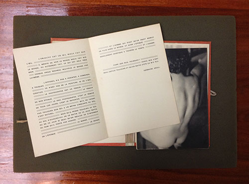
Köln/ Zülpich, Ann und Jürgen Wilde, 2003 orig photo-pictorial portfolio with 64 loose plates as issued in orig slipcase 24 x 30 cm new edition of 1000 numbered copies of the original edition ( 1928) text in German, French and English.

Joris Ivens - De Brug (The Bridge, 1928) from Avant-Garde Cinema on Vimeo.

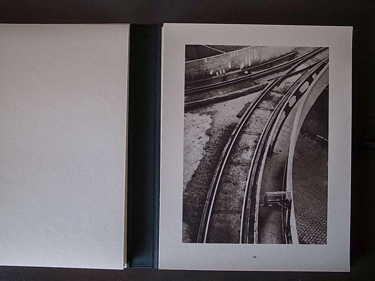
Fascinating reprint of Germaine Krull's most important photographic work. Originally published in 1928 by the Librairie des Arts Décoratifs, the portfolio features a faithful reprint of the 64 loose plates that appeared in the original publication along with separate booklets of Florent Fels' original introduction and a preface by Germaine Krull. "Métal" was intended to concern "the essentially masculine subject of the industrial landscape." Krull shot the portfolio's 64 black-and-white photographs in Paris, Marseille, and Holland during approximately the same period as Ivens was creating his film De Brug ("The Bridge") in Rotterdam, and the two artists may have influenced each other. The portfolio's subjects range from bridges, buildings (e.g., the Eiffel Tower), and ships to bicycle wheels; it can be read as either a celebration of machines or a criticism of them. Many of the photographs were taken from dramatic angles, and overall the work has been compared to that of László Moholy-Nagy and Alexander Rodchenko. Truly, "Métal" not only sealed the photographer's reputation as a leading modernist, but has also ranked as one of the finest examples of a modernist photobook in the dynamic, cinematographic mode. 

Nieuwe Fotografie
Rond 1890 raakten fotografen in de greep van het idee dat ze het beste nostalgische quasi-schilderijtjes in de trant van de Haagse School konden maken om hun vak als kunst erkend te krijgen. Typisch fotografische eigenschappen zoals scherpte en detailrijkdom werden zo veel mogelijk onderdrukt ten gunste van een artistiek ideaal dat van elders gehaald was. Het leverde plaatjes op van feeërieke laantjes met slanke berkenbomen, van schaapskuddes en peinzend naar de horizon starende boeren. Dergelijke foto's ademden vóór alles nostalgie en brachten een wereld in beeld die eigenlijk al niet meer bestond.

De reactie op dit sleets geworden vocabulaire kwam in de jaren ’20. In Nederland worden altijd de namen van Piet Zwart en Paul Schuitema genoemd als degenen die voor een frisse wind zorgden. Zij wilden niet langer de schilderkunst imiteren, maar de camera gebruiken waar ze goed in was: objectieve, haarscherpe beelden maken die vol details zaten, niets weglieten en soms meer lieten zien dat het menselijk oog had kunnen waarnemen.

In tegenstelling tot hun oudere voorgangers keerden Zwart en Schuitema hun gezicht (en camera) niet af van de eigen tijd, waarin telefoon, radio en bioscoop hun intrede hadden gedaan, er steeds meer producten met behulp van machines werden vervaardigd en in Rotterdam steeds grotere oceaanstomers aanlegden.

Zij – en andere aanhangers van de Nieuwe Fotografie, zoals deze stroming wordt genoemd – waren juist erg geïnteresseerd in alles wat met machines te maken had: ze werden geïntrigeerd door de vormen ervan (met hun koud glanzende metaal) en de producten die ze voortbrachten (de eindeloze herhaling van identieke vormen). Het onderwerp deed vaak minder ter zake: het was vooral aanleiding tot een compositie.

Fotografen als Zwart en Schuitema begonnen te experimenteren met een vormentaal die alleen in de fotografie kon worden gevonden, zoals extreem hoge en lage standpunten, close-ups, afsnijdingen, herhaling van vormen en patronen, optische vervorming, fotomontage, fotocollage en fotogram.

Klassiek fotoboek
Behalve de namen van Zwart en Schuitema dient in dit verband ook die van een Duitse fotografe te worden genoemd die tijdelijk in Nederland heeft gewoond, Germaine Krull (1897-1985). Zij had in Berlijn kennisgemaakt met Joris Ivens en een relatie met hem gekregen; in de herfst van 1925 vestigde zij zich in Amsterdam. Hier maakte Krull haar eerste foto’s in de stijl van de Nieuwe Fotografie. In 1928 resulteerde dat in de publicatie van Métal, een portfolio met 64 losse lichtdrukken, in Parijs uitgegeven door A. Calavas. Het bevat een aantal van de sterkste modernistischefoto’s die in de jaren ’20 zijn gemaakt en geldt inmiddels als een klassiek – en zeldzaam – fotoboek. Zoals de titel Métal al suggereert, ging Krulls interesse uit naar moderne industrie, havens, machines, bruggen en dergelijke eigentijdse ‘iconen’ die uit ijzer en staal waren opgetrokken. De opnamen zijn gemaakt in de Amsterdamse en Rotterdamse haven, in Marseille en Parijs. We herkennen op een aantal foto’s de Eiffeltoren en de Rotterdamse brug De Hef, van zeer dichtbij of vanaf een laag standpunt gefotografeerd. Veel van de andere foto’s zijn nauwelijks of niet te lokaliseren: het ging Krull niet om in het in beeld brengen van bepaalde plaatsen, maar om de compositorische mogelijkheden van havenkranen, bruggen en machines. De foto’s zijn dan ook niet van titels voorzien, maar eenvoudigweg 1 tot en met 64 genummerd. In die zin is Métal een uitzonderlijke uitgave. In het ontluikende genre van het fotoboek – waarin de fotografie ten minste gelijkwaardig is aan de tekst in plaats van eraan ondergeschikt te zijn – waren de meeste uitgaven van topografische aard, dus gewijd aan een stad of land, en zijn vooral de bekendste, meest geliefde en representatieve plekjes in beeld gebracht.

Het valt niet met volledige zekerheid vast te stellen wanneer de Amsterdamse en Rotterdamse opnamen totstandkwamen. Krull heeft uiteindelijk nog geen jaar in Nederland gewoond – medio 1926 verhuisde zij naar Parijs – maar ze verbleef af en toe nog wel in ons land. In 1928 bijvoorbeeld, het jaar waarin Métal verscheen, maakte zij foto’s van Ivens terwijl hij zijn film De Brugdraaide, over De Hef. Wellicht heeft Krull bij die gelegenheid nog enkele foto’s voor Métal gemaakt.

Project
Germaine Krull was niet de enige die in de tweede helft van de jaren ’20 een fotoboek maakte volgens de principes van de Nieuwe Fotografie. Als we naar de andere voorbeelden kijken, is er echter een belangrijk verschil. Zowel László Moholy-Nagy’s Malerei Photographie Film (München 1925) als het door Franz Roh en Jan Tschichold samengestelde foto-auge (Stuttgart 1929) en Werner Gräffs es kommt der neue fotograf! (Berlijn 1929) zijn op te vatten als een staalkaart van de hierboven al genoemde modernistische stijlmiddelen, zoals hoge en lage standpunten en close-up. Deze boeken waren bijna propagandistisch-educatieve uitgaven, waaruit iedereen kon leren wat de Nieuwe Fotografie bracht. Ze zijn dan ook
ongetwijfeld in het kunst- en fotografieonderwijs gebruikt zoals dat bijvoorbeeld aan het Bauhaus werd gegeven. De boeken van Moholy-Nagy, Roh, Tschichold en Gräff waren onvergelijkbaar veel heterogener, bevatten werk van verschillende, soms anonieme fotografen. Métal is daarentegen aan één onderwerp gewijd, en is duidelijk het werk van één vormvaste fotograaf die op verschillende plaatsen iets uitvoerde wat later een ‘project’ genoemd zou worden. In die zin kan Krulls serie worden opgevat als een vroege voorloper van de bekende typologieën van Bernd en Hilla Becher, die vier decennia later begonnen met het in reeksen fotograferen van industriële bouwwerken.


maandag 17 februari 2014

Métal more impressive : Études de nu Germaine Krull Photography


Germaine Krull
Book cover for Germaine Krull, Études de nu, (Paris: Librairie des Arts Décoratifs - A. Calavas Éditeur, (1930))
1930 

Etudes de nu

Holding a copy of Germaine Krull’s Etudes de nu in your hands is a special event. The book (Librairie des Arts Décoratifs, Paris, 1930) is a rare find, with few copies available in public collections and even fewer coming up for auction. Those that do appear on the block can go for princely sums, some in the neighborhood of $10,000. Given the scarcity of the book, I was quite excited to find a copy just a couple hours away in the Ryerson and Burnham Libraries at the Art Institute of Chicago.
It came as something of a disappointment, then, that as an object, Etudes de nu turned out to be merely curious rather than exceptional.
Yes, the portfolio of 24 loose-leaf sheets is gorgeously printed, and the small size and portfolio format contribute to an overall effect of delicacy and preciousness. However, the images themselves are rather bland, and they fit only very loosely together as a group. Some images feature the elegant curve of the female form from vaguely original angles, all framed very conventionally with a soft and caressing light.
Krull_EDN_2
In other photographs, we see Krull’s signature use of strong shadow, in this case appearing behind an awkwardly posed model. In between are a couple of double exposure experiments that only succeed in doubling the awkward. With so little going on, but in so many different directions, Etudes de nuprojects a lack of cohesion that is more confusing than intriguing.
Krull_EDN_1
Parr and Badger (Volume 1, p. 78) echo Kim Sichel’s assessment (Germaine Krull: Photographer of Modernity, p. 86) that this series of nudes is a “step backward” from the innovative modernism displayed in Krull’s 1928 masterwork Métal, and even a step back in relation to her earlier work in nudes. Certainly the more Sapphic, and visually interesting, nudes that Krull experimented with in Berlin in the early 1920s show that she was capable of pushing the genre into more original and provoking directions. (You can see these earlier nudes in Sichel’s book.) I’m holding out hopes that Krull’s signature accomplishment, Métal, will be more impressive. —Mary Goodwin


Germaine Krull
Book cover for Germaine Krull "Métal. Introduction by Florent Fels" (Paris: Librairie des Arts Décoratifs, 1928)
1928 
I looked at a first edition of Etudes de nu at the Ryerson and Burnham Libraries, Art Institute of Chicago. Click here to find a copy of Etudes de nu near you. See also 

Dutch Books of Nudes Alessandro Bertolotti Sanne Sannes Anthon Beeke Ed van der Elsken Ginger Gordon Diana Blok Graphic Design Typography Photography


Germaine Krull (1897-1985) led an extraordinary life that spanned nine decades and four continents. She witnessed many of the high points of modernism and recorded some of the major upheavals of the twentieth century. Her photographs include avant-garde montages, ironic studies of female nudes, press propaganda shots, as well as some of the most successful commercial and fashion images of her day. Her political commitments led her from communist allegiance to incarceration in Russia as a counterrevolutionary to support of the Free French cause against Hitler to a reclusive existence among Tibetan monks in India. Kim Sichel's study of this remarkable artist reveals a life of deep convictions, implausible transformations, complex emotional relationships, and inspired achievements.
Krull refused to limit herself to one long-term relationship, one geographical region, or one set of religious and moral beliefs. Contemporary critics ranked her with Man Ray and André Kertesz. Younger photographers such as Berenice Abbott looked up to her. Yet until recently the absence of an archive has made a proper evaluation of Krull's contribution to photography and to modernism difficult if not impossible. In this book Sichel examines Krull's autobiographical texts and photographic oeuvre to present and unravel the rich mythology that Krull fabricated around her life and work. The chapters follow the geographical and chronological sequence of Krull's life, moving from Munich to Moscow to Berlin to Amsterdam to Paris to Brazil to Africa to Bangkok and other locations.


Krull, Germaine. Métal. Paris: Librairie des arts décoratifs, 1928. (New facsimile edition published in 2003 by Ann and Jürgen Wilde, Köln.)
Krull, Germaine. 100 x Paris. Berlin-Westend: Verlag der Reihe, 1929.
Bucovich, Mario von. Paris. New York: Random House, 1930. (With photographs by Krull.)
Colette. La Chatte. Paris: B. Grasset, 1930. (With photographs by Krull.)
Krull, Germaine. Études de Nu. Paris: Librairie des Arts Décoratifs, 1930.
Nerval, Gérard de, and Germaine Krull. Le Valois. Paris: Firmin-Didot, 1930.
Warnod, André. Visages de Paris. Paris: Firmin-Didot, 1930. (With photographs by Krull.)
Krull, Germaine, and Claude Farrère. La Route Paris-Biarritz. Paris: Jacques Haumont, 1931.
Morand, Paul, and Germaine Krull. Route de Paris à la Méditerranée. Paris: Firmin-Didot, 1931.
Simenon, Georges, and Germaine Krull. La Folle d’Itteville. Paris: Jacques Haumont, 1931.
Krull, Germaine, and André Suarès. Marseille. Paris: Librairie Plon, 1935.
Krull, Germaine, Raúl Lino, and Ruy Ribeiro Couto. Uma Cidade Antiga do Brasil, Ouro Preto. Lisboa: Edições Atlântico, 1943.
Vailland, Roger. La Bataille d’Alsace (Novembre-Décembre 1944). Paris: Jacques Haumont, 1945. (With photographs by Krull.)
Krull, Germaine. Chiengmai. Bangkok: Assumption Printing Press, 1950–1959?
Krull, Germaine, and Dorothea Melchers. Bangkok: Siam’s City of Angels. London: R. Hale, 1964.
Krull, Germaine, and Dorothea Melchers. Tales from Siam. London: R. Hale, 1966.
Krull, Germaine. Tibetans in India. Bombay: Allied Publishers, 1968.
Krull, Germaine. La Vita Conduce la Danza. Firenze: Giunti, 1992. ISBN 88-09-20219-8.
(Unpublished autobiography of Krull in French, La Vie Mène la Danse or “Life Leads the Dance”, translated into Italian by Giovanna Chiti.)
Germaine Krull in Artizar art gallery from Galería ARTIZAR on Vimeo.