Macedonia: Portraits and Landscapes
GERMANY Schaden.com, Cologne. 2004. First edition, first printing. Martin Parr, The Photobook , vol 2, page 53,87. Brilliant book! 242 x 194 mm (9 1/2 x 7 1/2 in), 28 pages. Hardback with padded cover. 42 colour photographs, including 1 gatefold. Text by Paul Andriesse; design by SYB Utrecht.
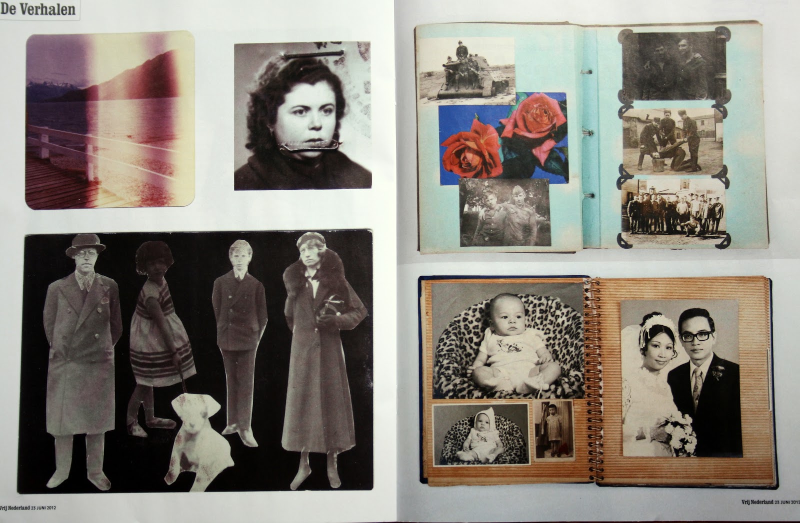
The Dutch Photobook describes the relatively recent history of the famed Dutch photobook. Editors Rik Suermondt and Frits Gierstberg chose over 120 of the most significant Dutch photobooks and placed them in the context of developments in photography and society.
The post-Second World War Dutch photobook is unique because of the long tradition of graphic designers and photographers working closely together. It is highly prized abroad, and many photobooks have become part of the collections of museums and private collectors. This book shows the immense variety and allure of the Dutch photobook and makes it accessible to a broad audience.
Six chapters, organized both thematically and chronologically, examine company photobooks , photobooks about youth culture, landscape books, city books, travelogues and autonomous photobooks. For each theme, the 20 most noteworthy books are described and represented by gorgeous illustrations of their covers and parts of their contents.
Despite - or perhaps because - the digitization of photography, the traditional medium of the photo book is (still) enormously popular amongst contemporary photographers. They see the book as the ideal form to present their work and to tell their story. The Dutch photo book has built over the years a certain reputation. The close collaboration between graphic designers and photographers determined in the period after 1945 the quality of the Dutch photo books. Gerry Badger wrote: ": ‘One of the most active photobook cultures in the postwar years was Holland, rivalling and perhaps exceeding even France.”
Dutch photographer, Cuny Janssen's (b. 1975) portraits of children and young people offer a fresh perspective on both the medium and method of photographic portraiture. In the light of this, developing and responding to contemporary social as well as artistic challenges form the crux of her practice.Based in Utrecht, Janssen's work has taken her to locations including Norway, Macedonia, Iran, India and the UK. Her creative influences are equally diverse, ranging from Marcel Proust to contemporary artist Thomas Struth, and from photographer Robert Adams to the Swiss 19th-century painter Ferdinand Hodler. Her in-depth familiarity with their work has become an important element of her development as an artist.Janssen's interest in the medium of books began in 2002 with a publication of images of children and young people in India. However, the true beginnings of her portraits and landscapes series came with her photographic approach to portraying children in areas of conflict. Janssen went to Macedonia in 2003 when ethnic violence was sporadic and many families were (and remain) displaced from their homes.Cuny Janssen is not an opportunistic artist. Her working process starts with the discipline of a plate camera and ends with a very careful edit long after the photograph has been taken. Her portraits come about through long periods of time spent with sitters and their families although the specific names of her sitters are not identified in the final works. Her photographs are neither snapshots nor formally poised moments. Alluding to a rich history of the portrait in art, her colour images actively engage in the quandaries of the portrait as psychological space and philosophical construct.Both the photographs of landscapes and children, juxtaposed without textual interpretation, carry an ambiguous undercurrent of expectancy and stasis in equal measure. We might relate them to Proust's concept of "extra-temporalisation", meaning literally "a place out of time".Overall, Janssen's practice has positive connotations; her ostensible subjects are of young lives and unspoiled nature. Combined with the children's resilience and the displaced feeling of the landscapes, Janssen's project emerges as a highly contemplative body of work, encouraging an optimistic reading of the enduring truths of survival and beauty.The artist's book "Finding Thoughts" is co-published by The Photographers' Gallery and Cuny Janssen.
Cuny Janssen (1975)
Cuny Janssen portretteerde kinderen uit Nederland, India, Noorwegen, Macedonië en Iran. In het voorwoord van Janssens' fotoboek Macedonia worden haar beweegredenen als volgt omschreven: 'Cuny Janssen fotografeert kinderen. Dat doet ze met een doel. Ze wil laten zien dat kinderen waar ook ter wereld, ondanks alle topografische, historische en culturele verschillen, in essentie gelijk zijn. In haar fotografische portretten gaat het om de universele gelijkheid van de mens*.'Nadat Janssen de tweede prijs van de Prix de Rome wint in 2002, krijgt haar werk een andere invalshoek. Ze zegt: 'Voor 2002 wilde ik alleen kinderen in schijnbaar normale omstandigheden fotograferen, omdat ik dacht dat extreme situaties de aandacht zouden afleiden van waar het in mijn beelden om gaat. Dit was dan ook mijn eerste reactie op het advies van jurylid Oliviero Toscani om oorlogskinderen te gaan fotograferen. In mijn gedachten zag ik alleen maar trauma's voor me en dat is niet wat ik wil laten zien. Maar na een jaar heb ik besloten om zijn advies op te volgen, simpelweg door van mijn stelling een vraag te maken. Krijg ik dan alleen maar trauma's te zien? Ik besloot toen om toch binnen zo'n extreme situatie contact te krijgen met het kind en om me te concentreren op de kracht, de waarde van de mens.'* Janssen vertrekt naar Macedonià en ontmoet in vluchtlingenkampen en opvangcentra kinderen van onder andere Macedonische, Albanese en Roma-zigeuner afkomst, die in 2001 getuige waren van het conflict dat uitbrak tussen Albanese rebellen en de regering. De reis resulteert in een serie van zestien intrigerende portretten. Tevens maakt ze indrukwekkende foto's van het Macedonische landschap, waarin stilte, tijdloosheid en licht regeren. Janssen: 'een portret is voor mij net zo goed een landschap en andersom. Er loopt een rode draad door mijn beleving van de mens en mijn beleving van de natuur.